Why a Pretty Website Isn’t Enough: How to Build a Website That Actually Sells
The new website looks great, everyone compliments it, and the phone still doesn’t ring. Design shapes the first impression, but something else closes the sale: an offer people understand within seconds, fast loading on mobile, pricing and proof that you can be trusted, and a path to getting in touch with nothing in the way. Here is what the research says, from eye tracking to lead response times, plus a checklist you can run on your own site today.
01Design wins the first impression, not the sale
People form an opinion of a website before they finish the first sentence. In 2006, Gitte Lindgaard’s team at Carleton University in Canada found that a first impression of a page’s look forms in about 50 milliseconds. A 2012 study co-authored by a Google researcher added an important detail: the best-rated sites were visually simple and looked the way people expect that kind of site to look. An unusual layout tends to look less appealing, not more.
Looks affect trust too. In a 2002 Stanford study, more than 2,600 people rated the credibility of websites, and 46.1% of the 2,440 comments mentioned design, more than anything else. Right behind it came how the information was structured (28.5%) and whether the site stayed focused (25.1%).
- Design look46.1%
- Information structure28.5%
- Information focus25.1%
- Company motive15.5%
- Usefulness of information14.8%
- Accuracy of information14.3%
- Name recognition and reputation14.1%
Share of 2,440 comments that mentioned each topic (one comment could mention several). Source: Fogg et al., Stanford Persuasive Technology Lab, 2002.
Good design gets you through the door. It won’t persuade anyone if the site doesn’t say what you offer, who it’s for, what it costs and how to reach you. That is where many good-looking websites fall short.
02Most businesses have a website. Far fewer use it to sell
Eurostat data for 2025 shows how wide the gap can be. In the EU, 79.0% of businesses with 10 or more employees have a website, yet only 66.4% of all businesses use it to describe what they offer or show prices, and just 22.5% take orders or bookings through it. The spread between countries is huge: in Finland 91.3% of businesses show their offer or prices online, in Croatia only 35.6%.
- Finland91.3%
- Sweden84.1%
- Germany83.7%
- EU average66.4%
- Czechia52.1%
- Romania48.1%
- Croatia35.6%
Share of all businesses with 10 or more employees (excluding the financial sector), selected countries. Source: Eurostat, dataset isoc_ciweb, 2025 survey.
Customers, meanwhile, are used to buying online. In 2025, 73.6% of people in the EU aged 16 to 74 bought something online in the previous 12 months. If your site doesn’t tell them what you do and roughly what it costs, they have to call, email or look elsewhere, and some of them end up with a competitor who answered the question right away.
Simply having a website no longer sets a business apart. What matters is whether it answers visitors’ questions and leads them to the next step.
03The first few seconds: headline, offer and next step
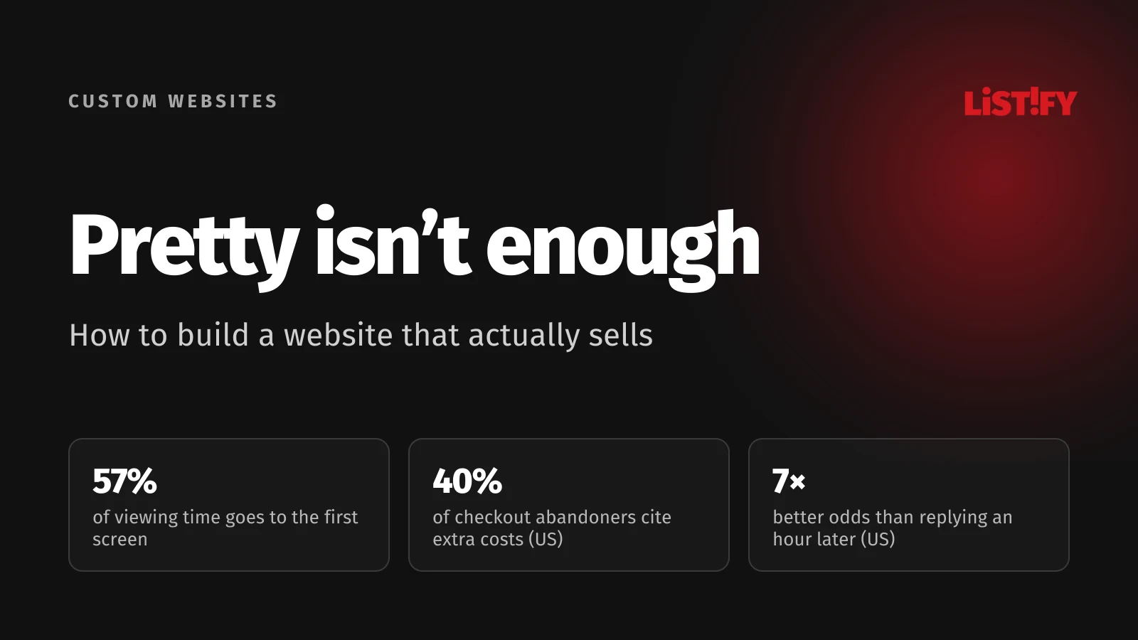
In a 2018 eye-tracking study on desktop screens, Nielsen Norman Group found that people spent 57% of their viewing time above the fold, meaning on what’s visible without scrolling, and 74% on the first two screenfuls. Everything further down gets far less attention.
- First screenful57%
- Second screenful17%
- Rest of the page26%
Share of page viewing time, desktop eye tracking. The second screenful and the rest are derived from the published 57% and 74%. Source: Nielsen Norman Group, 2018.
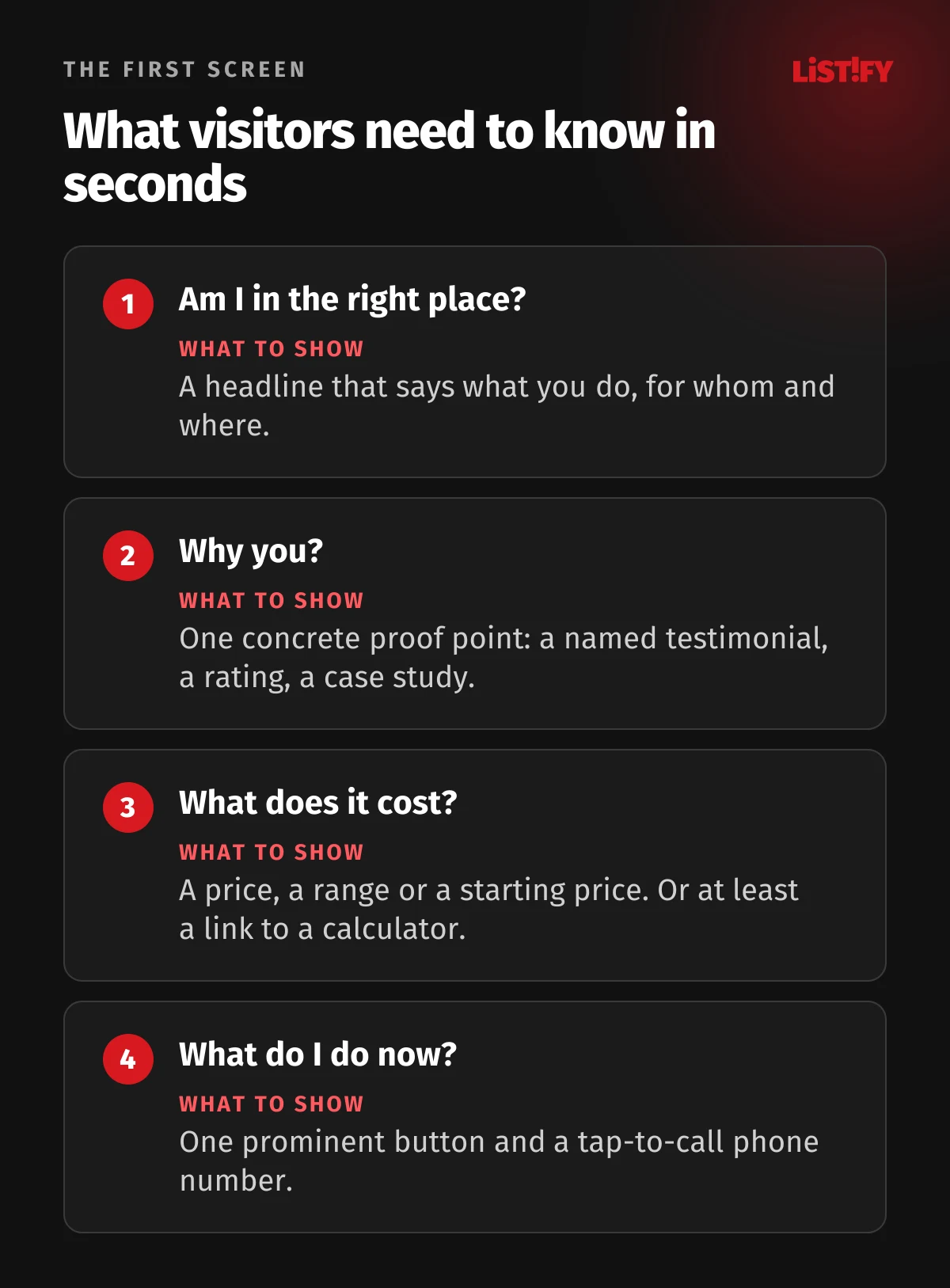
So the first screen has to answer four questions visitors ask themselves, even if they don’t realize it. If they can’t find the answers, they close the tab and go back to the search results. For more on what people take in during those first moments, see our article on the 3-second rule.
A headline that says what you sell
The most common mistake is a generic slogan. “Innovative solutions for your success” could be written by anyone and tells the visitor nothing. Compare it with “Turnkey bathroom remodels in Austin, finished in 4 to 6 weeks.” You instantly know what the company does, where and how fast. Under the headline, add one sentence with the main benefit and then one clear button, such as “Get a free quote” or “See pricing.”
Write plainly. Unbounce analyzed more than 41,000 landing pages and found that pages written at a 5th to 7th grade reading level converted 11.1% of visitors, while pages written in professional language converted 5.3%.
04Speed and mobile: a slow site loses leads before you ever see them
In 2022, the agency Portent compared speed and results across 20 websites with over 100 million page views. On the 14 lead generation sites, a page that loaded in 1 second had about three times the conversion rate of a page that took 5 seconds. The sample is small and this is a correlation, not an experiment. A 2020 Deloitte study commissioned by Google points the same way: across 37 brands, a 0.1-second improvement in mobile site speed came with an 8.4% increase in retail conversions.
How fast is the web today? Google measures real visits in Chrome and scores them on three Core Web Vitals: how quickly the main content appears (within 2.5 s), how quickly the page responds to a tap or click (within 200 ms), and whether the layout jumps around while loading.
- All three Core Web VitalsDesktop: 60.2%Mobile: 53.0%
- Loading (LCP within 2.5 s)Desktop: 78.7%Mobile: 65.8%
Share of websites with a good score based on real Chrome visits (Chrome UX Report). Only sites with enough Chrome traffic are included. Source: HTTP Archive, Core Web Vitals Technology Report.
Nearly half of the websites in Google’s data fail on mobile. And mobile is roughly half of all traffic: according to StatCounter, 49.3% of page views worldwide came from mobile devices in August 2026 and 49.1% from desktop. If you only ever check your site on a big office monitor, you’re not seeing what half your customers see.
What helps speed the most
- Images in WebP or AVIF, sized for how they’re actually displayed. An oversized hero photo is a common bottleneck.
- Fewer plugins, scripts and tracking tags. Every tool you add downloads something and slows the page down.
- No autoplaying sliders or background videos on the first screen unless there’s a clear reason.
- Regular checks in PageSpeed Insights and the Core Web Vitals report in Google Search Console.
- Hosting and technology that can handle traffic peaks. With templates running dozens of plugins, speed is often the first thing to go, as we explain in our article on WordPress templates.
05Trust: pricing, reviews and real people
Once visitors understand what you offer, they start asking whether they can trust you. The strongest proof is other customers’ experience. Using data from a US high-end gift retailer, the Spiegel Research Center at Northwestern University found that a product with five reviews was 270% more likely to be purchased than one with none. For higher-priced items, reviews raised the conversion rate by 380%, for lower-priced ones by 190%. The more that’s at stake, the more people look for confirmation from others.
The second factor is price. Baymard Institute surveys US online shoppers on why they abandoned a checkout. Leaving aside people who were just browsing, the top reason is extra costs such as shipping, taxes and fees that turn out too high.
- Extra costs too high (shipping, tax, fees)40%
- Delivery was too slow20%
- Didn’t trust the site with card details19%
- Had to create an account18%
- Checkout too long or complicated17%
- Website errors or crashes17%
- Unsatisfactory returns policy13%
- Couldn’t see total cost up front12%
Survey of US online shoppers, excluding those who answered “I was just browsing.” Respondents could give more than one reason. Source: Baymard Institute, updated September 2025.
The data comes from online stores, but the same logic applies to services. You don’t need a full price list if every project is quoted individually. A starting price, a range or a calculator shows people whether you fit their budget and saves time on both sides. You can see how we handle it on our pricing page.
What builds trust on a website
- Real testimonials with a company or person’s name, ideally with a photo or link. An anonymous “Jane from Chicago” convinces no one.
- Case studies with a concrete result: what was needed, what you did and what it achieved for the client.
- Ratings from Google or review platforms, if you have them.
- The people behind the business: team photos, names and direct contacts.
- Full contact details: phone, email, address and company registration details. For online stores, clear terms, shipping, returns and complaints information.
06Forms and checkout without friction
The last step is where many sales are lost. According to Baymard Institute, the average online checkout in 2024 had 5.1 steps and 11.3 form fields, while most sites need only 8 fields. Every unnecessary field is one more reason to leave.
The same goes for contact forms. For a first contact, a name, a phone number or email and a short message are enough. Budget, timeline and other details can wait for the call. If you really need them up front, make them optional or offer a few choices instead of an empty text box.
- A tap-to-call phone number, visible at the top of the page.
- One main button per screen. Five different calls to action side by side often means people click none of them.
- A clear confirmation after submitting, saying what happens next and when you’ll be in touch.
- Guest checkout. Offer an account only after the order is complete.
- A form that works on a phone: large fields, the right keyboard for phone and email, and clear error messages.
Don’t forget accessibility. In 2026, WebAIM checked the home pages of the top million websites and found accessibility errors on 95.9% of them. The most common was low-contrast text (83.9% of pages), and 51% had form fields without labels. Low contrast is a problem for anyone reading a phone in bright sunlight, not just people with visual impairments, and a field without a label leaves screen reader users guessing what to type.
07A lead came in. Who answers it within the hour?
A website can work perfectly and still lose the deal if the inquiry sits in an inbox for two days. In 2011, Harvard Business Review published an audit of 2,241 US companies that received a test inquiry through their website, measuring how quickly each one responded.
- Within 1 hour37%
- In 1 to 24 hours16%
- In more than 24 hours24%
- Never responded23%
Share of 2,241 US companies that received a test lead through a web form. Source: Harvard Business Review, 2011.
Almost a quarter never replied at all. Drawing on 1.25 million sales leads, the authors also showed why speed matters: companies that tried to contact a lead within an hour were nearly seven times as likely to reach a key decision maker as those that tried an hour later, and more than 60 times as likely as those that waited 24 hours or longer.
You don’t need a sales team to act on this. Make sure every inquiry reaches a specific person’s phone immediately, that the customer gets an automatic confirmation saying when you’ll respond, and that someone covers inquiries when the salesperson is away. For more on generating leads from ads and search, see our guide to B2B lead generation with paid ads and SEO.
08Measure what your website actually delivers
Without measurement, you’re guessing. According to W3Techs, 42.9% of websites use none of the traffic analysis tools the service tracks. If you don’t measure, you can’t know how many leads the site brought in or which change made a difference.
Start by tracking conversions, the actions that are worth something to you: a submitted form, a tap on the phone number or email, a completed order, a booking. Your website conversion rate is the number of conversions divided by the number of visits, times 100. If 2,000 visits a month bring in 30 inquiries, your conversion rate is 1.5%.
- Google Analytics 4 or another analytics tool with conversions set up. In the EU, the UK and many other places, tracking has to respect cookie consent.
- Google Search Console: which searches bring people to you and how fast the site is for real visitors.
- Session recordings and heatmaps (Microsoft Clarity is free): where people click, how far they scroll and where they leave.
- The source of every lead: ads, search, referrals. Otherwise you can’t tell what pays off.
Take “average conversion rate” benchmarks with a grain of salt. Unbounce reports a median of 6.6%, but that is for landing pages built with its tool, which mostly get campaign traffic. Online stores typically convert far lower, and every industry is different. The most useful comparison is your own site month over month and before and after each major change. To budget for enough traffic to make these numbers meaningful, see our guide on how much to spend on online marketing.
09Checklist: does your website sell?
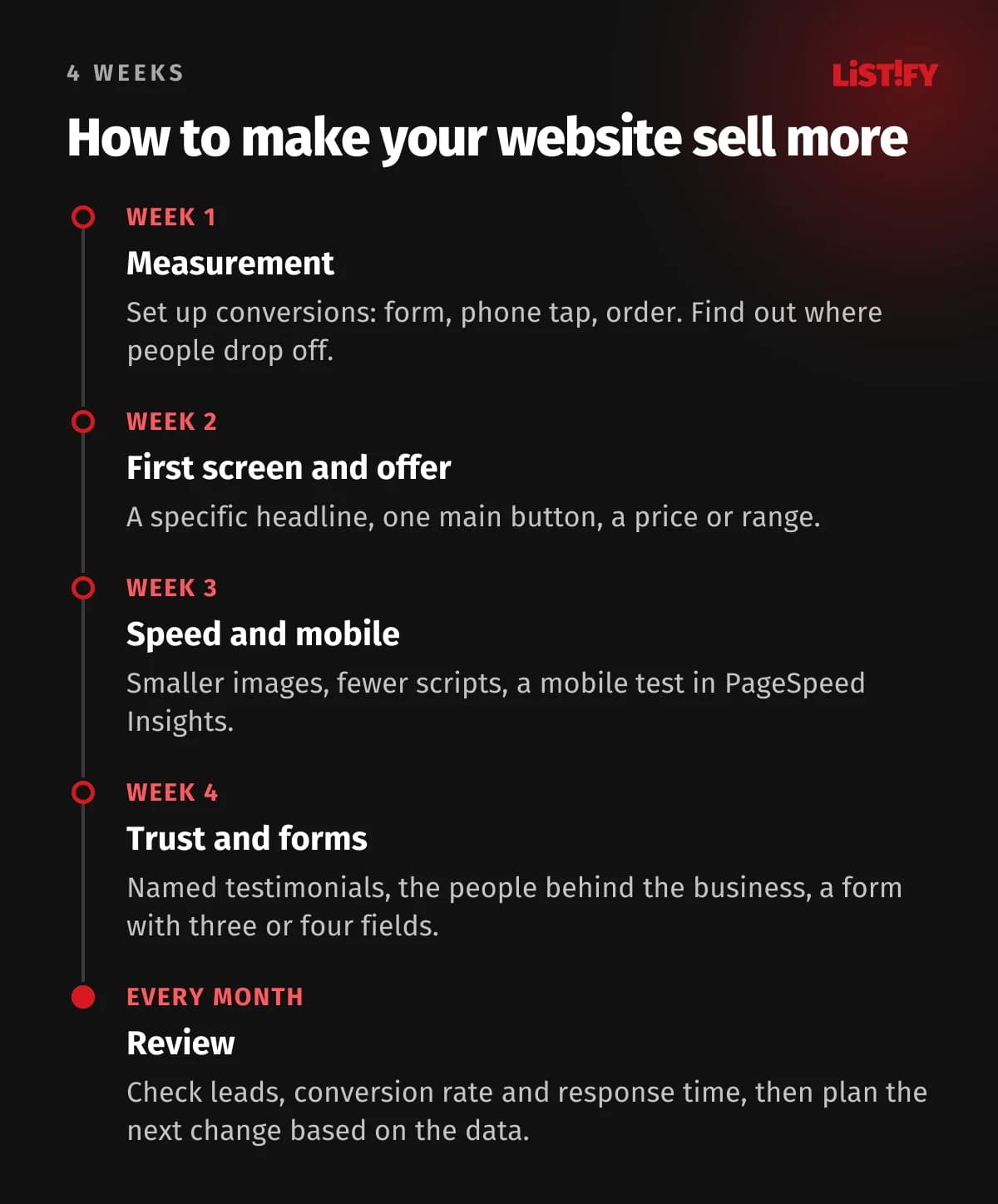
If you’re wondering how to increase website conversions, start here. Go through your site on a phone as if you were seeing it for the first time. For every “no,” write down a task.
- The headline on the first screen makes it clear what you do, for whom and where.
- The first screen has one prominent button and a tap-to-call phone number.
- Visitors can find a price, a range or a calculator within two clicks.
- The site shows real, named testimonials and case studies with results.
- The people behind the business and full contact details are easy to find.
- The site passes Core Web Vitals on mobile in PageSpeed Insights (if it has too little traffic for real-user data, the lab score for mobile is green).
- The contact form has no more than three or four required fields and a clear confirmation.
- Every inquiry reaches a specific person right away and gets a reply within an hour during business hours.
- You track conversions and know how many leads the site brought in last month.
- You update the site based on data at least once a quarter.
10Frequently asked questions
What is a website conversion rate and how do I calculate it?
A conversion rate tells you what percentage of visits end in an action you care about, such as a submitted inquiry or an order. Divide the number of conversions by the number of visits and multiply by 100. 2,000 visits and 30 inquiries give you 1.5%.
What is a good conversion rate?
There’s no single right number. Unbounce reports a median of 6.6% for landing pages built with its tool, online stores typically convert far lower, and industries vary widely. It’s more useful to compare your site with itself over time and check whether changes moved the numbers.
How do I increase website conversions?
The quickest wins usually come from the first screen, mobile speed and the form: a specific headline with one main button, fast loading, a price or range, named testimonials and as few required fields as possible. Check every change against your data, not your gut feeling.
Should I show prices if every project is quoted individually?
You don’t need a full price list, but a starting price, a range or a real example helps people see whether you fit their budget. Fewer inquiries from people who could never afford you is usually a good thing.
How fast should my website be?
Google recommends that the main content appears within 2.5 seconds, the page responds to interactions within 200 milliseconds and the layout doesn’t shift while loading. You can check your site for free in PageSpeed Insights, separately for mobile and desktop.
Will a redesign help if my website doesn’t sell?
Only if it fixes the real cause. A new look with the same copy, slow loading and a complicated form will perform the same. Start by measuring, find where people drop off, and then decide whether small changes are enough or you need a new website.
Is a ready-made template enough for a high-converting website?
For a simple brochure site, often yes. Problems start when the template slows the site down, can’t handle the form or calculator you need, or can’t be changed without more plugins. We compare the options in our article on custom websites.
11Summary
A pretty website makes a good first impression, but what sells is everything that comes after it: a clear offer on the first screen, fast loading on mobile, pricing and proof of trust, a simple form and a quick response to every inquiry. Unlike taste in design, all of it can be measured, tested and improved.
If you’re building a new website, start with the content and the customer’s path, not the colors. You can see how we run these projects on our how it works page and in our custom websites service overview.