The 3-Second Rule: Why the First Moments Make or Break Your Website and App
The 3-second rule says that within roughly the first three seconds, visitors decide whether to stay on your website or app, or leave. Two things have to happen in that time: the page has to load, and people have to understand where they are, what they’ll find and what to do next. If either one fails, most people simply hit Back and click somewhere else.
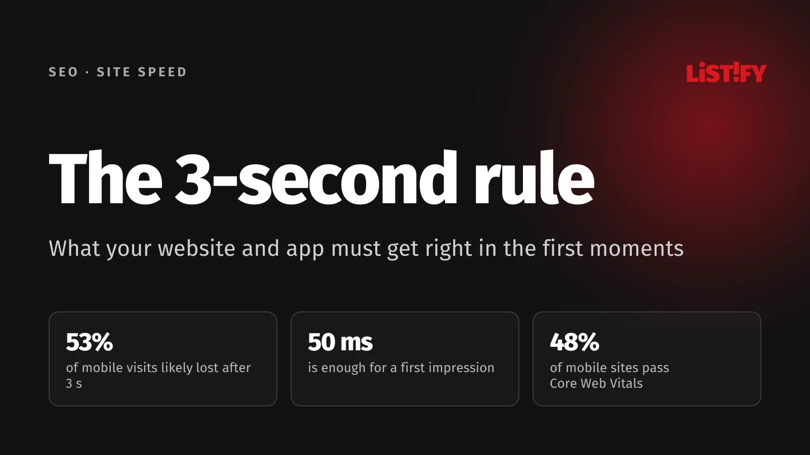
It isn’t a precise law. It’s a practical summary of what research on online behavior keeps confirming. According to a study by Lindgaard and colleagues, people form an opinion about how a website looks in just 50 milliseconds (Behaviour & Information Technology). Google research found that the probability of a visitor bouncing rises by 32% when load time goes from one second to three (Google). And Microsoft Research data, analyzed by Nielsen Norman Group, shows that people are most likely to leave a page during its first few seconds (NN/g).
There’s a logic to it. It comes down to how the brain processes what it sees, plus a few numbers Google measures on every website. Once you understand it, you’ll know exactly what to fix on your site or in your app. No technical background needed.
01Where the 3-second rule comes from, and what the data actually says
The rule rests mainly on two Google studies from 2016 and 2017 that have shown up in nearly every presentation on site speed since. They’re often quoted loosely, though, so it’s worth knowing what they really say.
Study 1: “53% of mobile visits end if a page doesn’t load within 3 seconds”
In September 2016, Google published a study called The Need for Mobile Speed. Based on Google Analytics data, 53% of mobile visits are likely to be abandoned if a page takes longer than 3 seconds to load. The study also cited a survey in which half of people said they expect a page to load in under two seconds (Google).
For context: an analysis of more than 10,000 mobile sites found that the average one took 19 seconds to load on 3G and 14 seconds on 4G (The ARF). Sites were many times slower than people wanted.
Study 2: “Every extra second raises the odds someone leaves”
Research by Google and SOASTA from 2017, published in February 2018, estimated how the probability of an immediate exit (a bounce) grows as load time increases. These are predictions from a machine learning model trained on real visit data, not direct measurements (Google).
- 1 s to 3 s32%
- 1 s to 5 s90%
- 1 s to 6 s106%
- 1 s to 10 s123%
Machine learning model estimates from Google and SOASTA research (2017, published February 2018). A relative increase compared with a page that loads in 1 s, not the share of people who leave. Source: Google.
This is often misread. “32% higher probability” doesn’t mean 32% of people leave. It’s a relative increase. If 20% of visitors bounce from a site that loads in one second, that becomes roughly 26% at three seconds and around 38% at five.
Study 3: Even a tenth of a second is worth money
According to Milliseconds Make Millions, a 2020 study commissioned by Google and prepared by Deloitte using data from the agency Fifty-Five, a mobile site that got just 0.1 seconds faster saw retail conversions rise by 8.4% and average order value by 9.2% (Deloitte). It shows a correlation rather than an exact formula, but the direction is clear: faster sites sell more.
- Conversions, retail8.4%
- Average order value, retail9.2%
- Conversions, travel10.1%
- Page views, luxury brands8.6%
Milliseconds Make Millions (Deloitte for Google, data from Fifty-Five, 2020). A correlation between speed and results, not a direct effect. Source: Deloitte.
Does it still hold in 2026?
The headline numbers do date from the 3G era. Connections are faster today, but sites are also heavier, packed with scripts, video and ads. According to the HTTP Archive Web Almanac 2025, only 48% of mobile sites and 56% of desktop sites meet all three of Google’s speed benchmarks, the Core Web Vitals (Web Almanac). Roughly half of all websites still don’t clear the basic bar.
- 2021Desktop: 41%Mobile: 32%
- 2022Desktop: 44%Mobile: 31%
- 2023Desktop: 48%Mobile: 36%
- 2024Desktop: 55%Mobile: 44%
- 2025Desktop: 56%Mobile: 48%
Share of sites that pass all three metrics. HTTP Archive, Web Almanac 2025.
So don’t treat 3 seconds as a hard cutoff after which your site stops working. Treat it as a sensible upper limit: by then, visitors need to know they’re in the right place. The sooner they know, the better.
02Why it works this way: what’s going on in the visitor’s head
It’s tempting to put it down to people simply being impatient these days. There’s more to it than that: it’s about how the brain takes in information and makes decisions. Once you get that, it becomes clear what to do differently on your site.
1. The brain judges before it reads
The brain works in two modes. The fast, automatic one runs constantly and effortlessly, and it forms an overall impression of a page before you’ve read a single word. The slow, careful one, the one you use to read and think, only kicks in afterwards, and it costs energy.
Lindgaard’s 2006 study showed that people rate a website’s visual appeal after just 50 milliseconds, and that this first impression closely matched their ratings after 500 milliseconds, a look ten times as long (Behaviour & Information Technology). A 2012 University of Basel study, co-authored by a Google researcher, went further: a site’s visual complexity and how typical it looked affected first impressions within 17 milliseconds (Google Research).
So before a visitor has even read your headline, they already have a feeling about whether the site is professional, clear and trustworthy. And that feeling colors everything that follows.
2. A cluttered page wears the brain out before it starts
The same study found that the best-rated sites had low visual complexity and high prototypicality, meaning they looked the way people expect that kind of site to look (Google Research). Every element on the screen has to be processed. The more colors, images, buttons and text, the more work. And the brain instinctively avoids work that doesn’t promise a clear payoff.
Familiarity works the same way. When an online store looks like an online store (cart top right, search at the top, products in the middle), the brain handles it using patterns it already knows and doesn’t need to figure anything out. Original but unfamiliar design costs attention, and in the first few seconds that’s attention visitors won’t give.
3. People browse like hunters looking for food
Researchers describe online behavior as “information foraging.” Like an animal looking for food, a visitor keeps deciding whether it’s worth staying where they are or moving on. They follow what’s called information scent: signs that they’ll find what they’re looking for here.
And leaving your site costs them one tap on the Back button. Your competitors are one tap away. As soon as the scent fades in those first seconds, because the page is blank, unclear or slow, the brain decides it’s worth trying another result.
4. Most people leave right at the start
Nielsen Norman Group analyzed Microsoft Research data on how long people stay on web pages. The chance of leaving is highest in the first 10 seconds, because people start out extremely skeptical: they’ve been burned by countless bad pages. If a page survives that first judgment, people look around, but they’re still likely to leave over the next 20 seconds. Only once they’ve stayed for about half a minute do the odds of them staying much longer rise sharply (NN/g).
According to NN/g, if you want several minutes of someone’s attention, you need to communicate your value clearly within 10 seconds (NN/g). The 3-second rule is a stricter version of the same idea: within three seconds it has to be clear that staying is worth it, and the next few seconds decide whether the page backs that up.
5. Waiting feels longer without feedback
Jakob Nielsen described three time limits rooted in human perception that have held for decades (NN/g):
- 0.1 seconds: a response feels instant, and people feel they’re controlling things directly.
- 1 second: people notice the delay, but their train of thought isn’t broken.
- 10 seconds: the limit for holding attention, after which people start thinking about other things.
Between 1 and 10 seconds, users feel at the mercy of the computer and wish it were faster (NN/g). A blank white screen is the worst case: the brain gets no signal that anything is happening, so the wait feels much longer. That’s why it matters so much to show something useful as early as possible, even while the rest of the page is still loading.
6. On mobile, patience runs even shorter
On a phone, people often search “in between”: on the bus, in a queue, while watching TV. Their attention is split, the connection is often worse, and the screen shows only a small slice of the page. That’s why Google’s study focused on mobile visits, and why what shows on the first screen without scrolling matters so much on mobile.
7. The first impression spills over onto everything else
When a site looks good at first glance, people subconsciously credit it with other good qualities too: that it’s easy to use, trustworthy, and run by a professional company. Psychologists call this the halo effect. It works the other way as well: a slow or messy site makes us doubt the whole business. That’s why the first few seconds have such an outsized influence on whether someone ends up buying from you.
03Second by second: what happens in the first moments
Here’s what the first seconds of a visit look like, step by step. On the left is the time, in the middle what’s happening in the visitor’s head, and on the right what your site has to deliver.
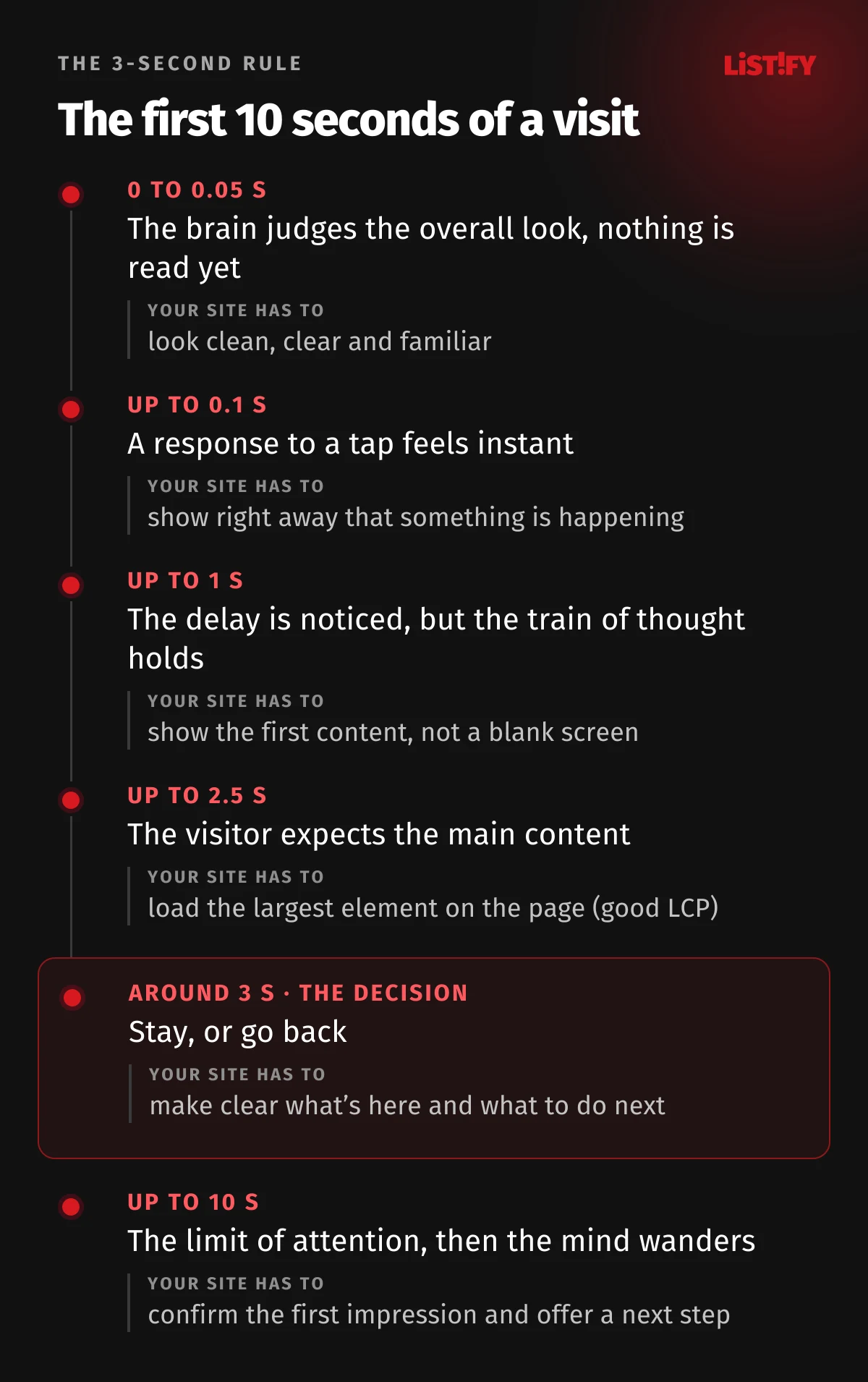
| Time after the click | What’s happening in the visitor’s head | What your site has to do |
|---|---|---|
| 0 to 0.05 s | The brain forms an overall visual impression, nothing is read yet | Look clean, clear and familiar |
| up to 0.1 s | A response that feels instant | Show that something is happening right after a tap |
| up to 1 s | The delay is noticed, but the train of thought holds | Show the first content, not a blank screen |
| up to 2.5 s | Expects to see the main content | Load the largest element on the page (the limit Google considers good) |
| around 3 s | The decision: stay or go back | Make clear what’s here and what to do next |
| up to 10 s | The limit of attention, then the mind wanders | Confirm the first impression and offer a next step |
Sources for the time limits: visual appeal from Lindgaard (Behaviour & Information Technology), response times from Nielsen (NN/g) and the 2.5-second threshold from Core Web Vitals (web.dev).
Each moment builds on the one before. If a page looks chaotic at first glance, the visitor heads into the next seconds already distrustful. If the screen stays blank for the first second, there’s nothing to hold on to and they start thinking about leaving. And if everything loads within three seconds but the headline doesn’t make it clear what the page is about, the speed was wasted.
You don’t have to load the whole page in 3 seconds, though. You just need the essentials to show up quickly: the headline, the main image and the button. The footer, reviews or map can finish loading while the visitor is already reading.
04The first half of the rule: speed and Core Web Vitals in plain English
Google measures how fast and smooth websites are using three metrics it calls Core Web Vitals. They’re based on data from real visitors using Chrome, not lab tests. Each one matches a question visitors subconsciously ask in the first few seconds.
| Metric | The visitor’s question | What it measures | Good score |
|---|---|---|---|
| LCP (Largest Contentful Paint) | “Has it loaded yet?” | How long it takes for the largest element on screen to appear, usually the main image or headline | 2.5 s or less |
| INP (Interaction to Next Paint) | “Is it responding?” | How long the page takes to visibly react to a tap or click | 200 ms or less |
| CLS (Cumulative Layout Shift) | “Is it going to jump?” | How much the content shifts around unexpectedly while loading | 0.1 or less |
Google sets these thresholds, and they still apply in 2026 (web.dev). To pass, at least 75% of real visits have to meet them, not just the average.
LCP: why it’s not enough for “something” to load
Picture walking into a store where it’s dark for the first three seconds. Then a single lamp by the door switches on, but you can’t see the shelves for another five seconds. LCP measures the moment “the shelves light up,” when you can see the main content you came for.
LCP is also the metric websites struggle with most. In 2025, only 62% of sites passed it on mobile, compared with 77% for responsiveness (INP) and 81% for layout stability (CLS) (Web Almanac). The usual culprits are a slow server, a huge uncompressed image or video at the top of the page, and scripts that block rendering.
- LCP (loading)Desktop: 74%Mobile: 62%
- INP (responsiveness)Desktop: 97%Mobile: 77%
- CLS (stability)Desktop: 72%Mobile: 81%
HTTP Archive, Web Almanac 2025. Mobile lags behind on loading (LCP) and responsiveness (INP), while layout stability (CLS) is actually better than on desktop.
INP: why responsiveness matters after the page loads
The 3-second rule doesn’t end once the page has loaded. When someone taps a button and nothing happens, the brain reads it the same way as slow loading: something’s broken. So they tap again, and sometimes submit a form twice. INP measures whether the page responds fast enough to feel alive. It’s most often dragged down by heavy third-party scripts, such as ads, chat widgets and analytics tools.
CLS: why jumping content is a problem
You know the feeling: you go to tap a link, an ad loads at the top, the content jumps down and you tap something else entirely. That’s CLS. A site that doesn’t behave predictably loses trust. It’s usually caused by images and ads without a set size, or cookie banners that push the content down.
How speed relates to SEO
Core Web Vitals are one of the signals Google uses to rank results (Google Search Central). They’re not the most important one, though: a fast site with weaker content won’t outrank a slower site with much better content. Speed shows up far more in how many people stay on your site and take action than in your rankings.
05The second half of the rule: clarity at a glance
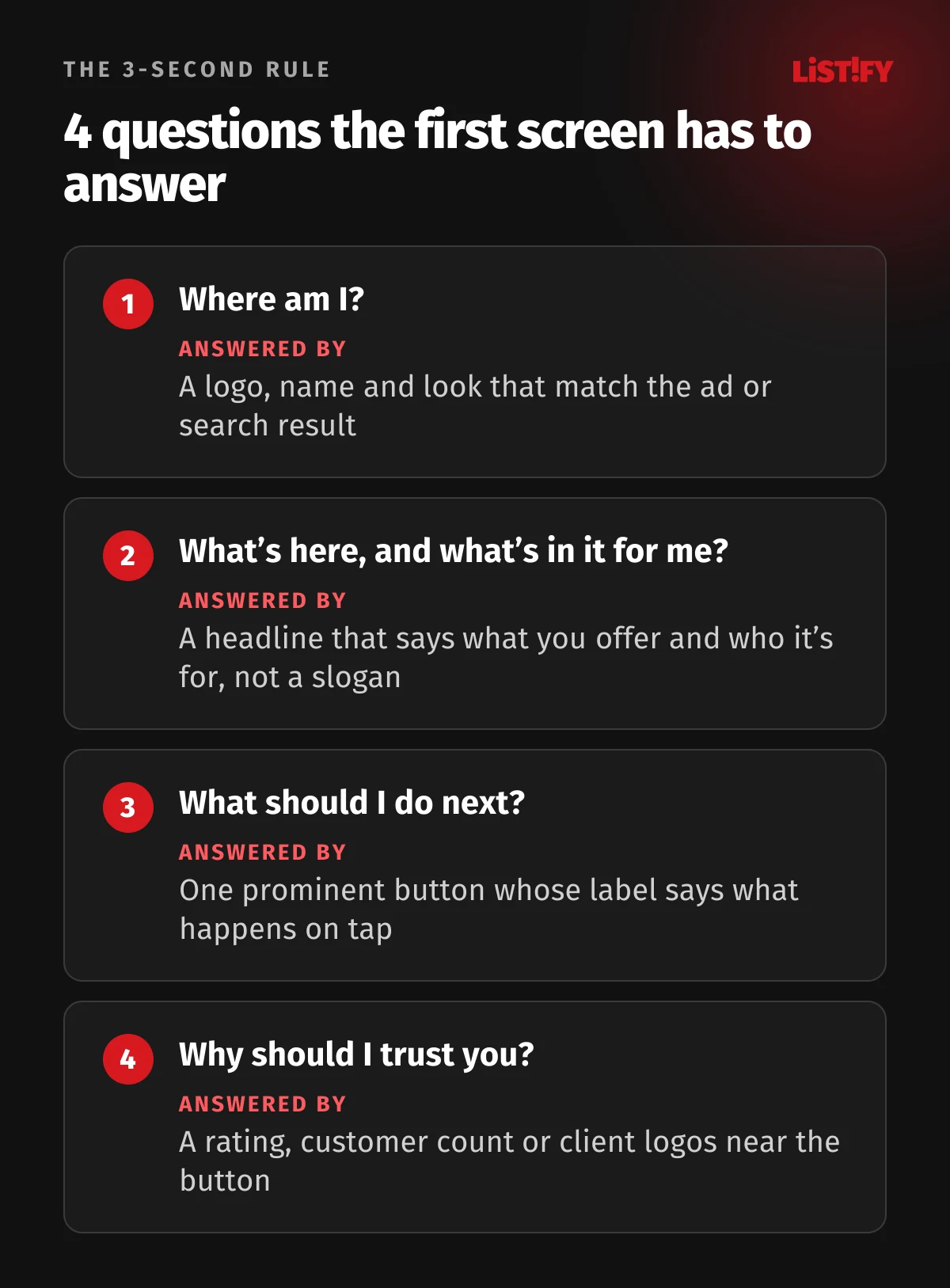
A fast site nobody can make sense of won’t hold visitors any longer than a slow one. In the first three seconds, people need to answer four questions, mostly without realizing it. If the site leaves any of them unanswered, the information scent fades and the urge to leave grows.
Four questions the first screen has to answer
- Where am I? The logo, name and overall look have to confirm this is the site I meant to visit. What makes a logo memorable is covered in our logo design rules. Especially if I came from an ad or a search, the page has to match what I clicked on.
- What’s here, and what’s in it for me? The main headline has to say clearly what you offer and who it’s for. A slogan won’t do the job.
- What should I do next? One prominent main button that says what happens when I tap it.
- Why should I trust you? A quick trust signal: a rating, a customer count, well-known brands you work with, or reviews.
The headline: the most important few words on your site
The headline is the first text the brain reads. It has to work for someone who has never heard of you and reads nothing else.
| Vague headline | Clear headline | Why it’s better |
|---|---|---|
| Innovative solutions for your growth | Bookkeeping for freelancers and small businesses from $59 a month | Says what, for whom and how much |
| Welcome to our website | iPhone screen repairs in 60 minutes, at our London and Manchester stores | A specific service, speed and location |
| The future is here | An app that plans your meals every morning based on your goals | Describes what the app actually does |
Vague slogans make the brain work out what they mean. That’s exactly the kind of effort it doesn’t want to make in the first few seconds. A specific headline gives a strong information scent: “Yes, this is what I’m looking for.”
The main button: one, prominent and specific
When the first screen has five equally important buttons, the brain has to choose. Every extra choice slows the decision down. So:
- One main button, the most visually prominent element. Other actions can be less prominent.
- Specific wording. Instead of “Submit” or “Learn more,” go for “Get a quote,” “Try it free for 14 days” or “Book a repair.”
- Visible without scrolling, especially on mobile.
An image that actually says something
The main image or video should back up the headline: show the product, the result, or the people you help. A generic stock photo of smiling people in an office says nothing and slows the page down. If an image doesn’t add information, make it smaller or drop it.
Trust signals: a quick answer to “Why should I trust you?”
Nobody reads long testimonials in the first few seconds. Short, specific signals work: a 4.8 out of 5 rating on Google, “over 12,000 customers,” logos of well-known clients, or certifications. One or two is enough, placed close to the main button.
Familiarity: don’t reinvent the wheel
Logo top left, menu at the top, cart top right, search in the header. People know these conventions from thousands of sites, and their brains process them automatically. Save originality for your content and visual style, not for where the basics go. The 2012 study confirmed that sites that look typical for their category make a better first impression (Google Research).
06How the rule applies to different kinds of sites and apps
The principle is the same everywhere, but exactly what visitors need to see within three seconds depends on why they came.
Company and service websites
Visitors want to find out quickly whether you do what they need and whether you’re the right fit. The first screen should tell them what you do, who for, where you operate and how to get in touch. A phone number or a “Request a quote” button should be visible right away, especially on mobile. It’s one of the first things we look at when we design custom websites.
Online stores
On the homepage, search and clear categories make the difference. On a product page, the photo, name, price, availability and “Add to cart” button all need to be visible immediately. If someone has to hunt for the price or stock status, the brain treats it as an obstacle and goes back to the comparison site they came from.
Landing pages from ads
This is where the 3-second rule is at its harshest. The visitor clicked on a specific promise in an ad, and the page has to confirm it instantly, ideally in the same words. If the ad says “Online English lessons from $15” and the page opens with a generic “Welcome to our language school,” the information scent breaks. And you paid for that click. That’s why in digital marketing we make sure the ad and the page speak the same language.
Articles and blogs
Someone who arrives from search with a question wants the answer, not a big hero image and a long intro. What works best is a headline that matches the question, with a short answer in the first few sentences right below it. The details can follow.
Mobile apps
For apps, the 3-second rule is mostly about startup. In Android vitals, Google treats startup as too slow when a cold start (the app launches from scratch, for example the first time after the phone is switched on or after the system has closed it) takes 5 seconds or more, a warm start 2 seconds or more, and a hot start (coming back from the background) 1.5 seconds or more (Android Developers Blog). Google also recommends aiming lower (Android Developers).
- Cold start5.0
- Warm start2.0
- Hot start1.5
The Android vitals thresholds at which Google treats startup as too slow. Google recommends aiming lower. Source: Android Developers Blog.
Beyond speed, the first screen after launch is what counts. A five-screen onboarding tour or a sign-up form right at the start is just as much of a barrier for a new user as a slow website. It works better to let people try the core feature first and only then ask them to sign up. The same principle applies to the mobile apps we build for clients.
Web apps and SaaS
After logging in, users expect their dashboard. Skeleton screens (gray outlines that gradually fill with data) help far more than a blank screen with a spinner. The brain sees from the first second what the page will look like, so the wait feels shorter. For actions like saving or deleting, it helps to show the result immediately and confirm it with the server afterwards. We build our custom web apps the same way.
0710 common mistakes that drive visitors away in the first few seconds
- A full-screen cookie banner. Instead of your content, the first thing visitors see is legal text. If your site uses analytics or advertising cookies, you need the banner, but it doesn’t have to cover the whole page. A smaller panel at the bottom that leaves the headline visible is enough.
- A pop-up right after the page loads. Asking for an email or pushing a discount code before people even know where they are. The brain reads it as an obstacle. If you want a pop-up, show it after a while or on exit.
- A huge image or video at the top. A classic cause of poor LCP. An uncompressed photo of several megabytes takes seconds to load on a phone.
- A slogan instead of a message. “Pushing the boundaries of what’s possible” doesn’t say what you do. See the headline table above.
- Content that jumps around. Ads, images or banners without a fixed size that shove the text down just as someone starts reading.
- Too many options at once. Five equally prominent buttons, a crammed menu, several offers side by side. Every extra choice drags out the decision.
- Having to scroll to reach the point. On mobile, only a few lines fit above the fold. If all that’s there is a logo and an image, visitors can’t see why they should stay.
- A blank white screen. A page or app that shows nothing until everything has loaded. The brain gets no feedback, and the wait feels endless.
- Too many third-party scripts. Chat widgets, analytics tools, ad tags and social embeds. Each one slows down loading and the response to taps.
- A site that looks like a shrunk-down desktop on mobile. Tiny text, buttons too small to hit with a finger, and tables spilling off the screen.
08How to test your site
Clarity test: the five-second test
The simplest, cheapest test for spotting clarity problems. You can run it in an afternoon.
- Find three to five people who don’t know your site. They don’t need to be experts; friends from another line of work are fine.
- Show them your homepage on a phone for exactly five seconds, then hide it.
- Ask: What does this company or app do? Who is it for? What would you do first?
- If the answers vary or people aren’t sure, the problem is your message, not your visitors.
Run the test on a phone. Most visits come from mobile these days, and that’s where the first screen has the least room.
Speed test: measure real-world data
- PageSpeed Insights (pagespeed.web.dev): enter your URL to see Core Web Vitals from real visitors plus a lab test with specific recommendations. Focus on the top section with real-world data; that’s what counts.
- Google Search Console: the Core Web Vitals report shows which groups of pages have problems, across your whole site at once.
- Your own phone on a slower network: open your site on an older phone using mobile data rather than Wi-Fi. You’ll see it the way a big share of your visitors do.
Lab tests and real-world data often disagree. A lab test runs once under ideal conditions, while real-world data captures the experience of thousands of people on different phones and networks. When they conflict, trust the real-world data.
09How to speed up your site: what helps most
You don’t need to be a developer to know what to ask your web team. These steps usually make the biggest difference.
For everyone
- Shrink your images. Use modern formats like WebP or AVIF, and save images at the size they’re actually displayed. A 4,000-pixel-wide photo squeezed into a 400-pixel box is the most common needless slowdown.
- Get rid of what you don’t need. Every chat widget, tracking pixel, slider or animation has a cost. Check what you actually use.
- Decent hosting. A slow server holds everything else back. Cheap shared hosting is often the first place worth investing.
- Lighter cookie banners and pop-ups. Less code, less screen space, shown later.
For developers
- Load the main image first (fetchpriority=“high” or preload) and don’t lazy-load it. Lazy loading is for images below the fold.
- Reserve space for images, ads and embeds using dimensions or aspect ratios. That fixes most CLS issues.
- Cut back on JavaScript, especially render-blocking scripts. Defer third-party scripts and break up long tasks so they don’t delay responses (INP).
- Render content on the server or ahead of time, so the browser doesn’t have to download and run an app before showing anything.
- Use a CDN and caching so content is served from a server as close to the visitor as possible.
- Fonts: load only the weights you use, and set font-display so text shows up immediately while the font loads.
10Checklist: does your site pass the 3-second rule?
Speed
- LCP of 2.5 seconds or less on mobile, based on real-world data in PageSpeed Insights
- INP of 200 milliseconds or less
- CLS of 0.1 or less, with no content jumping while loading
- The main image is compressed, in a modern format and loaded first
- A tap gets an immediate response, not a blank screen
Clarity
- The headline says what you offer and who it’s for, with no vague slogans
- On mobile, the headline and main button are visible without scrolling
- There’s only one main button, and its label says what happens
- At least one trust signal sits near the button
- Neither the cookie banner nor a pop-up covers the content
- Ad landing pages match the promise in the ad
- The five-second test with three people went well
Apps
- Cold start under 5 seconds, ideally much less
- Users can try the core feature before being asked to sign up
- Skeleton screens show while loading, not just a spinner
11FAQ
What is the 3-second rule?
The rule says that within roughly three seconds, visitors decide whether to stay on a website or app. In that time the page has to load, and it has to be clear what it offers and what to do next.
Is 3 seconds a scientifically precise number?
Not exactly. It comes mainly from a 2016 Google study that found 53% of mobile visits are likely to be abandoned when a page takes longer than 3 seconds to load. It’s more of a rough guide than a precise law. Faster is always better.
How fast does a website need to load?
Google considers it good when the main content appears within 2.5 seconds (LCP), the page responds to a tap within 200 milliseconds (INP), and content doesn’t jump while loading (CLS of 0.1 or less).
Is a fast site enough?
No. Speed is only half the rule. If the first screen doesn’t make clear what you offer and what visitors should do, they’ll leave even a fast site.
How can I tell if my site passes?
Measure speed in PageSpeed Insights and Google Search Console. Test clarity with the five-second test: show your homepage for five seconds to people who don’t know your site, then ask them what you do.
Does the rule apply to mobile apps too?
Yes. In Android vitals, Google treats a cold start of 5 seconds or more as too slow and recommends aiming lower. The first screen after launch matters just as much.
Does site speed affect Google rankings?
Yes, Core Web Vitals are one of Google’s ranking signals, but not the most important one. Speed shows up far more in how many people stay on your site and take action.
12Sources
We checked the studies and figures against the original sources in September 2026:
- Lindgaard et al.: Attention web designers, you have 50 milliseconds to make a good first impression (2006)
- Tuch et al.: The role of visual complexity and prototypicality regarding first impression of websites (2012)
- Google: The need for mobile speed (2016)
- The ARF: Many Visitors Abandon Mobile Sites If Load Time Tops 3 Seconds
- Google: Find out how you stack up to new industry benchmarks for mobile page speed (2018)
- Deloitte: Milliseconds Make Millions (2020)
- Nielsen Norman Group: How Long Do Users Stay on Web Pages?
- Nielsen Norman Group: Response Times, The 3 Important Limits
- Nielsen Norman Group: Website Response Times
- web.dev: Web Vitals
- HTTP Archive: Web Almanac 2025, Performance
- Google Search Central: Page experience
- Android Developers Blog: App performance to drive app excellence (2021)
- Android Developers: App startup time