The Anatomy of a Landing Page That Converts: 10 Parts That Turn Clicks into Leads
Your ad gets people to the page. Whether they become customers depends on how that page is built: what they see first, how many fields they have to fill in, how fast it loads on a phone and what happens after they hit submit. We have broken a landing page down into ten parts. We show what belongs in each, how to build it and where people usually get it wrong. The numbers come from studies you can check, and the legal rules from EU law and the Czech and Slovak regulators.
A landing page is a standalone page built for a single offer. People arrive from an ad, an email or a social post and are meant to do one thing: send an enquiry, sign up, download a brochure or buy. Everything else on the page either helps them take that step or gets in the way.
We cover the words in a separate guide, Landing Page Copywriting That Sells. This one is about construction: the order of the sections, the form, speed, mobile, accessibility, the cookie banner, tracking and testing. In other words, what the designer and developer have to get right so that good copy gets a fair chance.
01The short answer: ten parts every landing page needs
- A header without navigation. Your logo and maybe a phone number. No links that take people somewhere else (the logo can be the exception).
- The hero section. A headline that matches the ad, one line on the benefit and a button.
- Quick proof. Client logos, number of projects or a rating right below the hero.
- Benefits. Three to five reasons, each tied to a concrete result.
- Reviews and case studies. Real names, companies and photos.
- How it works. Three steps from submitting the form to getting the result.
- The form. Only the fields you genuinely need to prepare an offer.
- FAQs. Price, timing, commitment, what happens if it does not work out.
- A second call to action. For people who read all the way down.
- A thank-you page. What happens next and when you will be in touch.
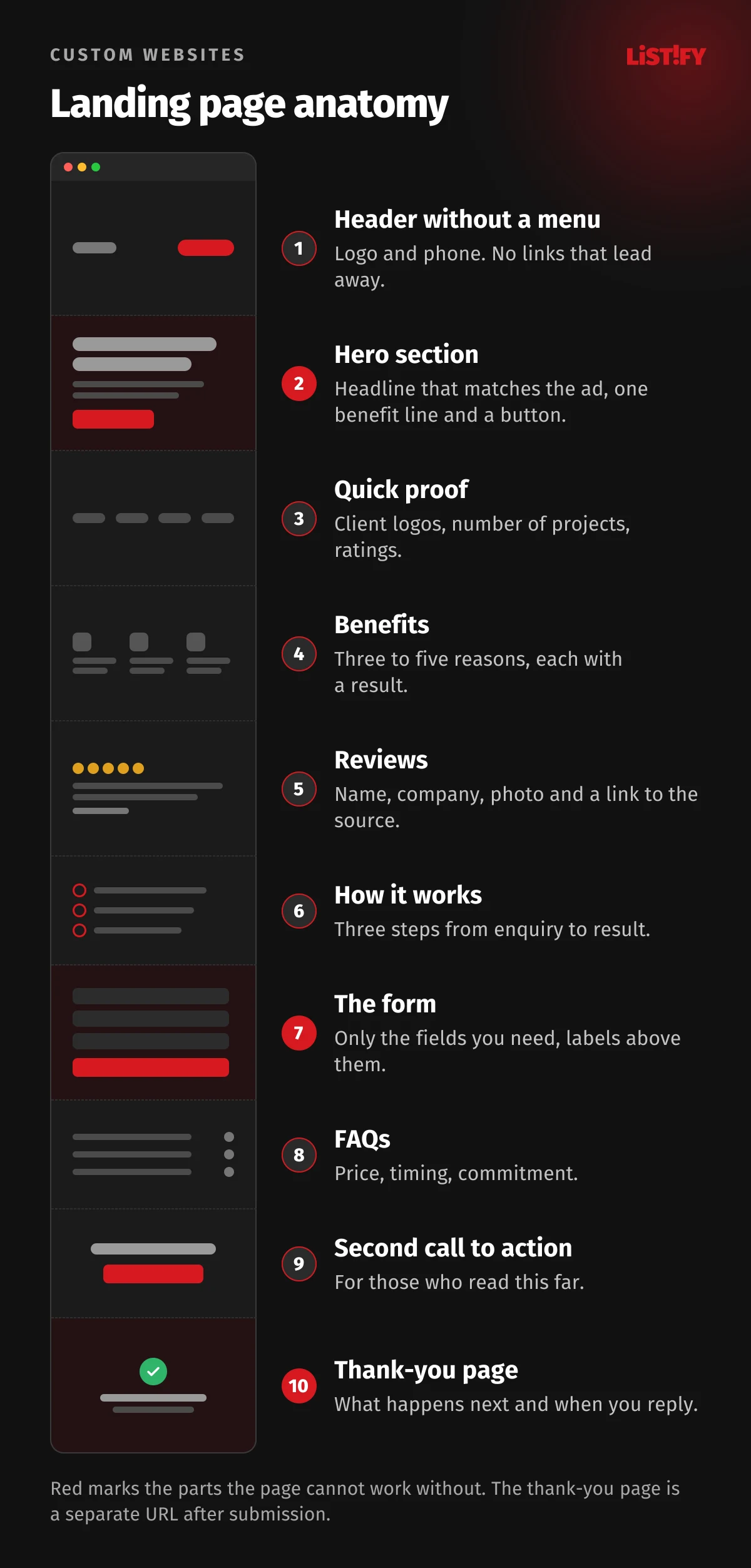
The order is not set in stone. For a cheap, simple offer, the form can sit right in the hero. For an expensive service that people think about for weeks, they need more proof and more answers before they fill anything in. The parts themselves stay the same.
02One goal per page, and the ad’s promise right at the top
A normal website has dozens of links and lets visitors choose where to go. A landing page has one goal and one main button. There are two main types: lead generation pages (the goal is a submitted form) and click-through pages (the button leads to a cart, a sign-up or an order).
You will often read that removing the navigation lifts conversions by dozens of percent. We could not find a study with a published method behind that claim, and the most quoted case study, which claimed an online shop doubled conversions by removing its menu, is no longer at its original address. There is still a sensible reason to drop the menu: every extra link gives visitors a chance to leave before doing what they came for.
Message match: the page has to keep the ad’s promise
Google’s landing page guidance explains it with a simple example: if your ad promises shoes at 20% off, people should be able to find and buy those shoes at that price on your landing page. Landing page experience is one of the three components of Quality Score, next to expected click-through rate and ad relevance. Google is clear that Quality Score itself is not an input in the ad auction; it is a diagnostic tool. Ad and page quality still affect the auction, and a below-average landing page rating shows you where money leaks.
Under its destination requirements, Google also disapproves pages whose domain does not match the ad, pages that break the browser’s back button, pages with pop-ups that block access to the content and pages that load slowly in common browsers. So building a landing page well is not just about conversion rates. A badly built page can mean the ad never runs at all.
03The hero section: where most of the attention goes
In an eye-tracking study with 120 participants, Nielsen Norman Group found that people spend 57% of their viewing time above the fold, the part of the page they see without scrolling. The second screen gets another 17%. Within that first screen, more than 65% of the attention goes to its top half. The study was done on desktop, and on a phone the fold comes even sooner.
The hero should only contain what tells people they are in the right place and what to do next:
- A headline that repeats the ad’s promise in the ad’s words, not company jargon.
- One line under the headline: who it is for and what result they get.
- The main button with a specific action (“Get my quote within 24 hours”, not “Submit”).
- An image that shows something: the product, the result of your work or real people from your team.
- A small piece of proof next to the button: a rating, number of clients, a guarantee.
In its article on photos as web content, NN/g describes how people ignore large decorative images and stock photos of models, but study photos of real people and products. Auto-rotating carousels do not belong in the hero either. NN/g describes a test in which a participant could not find an offer set in huge type, because the panel had already rotated away.
A large hero image has one more catch: it usually decides how quickly the page appears. More on that in the section on speed.
04Proof and trust: what to show and where to put it
A landing page is often the first time someone hears about your company, so they need proof before they fill in the form. Why reviews carry so much weight, and why a 4.7 rating sells better than a perfect five stars, is covered in the Spiegel Research Center study we discuss in Landing Page Copywriting That Sells. For the build, what matters more is which proof to use and where to place it.
- Quick proof right below the hero. A strip of client logos, the number of completed projects or an average rating. One line the eye catches on the first scroll.
- Reviews with a name, company and photo. An anonymous “Jane from London” convinces nobody. Only publish a client’s name and photo with their permission.
- Ratings from a third-party platform such as Google, linked so people can check them.
- A short reassurance right next to the form. A line like “We reply within 24 hours, no obligation” removes the last doubt at the moment someone hesitates over the button.
- Company details: legal name, company ID number, registered address and phone. They reassure people who have never heard of you.
Reviews come with rules too. Under Czech consumer law, as the Czech Trade Inspection Authority explains, if you show customer reviews you must say whether and how you check that they come from real customers. Claiming they come from people who actually bought from you, without taking reasonable steps to check, is always a misleading practice, and so is publishing fake reviews.
05The form: fewer fields, clear labels, no unnecessary consent box
The form is where pages most often lose people who have already made up their minds. Nielsen Norman Group puts it simply: every time you cut a field or question, you increase the conversion rate. They cut one of their own forms from six fields to two. The “X% per field” figures that circulate online do not come from any study we could trace.
E-commerce data gives a useful picture. Baymard Institute found that most sites need only 8 fields in their checkout, yet the average in 2024 was 11.3. When they tested a single “Full name” field instead of two, only 4% of users hesitated. A checkout is not an enquiry form, but the principle is the same: every field has to earn its place.
How to build a form people finish
- One column. The eye moves top to bottom and nothing gets missed.
- A label above every field, not just grey placeholder text that disappears as you type.
- One or two optional fields at most, clearly marked as optional.
- Show errors next to the field, after it is filled in. NN/g recommends inline validation, but not before the user has left the field.
- The right input type and autofill. The
autocompleteattribute lets the browser fill in name, email and phone, and according to MDN it also satisfies WCAG success criterion 1.3.5. Inputs withtype="email"andtype="tel"bring up the right keyboard on phones. - A button that says what happens, with a line below it saying when you will reply.
<form action="/enquiry" method="post">
  <label for="name">Full name</label>
  <input id="name" name="name" autocomplete="name" required>

  <label for="email">Email</label>
  <input id="email" name="email" type="email" autocomplete="email" required>

  <label for="phone">Phone (optional)</label>
  <input id="phone" name="phone" type="tel" autocomplete="tel">

  <button type="submit">Get my free quote</button>
  <p>We reply within 24 hours. <a href="/privacy">How we use your data</a></p>
</form>
An enquiry does not need a consent checkbox
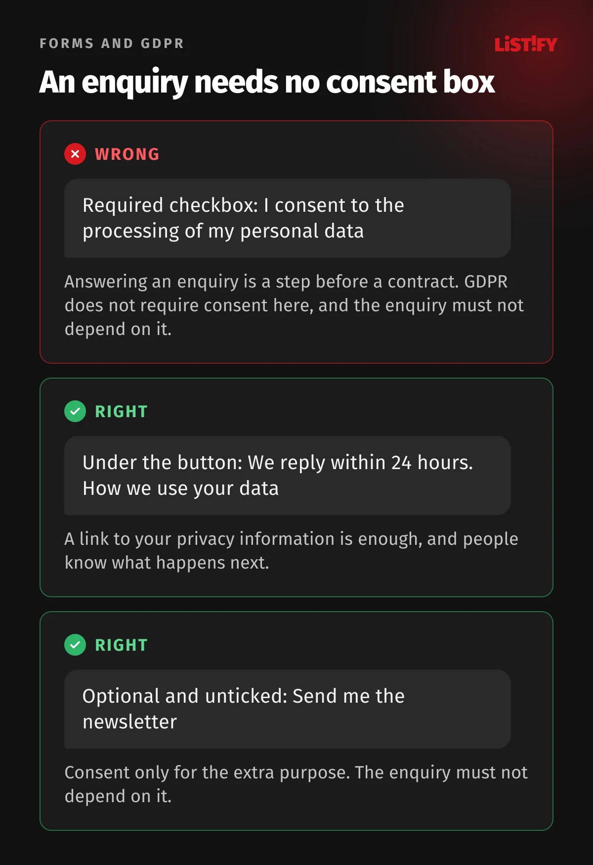
Many websites, especially in Central Europe, still force visitors to tick “I consent to the processing of my personal data” before sending an enquiry. Under Article 6(1)(b) GDPR, you can process data without consent when it is needed to take steps at the person’s request before entering into a contract. Answering an enquiry is exactly that. The Czech data protection authority (ÚOOÚ) says in its guidance on consent that where another legal basis applies, consent must not be required.
Instead of a mandatory checkbox, a link under the button to your privacy information (Article 13) is enough. A checkbox only makes sense for something extra, such as a newsletter, and it must be unticked. In its 2025 annual report, the Slovak data protection authority describes a company that made a loyalty card conditional on newsletter consent and found it to be a breach. The same logic applies to an enquiry tied to marketing consent.
06Speed: the three numbers Google measures
Google rates page speed and stability with three Core Web Vitals. According to web.dev, these are the thresholds for a good result:
| Metric | What it measures | Good result |
|---|---|---|
| LCP (Largest Contentful Paint) | How long until the largest element appears, usually the hero image | within 2.5 s |
| INP (Interaction to Next Paint) | How quickly the page responds to a tap or click | 200 ms or less (over 500 ms is poor) |
| CLS (Cumulative Layout Shift) | How much the content shifts unexpectedly | 0.1 or less (over 0.25 is poor) |
How sites actually perform is shown in the Web Almanac 2025 by HTTP Archive, based on Chrome user data from June 2025. Only 48% of sites pass all three metrics on mobile, and 56% on desktop. The numbers have mostly improved since 2021, but on mobile more than half of all sites still fail.
- 2021Desktop: 41%Mobile: 32%
- 2022Desktop: 44%Mobile: 31%
- 2023Desktop: 48%Mobile: 36%
- 2024Desktop: 55%Mobile: 44%
- 2025Desktop: 56%Mobile: 48%
Share of sites that pass all three metrics. Chrome UX Report data, 2025 = June 2025, more than 16 million sites. Source: HTTP Archive, Web Almanac 2025.
What slows landing pages down most
According to the same Almanac, the largest element is an image on 76% of mobile pages. On a landing page, that is almost always the big hero photo. These are the most common fixes:
- Serve the hero image as WebP or AVIF, sized separately for mobile and marked with
fetchpriority="high". The Almanac found that attribute on only 17% of mobile pages whose LCP element is an image. - Never lazy-load the hero image.
loading="lazy"is for images further down the page, not the one in the first screen. - Set dimensions on images, videos and ad slots so content does not jump while loading (CLS).
- Fewer third-party scripts. Every chat widget, map, tracking tag and social pixel can delay the response to a tap (INP).
- Load only the font weights you use, in a way that keeps text visible straight away.
You can check all of this for free in PageSpeed Insights. Real-user data shows all three metrics; the lab test (Lighthouse) cannot measure INP and uses Total Blocking Time as a stand-in. Google retired the old Mobile-Friendly Test on 1 December 2023, even though some help pages still link to it. Why the first seconds decide so much is the subject of The 3-Second Rule.
07Mobile: build for thumbs, not a mouse
How many people visit from a phone depends on where they come from. Across all sites tracked by StatCounter, mobile accounted for an average of 52.5% of page views worldwide from January to September 2026, 44.1% in Czechia and 50.0% in Slovakia, with big swings between months (StatCounter). Landing pages are different, because most visits come from ads and social media. In Unbounce data covering more than 41,000 landing pages, 83% of visits were on mobile, while desktop still converted 8% better.
- Czechia, all sites (Jan to Sep 2026)44.1%
- Slovakia, all sites (Jan to Sep 2026)50.0%
- Worldwide, all sites (Jan to Sep 2026)52.5%
- Landing pages built in Unbounce (2023/24)83.0%
StatCounter: page views on sites with its code, average of January to September 2026. Unbounce: visits to landing pages built with its tool, July 2023 to July 2024. Different metrics, so read it as an order of magnitude. Sources: StatCounter CZ, SK, worldwide, Unbounce.
The practical takeaway: design campaign landing pages for the phone first and then stretch them to desktop. On mobile, check these things in particular:
- Button and link size. WCAG 2.2 level AA requires targets of at least 24 by 24 CSS pixels, with some exceptions. Apple’s Human Interface Guidelines give a default control size of 44 by 44 points, and Google recommends 48 by 48 dp on Android, roughly 9 mm.
- The main button within thumb reach. A sticky bar with the button at the bottom of the screen helps on long pages, as long as it does not cover content.
- No zooming on form fields. Use at least 16 px text in inputs, or Safari on iPhone zooms in when someone taps them.
- Phone numbers as
tel:links, so people can call with one tap. - No full-screen pop-up the moment someone arrives.
08Accessibility: required for some, a win for everyone
Every year, WebAIM runs automated tests on the home pages of the top one million websites. In The WebAIM Million 2026, 95.9% of pages had detectable WCAG failures, with an average of 56.1 errors per page. The most common ones hurt conversions directly: low-contrast text and form fields without labels.
- Low-contrast text83.9%
- Image without alt text53.1%
- Form field without a label51.0%
- Empty link46.3%
- Empty button30.6%
- Missing document language13.5%
Automated WAVE test, February 2026, one million home pages. Automated tools cannot find every issue. Source: The WebAIM Million 2026.
When accessibility is a legal requirement
Since 28 June 2025, the European Accessibility Act (Directive 2019/882) has applied to certain services provided to consumers. For landing pages, the relevant one is e-commerce services: services provided at a distance through a website or app with a view to concluding a consumer contract. Microenterprises providing services, meaning fewer than 10 people and turnover or balance sheet total of no more than €2 million, are exempt.
- Covered: an online shop or order page aimed at consumers, run by a company that is not a microenterprise.
- Usually not covered: a lead generation page for a B2B service, and websites of microenterprises.
- Czechia: Act No. 424/2023 Coll., enforced by the Czech Trade Inspection Authority. It first asks for a fix; the maximum fine for an inaccessible service is CZK 10 million.
- Slovakia: Act No. 351/2022 Coll., enforced by the Slovak Trade Inspection. Fines range from €200 to 3% of turnover, capped at €6,000, €20,000 or €30,000 depending on the offence.
Even if the law does not apply to you, the fixes pay off. High-contrast text is readable on a phone in sunlight, a labelled field is easy for anyone to fill in, and a button with text works with screen readers. These are the same changes that lift conversions.
09Cookie banner and tracking: no marketing tags without consent
A landing page without tracking is just a nice page. In the EU, though, tracking depends on consent. Article 5(3) of the ePrivacy Directive only allows storing or accessing information on a user’s device with their consent, except where it is strictly necessary for the service. Czechia has required prior consent since 1 January 2022 under Section 89(3) of the Electronic Communications Act. In Slovakia, it is Section 109(8) of Act No. 452/2021, and the cookie regulator is the telecoms authority RÚ, not the data protection office.
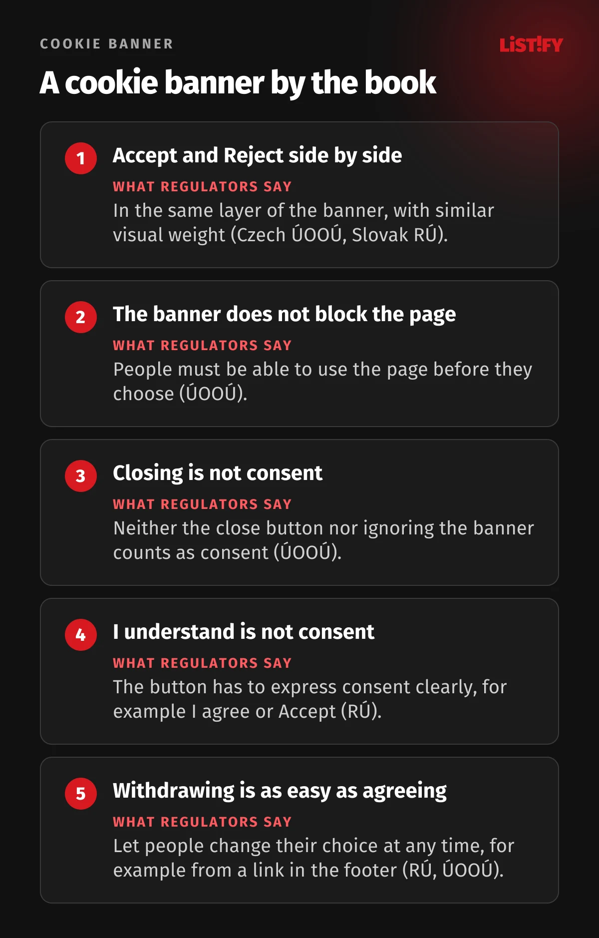
Both regulators have said what a compliant banner looks like. The Czech ÚOOÚ, in its cookie FAQ, says that Accept and Reject should sit in the same layer with similar visual weight, that the banner must not block the page and that closing it or ignoring it is not consent. Slovakia’s RÚ reports more than 105 inspections and fines totalling over €80,000 between the law taking effect in 2022 and August 2025, and its guidance says a button labelled “I understand” does not express consent.
For the build, that translates into a few technical rules:
- Marketing and analytics tags only fire after consent. Not “in the background” first and ask later.
- The banner must not cover the form or the button, and access to the page must not depend on consent.
- Google Consent Mode v2. For users in the EEA, Google requires consent signals; without them, audiences and part of ad measurement stop working. In basic mode, Google tags do not load at all until the user responds to the banner. In advanced mode they load straight away and send cookieless signals before consent, so basic mode is the safer choice in Czechia and Slovakia.
- Track enquiries as a key event in Google Analytics 4 (formerly a “conversion”) on the thank-you page or on successful submission, not on the button click.
- Expect some people to decline. The number of enquiries in your CRM or inbox is a more honest figure than the chart in Analytics.
How much to put into ads in the first place is covered in How Much Should a Small Business Spend on Marketing?, and how to turn the results into a report your management will understand in Marketing Reporting for Executives.
10After the click: the thank-you page and a fast reply
A submitted form is not the finish line. The thank-you page should say what happens next: who will get in touch, by when and how. It can offer a next step, such as booking a call slot or downloading something useful. It is also the most reliable place to track the conversion, because it only appears after a successful submission.
Then speed decides. In 2011, Harvard Business Review published an audit of 2,241 US companies that the authors contacted through web forms. Only 37% replied within an hour, 23% never replied at all, and those that did reply within 30 days took 42 hours on average. In a follow-up study of 1.25 million leads, companies that tried to make contact within an hour were nearly seven times as likely to have a meaningful conversation with a decision maker as those that waited even one hour longer.
- Within 1 hour37%
- 1 to 24 hours16%
- More than 24 hours24%
- Never23%
Audit of 2,241 US companies using a test enquiry sent through a web form. The data is older and from a different market, but the principle holds. Source: Harvard Business Review, 2011.
That is why the cheapest landing page improvement is often not on the page but behind it: a phone notification for every new enquiry, an automatic confirmation email and one named person who replies. More on the path from click to client in How to Generate B2B Leads Effectively with Paid Ads and SEO.
11Testing: an A/B test needs more visitors than you think
An A/B test compares two versions of a page on real visitors. It sounds simple, but most tests do not produce a winner. In a 2022 research paper, Ron Kohavi and his co-authors summarised how many experiments actually win at large companies:
- Microsoft33%
- Bing15%
- Booking.com, Google Ads, Netflix10%
- Airbnb (search)8%
The authors call these ballpark estimates, as companies count them differently. Source: Kohavi, Deng, Vermeer: A/B Testing Intuition Busters, KDD 2022.
The second problem is traffic. The same paper gives an example: with a 3.7% conversion rate, detecting a 10% relative improvement takes about 41,600 users per variant. A landing page with a thousand visits a month would wait years for that test.
What this means for a smaller business:
- Test big changes, not button colours. A different offer, a different hero, a shorter form. Big differences show up even in smaller samples.
- Fix the obvious problems before you test. A slow image, a form that breaks on iPhone or a missing price do not need a test.
- Watch session recordings and click maps (with visitors’ consent). You will see where people drop out of the form.
- Talk to customers. Five conversations with people who sent an enquiry and five with people who did not often tell you more than a month of testing.
If you are looking for a free tool, Google Optimize is no longer an option: Google shut it down on 30 September 2023.
12What a landing page costs in Czechia and Slovakia
We found no representative price survey for landing pages in Czechia or Slovakia. Public price lists from individual suppliers show how wide the range is:
- Czech freelancer, template package: for example CZK 6,899 excluding VAT for one page with up to six sections.
- Czech studios: estimates of CZK 10,000 to 30,000, another studio says up to CZK 35,000.
- Slovak suppliers: a custom single page for €350 from a freelancer, a one-page site from €990 at an agency.
- A custom page with research, copy, tracking and CRM integration usually has no public price, and the cost depends on scope.
The price depends mainly on who provides the copy and photos, how many versions you need (languages, variants for different campaigns), whether the form connects to a CRM or email tool and who sets up tracking and the cookie banner. A cheap page that takes five seconds to load and does not track enquiries gets expensive every month you pay for ads pointing at it.
You can get a rough price for a custom website or landing page in our calculator. See how we work for the process.
13Pre-launch checklist
- The hero headline matches the ad, and every price and discount in the ad also appears on the page.
- The page has one main goal and one main button; the menu is gone or kept to a minimum.
- The form only asks for what you need, with labels above fields, correct input types and
autocomplete. - An enquiry form has no mandatory consent checkbox; there is a privacy link under the button.
- You have submitted the form from an iPhone and an Android phone, and the enquiry actually arrived.
- PageSpeed Insights shows good LCP, INP and CLS from real users on mobile; for a brand new page without field data, good LCP, CLS and Total Blocking Time in the lab test.
- Buttons are at least 24 by 24 CSS pixels (ideally 44 to 48), text has enough contrast, images have alt text.
- The cookie banner has Accept and Reject in the same layer, and tracking tags wait for consent.
- Enquiries are tracked as a key event on the thank-you page.
- A named person gets notified of every new enquiry and knows how quickly to reply.
- The page shows company details: legal name, company ID, registered address and contact.
14Frequently asked questions
What is a good landing page conversion rate?
Unbounce reports a median of 6.6% across industries (2023/24 data, only pages built with its tool). Industries range from roughly 4% to 12%. The best benchmark is your own page before and after a change. Source: Unbounce.
Should a landing page have a navigation menu?
Usually not, or only a minimal one. Every extra link is a way out. There is no solid study with a precise number, but for single-campaign pages it is a sensible default. Your logo can still link to the main site.
How many fields should an enquiry form have?
As many as you need to send a first reply. Name, email or phone and one question about the project are often enough. You can ask for details on the first call.
Do I need a GDPR consent checkbox on my form?
Not for an enquiry. Processing is needed to take steps at the person’s request before a contract (Article 6(1)(b) GDPR), so a link to your privacy information is enough. You need consent for a newsletter or other extra purposes, and you cannot make the enquiry depend on it. Source: GDPR.
Does the European Accessibility Act apply to my landing page?
If you sell to consumers online through it and you are not a microenterprise, probably yes. Lead generation pages for B2B services and microenterprise websites usually do not. In Czechia it is enforced by the Czech Trade Inspection Authority, in Slovakia by the Slovak Trade Inspection.
Should my landing page live on the main domain or a separate one?
Usually on the main domain or a subdomain. People trust a familiar address more, and Google disapproves ads whose display domain does not match the page.
15Bottom line: what to check first
No single trick makes a landing page convert. What matters is how the parts work together: the ad’s promise in the hero, proof, a short form, fast loading on mobile, readable text, a fair cookie banner, proper tracking and someone who replies within the hour.
If you already have a page, start with the checklist above and run it through PageSpeed Insights. If you are just starting, set up enquiry tracking first so you know whether your changes help. And if you would rather not build it yourself, get in touch. We design and build custom landing pages, from the copy to the connection with your CRM. Why good looks alone are not enough is the topic of Why a Pretty Website Isn’t Enough.
16Sources
- Google: web.dev, Core Web Vitals, Quality Score, Landing pages, Destination requirements, Optimize sunset, Consent mode
- HTTP Archive: Web Almanac 2025, Performance; WebAIM: The WebAIM Million 2026
- Nielsen Norman Group: Scrolling and Attention, Photos as Web Content, Web Form Design, Errors in Forms
- Baymard Institute: Checkout Form Fields; Unbounce: Conversion Benchmark Report
- Harvard Business Review: The Short Life of Online Sales Leads; Kohavi et al.: A/B Testing Intuition Busters
- EU law: Directive 2019/882, ePrivacy Directive, GDPR
- Czechia: Act No. 424/2023 Coll., Act No. 127/2005 Coll., ČOI on accessibility, ÚOOÚ cookie FAQ, ÚOOÚ on consent
- Slovakia: Act No. 351/2022 Coll., Act No. 452/2021 Coll., RÚ cookie monitoring, Slovak DPA annual report 2025
- RÚ and Slovak DPA guidance on cookie consent; ČOI on consumer reviews
- Mobile and forms: StatCounter, WCAG 2.2 target size, Apple HIG, Android touch targets, MDN autocomplete
- Google consent and analytics: Consent in the EEA, GA4 key events; NN/g: Auto-forwarding carousels