Mobile first: why good websites start with the phone, even when half your traffic is desktop
Worldwide, a little over half of all web pages are now opened on a phone. In Europe and the US, desktop still holds its own. Good websites are designed starting with the phone anyway. A small screen shows you what actually matters, Google ranks the mobile version of your site, and a mid-range phone exposes every unnecessary script. Below: what mobile first actually means, how to design a site this way, and when you’re better off starting with the desktop.
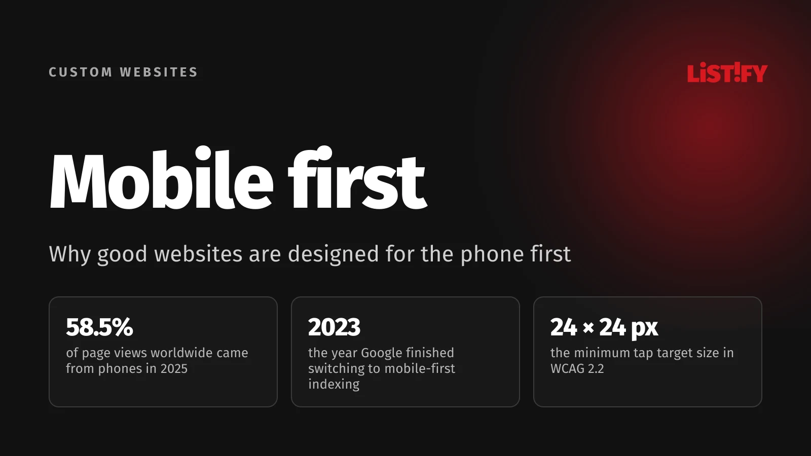
In 2015, phones accounted for 35% of page views worldwide, according to StatCounter. By 2025 that share had reached 58.5%. The picture is less one-sided in Europe and the US. Over the 12 months to August 2026, phones averaged 46.8% of page views in Europe and 42.9% in the US, with desktop ahead in both.
So your site has to work well on both. Mobile first doesn’t mean forgetting the desktop; it’s about the order of work. You tackle the hardest constraints first (a small screen, a finger instead of a mouse, a slower processor) and then expand the design for larger displays.
If you’re planning a new site, you may also find these useful: custom website development, step by step and the 3-second rule, where we cover loading speed.
01The short answer: why start with the phone
- A small screen forces you to decide what matters. There is no room for extras on a 360-pixel screen, and whatever survives on mobile is usually what matters on desktop too.
- Google looks at the mobile version. Since 2023, Google has used the mobile version of virtually every site to index and rank it.
- The phone is the weakest link. Slower processor, patchier connection. What runs smoothly on mobile will run on desktop. The reverse isn’t true.
- Adding is easier than cutting. Scaling a lean mobile design up to a large screen takes less work than stripping down a crowded desktop page.
- It isn’t always the right call. For internal tools people use mostly at a desk, starting with the large screen can make more sense. Let your own data decide.
02What mobile first means, and what it doesn’t
Mobile first is a design approach: you design and build the site for the phone first, then progressively expand it for tablets and desktops. The result is one site that adapts to every screen. A single column and large buttons on a phone, more columns and more room on a desktop.
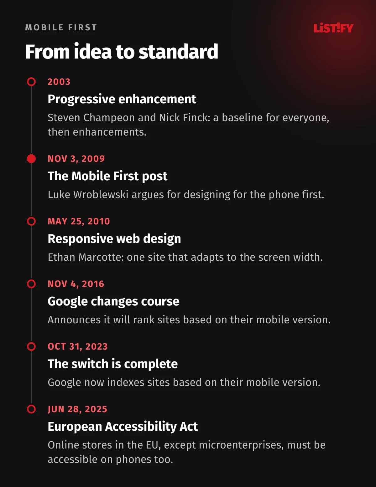
The idea builds on an older principle developers call progressive enhancement. Steven Champeon and Nick Finck named it in March 2003. As MDN puts it, the goal is to give as many people as possible the essential content and functionality, and add the best experience only for devices that can handle it. The opposite approach, graceful degradation, starts with the full version and strips features away for weaker devices.
The terms often get mixed up, so here they are side by side:
| Approach | What it is | Where you see it |
|---|---|---|
| Mobile first | A process: design and code start with the phone, larger screens are added later | Typical for new websites and online stores |
| Responsive design | A technique: one site whose layout changes with screen width | Almost every site today, whichever way it was built |
| Desktop first | A process: design starts with the desktop and gets simplified for phones | Older sites, internal tools, admin panels |
| Separate mobile site | Two sites, such as m.example.com and example.com | Rare today, twice the maintenance |
So a responsive site can be built either way. The difference shows on the phone: a site designed for desktop and then squeezed down often hides important information, has tiny buttons and loads heavy images that the small screen doesn’t need.
03Where mobile first came from
The term was popularized by designer Luke Wroblewski. In a post dated November 3, 2009, he pointed out that the mobile version of a site was usually designed after the desktop one and argued for flipping the order. He gave three reasons: mobile is exploding, mobile forces you to focus, and mobile extends your capabilities (location, touch, orientation). On the second point he noted that a 320 × 480 pixel screen simply has no room for anything unnecessary.
Six months later Ethan Marcotte introduced responsive web design, and in October 2011 Wroblewski published the book Mobile First. What was then a bold idea has since become standard practice. The decisive push, though, came from Google.
04How many people browse on their phone
StatCounter tracks page views on sites that use its tracking code. Worldwide, phones overtook desktops on a full-year basis back in 2017. Europe followed in 2022. In the US the two have traded places several times, and desktop has led since 2025.
- 2015Europe: 21.9%Worldwide: 35.1%
- 2017Europe: 34.5%Worldwide: 51.6%
- 2019Europe: 41.6%Worldwide: 50.4%
- 2021Europe: 45.6%Worldwide: 55.0%
- 2022Europe: 49.4%Worldwide: 58.3%
- 2023Europe: 50.0%Worldwide: 55.2%
- 2024Europe: 52.4%Worldwide: 61.0%
- 2025Europe: 51.1%Worldwide: 58.5%
Annual StatCounter data. The rest is desktop and tablet. Sources: StatCounter Worldwide, StatCounter Europe.
Page views are only one way to count. Contentsquare, which analyzed 99 billion web and app sessions across more than 6,500 client websites in nine industries, found that mobile devices accounted for 69.9% of traffic in late 2025 (Contentsquare). Adobe reports that 56.4% of US online holiday spending in 2025 happened on a smartphone (Adobe). The share varies a lot by industry, so check your own analytics before you trust any headline number.
Data on people tells the same story. According to Eurostat, 89.9% of people aged 16 to 74 in the EU used the internet on a mobile phone in 2025. Among those aged 65 to 74, it was 70.3%.
- Age 16 to 2497.0%
- Age 25 to 3496.2%
- Age 35 to 4495.7%
- Age 45 to 5493.4%
- Age 55 to 6486.7%
- Age 65 to 7470.3%
Share of all people in each age group who used the internet on a mobile or smartphone. Source: Eurostat, isoc_ci_dev_i.
If your customers skew older, the desktop may matter more for you, though even among 65 to 74 year olds, seven in ten go online on a phone. Designing for the phone first still pays off: large buttons and readable text help older visitors on any screen.
05Google ranks the mobile version of your site
In November 2016 Google announced that it would start ranking sites based on their mobile version, because most people were already searching on a phone. The switch took seven years. From July 2019 every new site was indexed this way by default, and on October 31, 2023 Google declared the move complete. The last few sites still crawled by the desktop crawler were switched over after July 5, 2024. Content that can’t be accessed on a phone at all will no longer be indexable.
In practice, whatever is missing on mobile doesn’t exist for Google. Its documentation focuses on these points:
- The same content on mobile and desktop. You can tuck it into accordions or tabs on a phone, but it has to be there.
- The same headings, title and meta description. If the mobile page carries less text, expect to lose some search traffic.
- The same structured data and the same image alt text. Images in sufficient resolution, at the same URLs.
- No primary content that loads only after a tap or swipe. Googlebot won’t trigger it.
- The same robots meta tag. Otherwise you can accidentally block indexing on mobile.
Google doesn’t require a separate mobile site. A responsive site with the same content on every device is the simplest way to meet all of the above. For more on search, see SEO in 2026.
06The phone is the slowest device you’re building for
Phones have slower processors than desktops and often worse connections. Real-world Chrome data confirms it. According to HTTP Archive, in August 2026, 60.2% of sites passed all three Core Web Vitals, Google’s metrics for loading, responsiveness and visual stability, on desktop, but only 53.0% on mobile. (The mobile sample includes more sites, so the two groups aren’t identical.) The biggest gap is in how quickly a page responds to a tap.
- Content loading (LCP)Desktop: 78.7%Mobile: 65.8%
- Response to taps (INP)Desktop: 97.7%Mobile: 80.1%
- Layout stability (CLS)Desktop: 74.0%Mobile: 83.1%
- All three at onceDesktop: 60.2%Mobile: 53.0%
Chrome UX Report: real visits by Chrome users. A score is good when at least 75% of page loads meet the threshold. Source: HTTP Archive, Core Web Vitals Technology Report, our calculation from the data.
On desktop, nearly every site responds quickly. On mobile, roughly four in five do. JavaScript plays a big part: a phone takes longer to process it, and when there’s a lot of it, the page freezes for a moment after a tap. Layout stability is the one exception: here mobile actually does better (83% vs. 74%).
How much data does a phone download? According to the Web Almanac 2025, the median mobile home page weighed 2.56 MB, including 911 KB of images and 632 KB of JavaScript. Mobile first helps directly here: when you start with the phone, you only add what is actually needed, instead of hiding desktop content on mobile that still gets downloaded. We cover how to speed up a site step by step in the 3-second rule.
07Fingers, not cursors: how big should buttons be?
A mouse can hit a single pixel. A finger can’t. That is why every major guideline sets a minimum size for anything people tap. They differ in units and strictness:
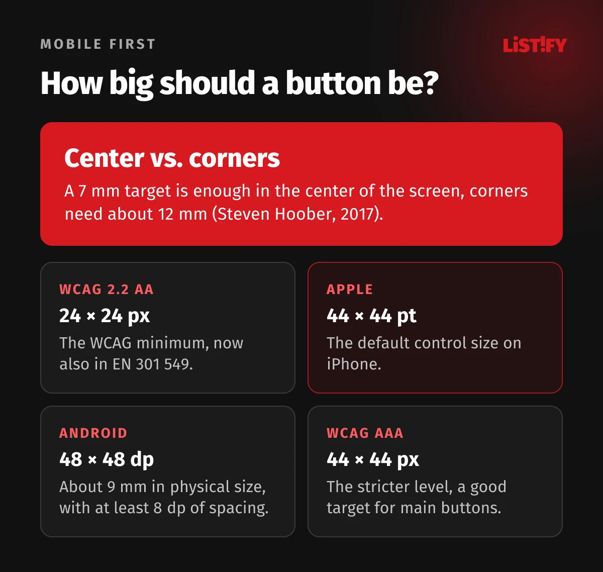
- WCAG 2.2, level AA: a target of at least 24 × 24 CSS pixels, or enough spacing around smaller ones (W3C). The European accessibility standard EN 301 549 adopted this criterion in its September 2026 version.
- Apple: the default control size on iPhone is 44 × 44 points, with a minimum of 28 × 28 (Human Interface Guidelines).
- Android: at least 48 × 48 dp with 8 dp of spacing, about 9 mm in physical size (Google).
- WCAG, level AAA: 44 × 44 CSS pixels. A stricter level the law doesn’t require, but a good target for primary buttons.
For years, designers assumed people hold their phone in one hand and can comfortably reach only the bottom of the screen. Steven Hoober, whose 2013 study of how people hold their phones is still widely quoted, wrote in 2017 that the column had been cited “almost too much for my comfort.” His later research found that 75% of people tap with just one thumb, but they shift their grip constantly and are most accurate in the center of the screen. A 7 mm target is enough there, while corners need about 12 mm. So put the main actions where they are easy to reach and keep tiny icons out of the corners.
And one easy fix: don’t disable zoom. According to the Web Almanac 2025, 19% of mobile sites still block zooming, either with user-scalable=no or by capping the maximum scale at 1. People with poor eyesight then can’t enlarge the text.
08Mobile forms: where leads slip away
Forms are where many mobile visitors give up. Typing on a small keyboard is harder, and every extra field is another hurdle. Most of the problems can be fixed with a few lines of code that cost nothing:
- The right field type. Use
type="email"for email (keyboard with @),type="tel"for phone numbers (number pad) andinputmode="numeric"for US ZIP codes. UK, Canadian and many other postal codes contain letters, so leave those as a regular text field. - Autofill. The
autocompleteattribute tells the browser what belongs in a field, so it can fill in a name, address or email with a single tap (MDN). WCAG 2.2 success criterion 1.3.5 (level AA) requires fields that ask for the user’s own details, such as name, email or address, to identify their purpose in code, andautocompleteis the standard way to do it. - Labels above fields, not inside them. Placeholder text disappears as soon as you start typing, and on a phone you lose track of what you were filling in.
- One column, full-width fields. On a narrow screen, put fields one under another. The only exception is a pair of very short fields, such as month and year.
- Only the fields you need. Anything you don’t need to respond to the inquiry can wait until you follow up.
- Show errors right next to the field, in plain language. Don’t put them in a red box at the top of the page that people have to scroll all the way back up to find.
<label for="email">Email</label>
<input id="email" name="email" type="email" autocomplete="email">

<label for="tel">Phone</label>
<input id="tel" name="tel" type="tel" autocomplete="tel">

<label for="zip">ZIP code</label>
<input id="zip" name="zip" inputmode="numeric" autocomplete="postal-code">
Why it matters: across the client sites Contentsquare measures, desktop converts at 3.4% while mobile web converts at around 2%. Contentsquare reads this as people finding a site on their phone and buying later on a computer, but some never come back. The fewer obstacles you put in their way on mobile, the less you depend on them coming back. More tips on turning visits into leads are in why a pretty website isn’t enough.
09How to design mobile first: a six-step process
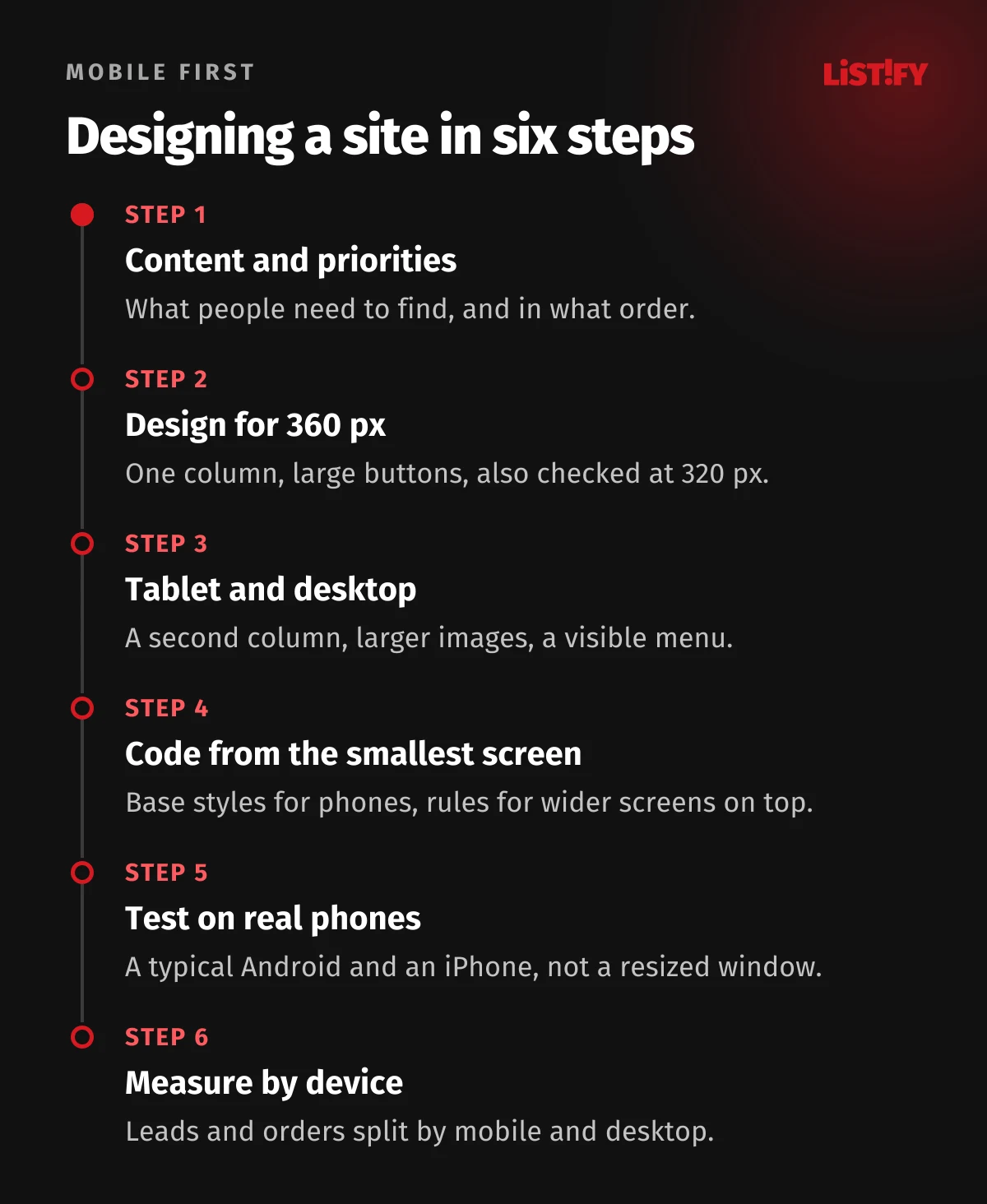
1. Content and priorities
Before a designer draws the first screen, write down what people need to find on the page and in what order. What you offer, who it is for, what it costs and how to get in touch. On a phone, order equals importance: the further down something is, the fewer people see it.
2. Design for phone width
Most phones have screens 360 to 430 pixels wide. In Europe, according to StatCounter, those widths accounted for at least three quarters of mobile page views in August 2026. Design for a width of around 360 px and check the layout at 320 px as well, which WCAG requires for reflow. Designing for one specific phone isn’t enough: the most common resolution had just 15.9%.
3. Expand for tablet and desktop
Only then do you add a second column, larger images and a visible menu. Watch out for the opposite mistake: a mobile design simply stretched across a big monitor. Nielsen Norman Group described in 2023 how such sites end up with oversized images, wasted white space and content scattered across long pages on desktop. Mobile first doesn’t mean mobile only.
4. Code from the smallest screen up
Base styles apply to phones, and rules for larger screens are added with a minimum width condition. The phone gets a simple base layout, and larger screens build on it instead of the phone having to undo a desktop layout.
/* Base: phone, single column */
.products { display: grid; gap: 16px; }

/* From 768 px: two columns */
@media (min-width: 768px) {
  .products { grid-template-columns: 1fr 1fr; }
}

/* From 1200 px: four columns */
@media (min-width: 1200px) {
  .products { grid-template-columns: repeat(4, 1fr); }
}
5. Test on real phones
A resized browser window on a laptop won’t reveal a slow processor or what it’s like to type into a field with your thumb. Test on a typical mid-range Android phone as well as an iPhone, not just on the latest model someone brought to the meeting.
6. Measure by device
Split visits, inquiries and orders by device in your analytics. If phones bring in half your visitors but only a tenth of your leads, you know where to start. PageSpeed Insights shows how fast your site is on mobile, based on real user data.
10The EU accessibility law covers mobile too
Since June 28, 2025, the European Accessibility Act (Directive (EU) 2019/882) has applied across the EU. It covers e-commerce, consumer banking, e-books and passenger transport, among other things. The directive defines e-commerce as services provided “through websites and mobile device-based services”, so accessibility is judged on phones as well.
- Who it applies to: services provided to consumers, typically online stores. Business-to-business services are outside its scope.
- Exemption: microenterprises providing services, meaning companies with fewer than 10 people and annual turnover or balance sheet total of no more than EUR 2 million.
- Enforcement: each member state sets its own penalties and designates the authorities that check compliance.
- Transition: services using products already in use before June 28, 2025 can continue until June 28, 2030 at the latest.
A tiny button, text that can’t be enlarged or a form without labels isn’t just inconvenient. For an online store in the EU, it can be a legal problem. Mobile first and accessibility overlap a lot: large tap targets, readable type and a clear structure help everyone. We cover accessibility in more depth in UI vs UX.
11Five myths about mobile first
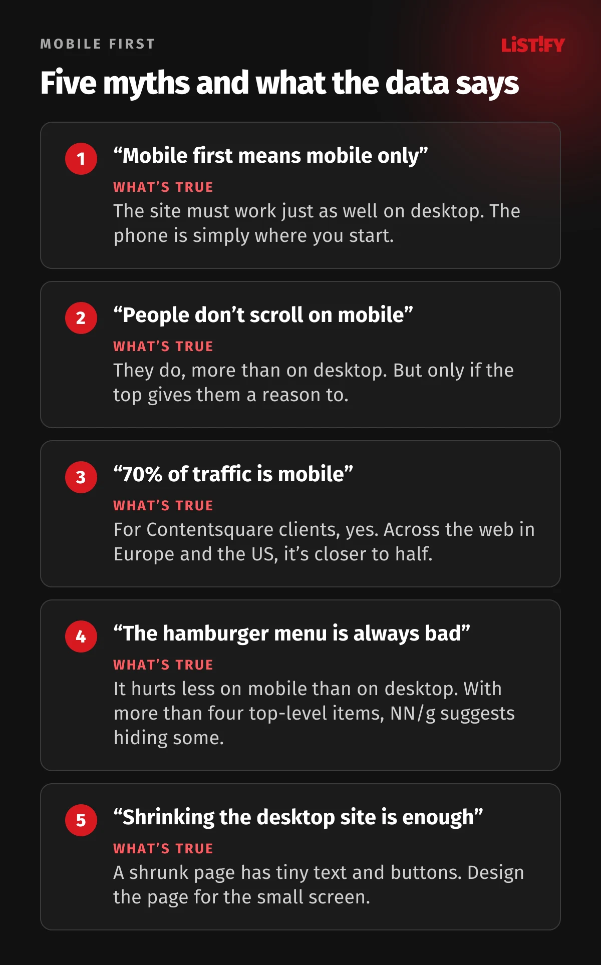
“Mobile first means mobile only.” No. Nielsen Norman Group put it right in a headline: Mobile First Is NOT Mobile Only. The site has to work just as well on desktop; you just get there in the second step.
“People don’t scroll on mobile.” They do, even more than on desktop, because they have to. But only if what is at the top gives them a reason to keep going (NN/g). Your main message belongs on the first screen, the rest can sit further down.
“Seventy percent of traffic is mobile.” For some sites, yes. Contentsquare measured 69.9% mobile traffic across more than 6,500 client websites (Contentsquare). StatCounter, which counts page views on a much broader mix of sites, puts phones closer to half in Europe and the US. Your own analytics is the only number that counts.
“The hamburger menu is always bad.” It hurts on desktop, less so on mobile. NN/g research recommends hiding part of the menu on phones if it has more than four top-level items.
“Shrinking the desktop site is enough.” A scaled-down desktop page has small text, tiny buttons and content that still downloads even though nobody sees it. With mobile first, you design the page for a small screen from the start.
12When mobile first doesn’t make sense
Some websites and apps are used almost entirely on a computer: accounting and inventory systems, store admin panels, data analysis tools or complex configurators. In a diary study, Nielsen Norman Group found that people tend to handle more important tasks on larger screens, and its advice for high-stakes products such as finance or healthcare is blunt: “If the volume of your interactions on mobile is low, definitely avoid a mobile-first strategy.”
That doesn’t mean ignoring mobile. Even an internal system should have a responsive foundation, because a salesperson in the field or a manager on the road needs to check things quickly. The difference is where the design starts: with the large screen and dense tables for an internal system, with the phone for a customer-facing site.
- Start with the phone for websites, online stores, bookings, orders, anything customer-facing, and anything people open from a link in an email or on social media.
- Start with the desktop for internal systems built around large tables, when your data shows only a small share of people use a phone.
- Either way, test on both and measure where your users actually come from.
13Checklist: is your site really mobile first?
- On a phone, people can see what you offer and how to contact you without scrolling
- Content, headings, title and meta description are the same on mobile and desktop
- Main buttons are at least 44 × 44 px, and nothing tappable is smaller than 24 × 24 px
- Pinch-to-zoom works: the page doesn’t use
user-scalable=noormaximum-scale=1 - The page doesn’t scroll sideways at a width of 320 px
- Forms use the right field types,
autocompleteand labels above the fields - Phone numbers can be dialed with a tap, and addresses open a map
- The mobile version passes Core Web Vitals in PageSpeed Insights (real-user data)
- The site has been tested on a typical Android phone and an iPhone, not just in a resized window
- Analytics shows inquiries and orders separately for mobile and desktop
- The desktop version doesn’t look like a stretched phone screen
If you can’t check off more than three of these, it’s worth getting your site reviewed. We design new custom websites starting with the phone and test them on real devices before launch. See how we work and our pricing.
14Frequently asked questions
What does mobile first mean?
It’s an approach where a website is designed and built for phones first, then expanded for tablets and desktops. The result is one responsive site that works on every device.
What is the difference between mobile first and responsive design?
Responsive design is a technique: one page changes its layout depending on screen width. Mobile first is the order of work: the design starts with the phone. A responsive site can also be built the other way round, starting with the desktop.
Do I need a mobile version of my site for Google?
Not a separate one. But since 2023, Google has used the mobile version of virtually every site for indexing and ranking, and content that can’t be accessed on a phone at all won’t be indexed. The simplest solution is a responsive site with the same content on every device.
What share of web traffic comes from phones?
According to StatCounter, phones accounted for 58.5% of page views worldwide in 2025, and somewhat less than half in Europe and the US. In 2025, 89.9% of people aged 16 to 74 in the EU used the internet on a phone (Eurostat).
How big should buttons be on mobile?
The WCAG 2.2 minimum (level AA) is 24 × 24 CSS pixels. Apple recommends 44 × 44 points and Android 48 × 48 dp. Make your main buttons at least 44 × 44 px.
Does mobile first make sense for an internal system?
It depends on how people access it. If they use it almost exclusively on a computer, start with the large screen and treat mobile as a simplified version for quick checks. Let your analytics decide.
15Sources
- Luke Wroblewski: Mobile First (2009) and the book Mobile First (2011)
- Ethan Marcotte: Responsive Web Design, A List Apart (2010)
- Steven Champeon: Progressive Enhancement and the Future of Web Design (2003, archived)
- MDN: Progressive enhancement and Graceful degradation
- Google: mobile-first indexing announced (2016), default for new sites (2019), completed (2023) and end of the desktop crawler (2024)
- Google: mobile-first indexing best practices
- StatCounter: devices worldwide, in Europe, in the US and mobile screen resolutions in Europe
- Eurostat: devices used to access the internet, isoc_ci_dev_i
- Contentsquare: 2026 Digital Experience Benchmark, conversions and mobile statistics
- Adobe: 2025 holiday shopping season
- HTTP Archive: Core Web Vitals Technology Report
- Web Almanac 2025: Page Weight and Accessibility
- W3C: WCAG 2.2 and Understanding Success Criterion 2.5.8
- Apple: Human Interface Guidelines, Accessibility
- Google: touch target size on Android
- Steven Hoober: Design for Fingers, Touch, and People (2017)
- MDN: inputmode and autocomplete
- Nielsen Norman Group: Mobile First Is NOT Mobile Only, Content Dispersion, The Fold Manifesto, Hamburger Menus and Large Devices Preferred for Important Tasks
- Directive (EU) 2019/882, European Accessibility Act and ETSI EN 301 549 V4.1.1