UI vs UX: Why Beautiful Design Isn’t Enough When Users Get Lost
A website can look fantastic and still leave people unable to find the pricing page, the contact form or the button they came for. UI is how it looks. UX is whether people get where they’re going. We explain the difference in plain English, show why polished design can hide real problems, and walk through how to measure whether visitors get lost on your site, even without a big research budget.
The short version: UI (user interface) is what you see on the screen and interact with. Colors, fonts, buttons, icons, forms. UX (user experience) is everything a person goes through while trying to get something done on your website or app: whether they find what they need, whether they understand the copy, how long it takes and how they feel when they leave. You’ll find both terms in our glossary too.
The distinction sounds academic until it starts costing money. A designer delivers a gorgeous mockup, everyone signs off because they like it, and after launch customers call to say they can’t find the form. Nothing is wrong with the screens; what fails is the experience of using them.
01UI and UX: what each one means
Don Norman coined the term “user experience” in 1993 for his group at Apple, as Jakob Nielsen recounts. Nielsen later became Norman’s partner at Nielsen Norman Group, and in 1998 the two defined UX as all aspects of the end user’s interaction with a company, its services and its products. The user interface, in their words, is an extremely important part of the design, but only a part.
The international standard ISO 9241-210 (2019) is more precise. It defines UX as a person’s perceptions and responses resulting from the use, or even the anticipated use, of a product, system or service. That covers emotions, beliefs, comfort and what the user actually accomplishes, before, during and after use. The UI gets a drier definition: all the components of a system that give the user information and controls to complete a task.
Norman and Nielsen illustrate it with a movie review site. Even if the interface for finding a film is perfect, someone looking for a small independent release will leave disappointed if the database only covers major studio titles. Flawless UI, poor UX. The same thing happens on business websites: a beautifully designed pricing page won’t help if it leaves out the one service the customer came for.
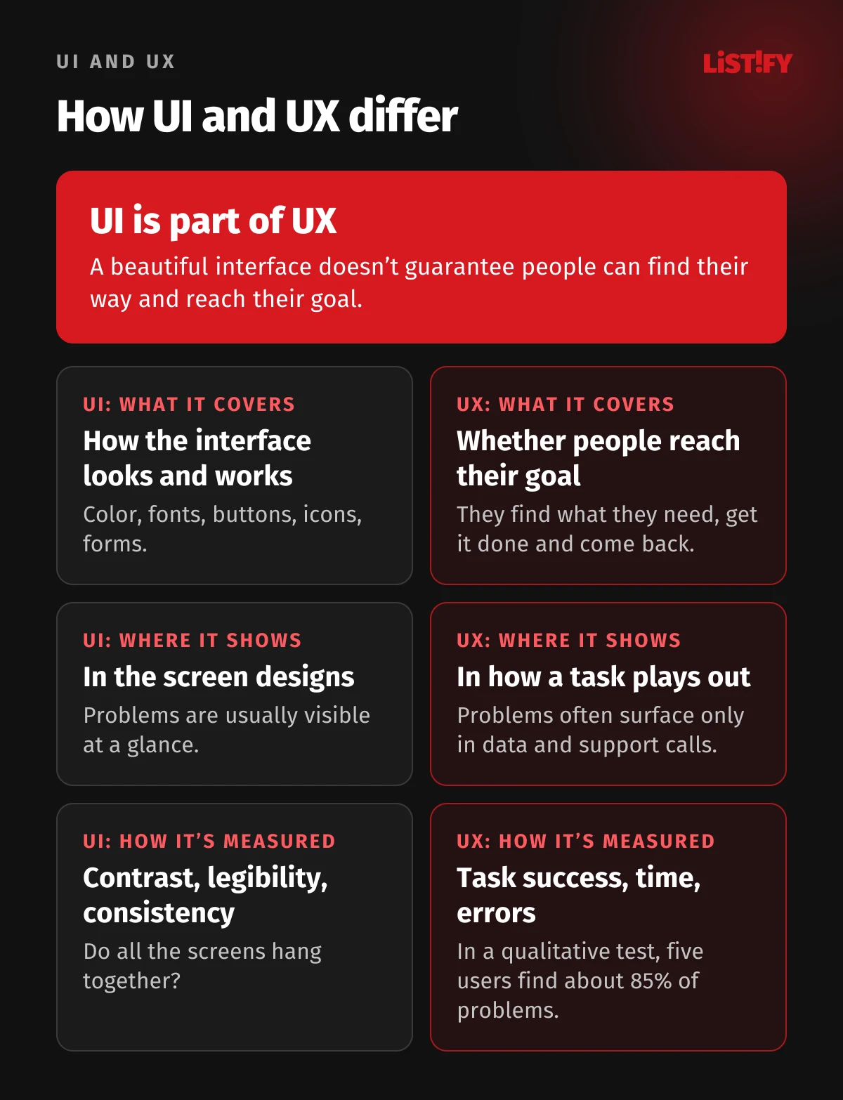
| Area | UI (user interface) | UX (user experience) |
|---|---|---|
| Question it answers | How does the interface look and work? | Do people reach their goal, and how do they feel doing it? |
| Typical deliverables | Visual design, color, typography, components, a design system | Research, site structure, user flows, wireframes, usability tests |
| How it’s measured | Match with the design spec, legibility, contrast, consistency | Task success, time on task, errors, repeat visits, conversions |
| When problems show up | Usually the first time you look at the design | Often only after launch, in analytics or customer calls |
A related term you’ll hear is usability: how easily, quickly and accurately people can do what they came to do. Usability is a quality of the interface. UX is the broader concept that also includes content, speed, trust and customer support.
02Why beautiful design can fool you
In 1995, Masaaki Kurosu and Kaori Kashimura of the Hitachi Design Center tested 26 versions of an ATM interface. According to NN/g’s summary, they asked 252 participants to rate each design for looks and ease of use. Their ratings of beauty correlated more strongly with how easy the ATM seemed to use than with how easy it actually was. UX researchers call this the aesthetic-usability effect.
In 2000, Noam Tractinsky and colleagues went further. They had 132 students use a simulated ATM where both the look and the actual usability varied. The result: aesthetics shaped how usable the system seemed even after people had used it, while actual usability had no such effect.
For a business, this has a practical consequence. Show a new website design to your leadership team and they’ll tell you whether they like it. They won’t tell you whether customers can find their way around. NN/g describes a study participant who ran into many problems on the Fitbit site, including serious navigation flaws. She finished the task with difficulty, then rated the site’s ease of use very highly. A pretty design, NN/g notes, makes people forgive minor usability problems, but not large ones.
Looks also register fast. A 2012 study by Alexandre Tuch and colleagues, published by Google Research, found that visual complexity and how “typical” a site looks for its category affect aesthetic ratings within the first 50 milliseconds, and in some cases within 17. Simple sites that looked the way people expected that type of site to look scored best. In other words, a site that looks good to visitors is usually one that looks familiar, not one that tries to be original.
03What getting lost on a website looks like
Getting lost rarely looks dramatic. A visitor doesn’t click the menu because they don’t see it. They click “Services” when they want pricing. They type “returns” into site search and get blog posts. Thirty seconds later they’re gone, and all your analytics shows is a short visit.
Hidden navigation
In 2016, Nielsen Norman Group tested six websites with 179 participants in three versions: navigation hidden behind a hamburger icon, visible navigation, and a combination of both. On desktop, people used hidden website navigation in only 27% of cases, compared with 48% for visible and 50% for combined navigation. With hidden navigation, tasks took at least 39% longer on desktop, and across desktop and mobile combined, perceived difficulty rose 21% compared with visible navigation. On mobile, people used hidden navigation more often, in 57% of cases, but they still used combined navigation in 86% of cases.
- Hidden behind a menu iconDesktop: 27%Mobile: 57%
- Combined (partly visible)Desktop: 50%Mobile: 86%
Share of cases in which participants used the navigation during a task. Visible navigation was used in 48% of cases on desktop; it wasn’t tested on mobile. Source: Nielsen Norman Group, 2016, 179 participants.
Categories that only make sense to you
Baymard Institute benchmarks leading US and European ecommerce sites every year. In its 2025 benchmark, homepage and category navigation was rated mediocre to poor on 58% of desktop sites and 67% of mobile sites. A striking 95% of sites don’t highlight which section of the main navigation the user is currently in. Baymard also found that 75% of sites split their catalog into too many narrow categories, which makes it harder for people to find relevant products.
Site search that doesn’t speak your customers’ language
People who get lost in the menu try search. According to Baymard, 56% of sites deliver a mediocre or worse search experience. Non-product queries fare worst: 66% of sites struggle with them, even though 34% of test participants used the search field to look for things like a return policy or how to cancel an order.
- Search (2026)Desktop: 46%Mobile: 58%
- Navigation and categories (2025)Desktop: 58%Mobile: 67%
- Product lists and filters (2025)Desktop: 58%Mobile: 78%
Share of leading US and European ecommerce sites rated mediocre, poor or worse in Baymard Institute’s benchmarks. Not an average of all online stores. Sources: search, navigation, product lists.
Links that say “more” and “click here”
Vague link text is one of the most common failures in government accessibility monitoring, for example in Czechia and Slovakia. It looks tidy in a mockup, but it forces people to guess where each link goes. Poor text contrast, often on buttons and headings, is another favorite: elegant in a presentation, hard to read on a phone in daylight.
04Getting lost, by the numbers
Every two years, Eurostat asks Europeans whether they ran into problems using public authority websites or apps. In 2024, 13.65% of people aged 16 to 74 across the EU said a government website or app was difficult to use. The share varies widely by country, from under 3% in Romania to over 28% in Spain.
- Spain28.5%
- Portugal26.5%
- Ireland25.6%
- Finland20.8%
- France19.6%
- Netherlands16.0%
- EU average13.7%
- Germany5.7%
- Poland4.2%
- Romania2.7%
Share of all people aged 16 to 74, last 12 months. Selected EU countries. Source: Eurostat, isoc_ciegi_pb22, indicator I_IIGOVDU.
Don’t read the chart as a quality ranking. Countries where people use government services online more often also have more chances to hit a bad form: in Finland, 95% of people used a public authority website or app in 2024, in Germany 60%. What stands out is that even in Finland, where almost everyone uses these services, one in five people found a public website or app hard to use.
Users’ skills are part of the picture too. According to Eurostat, 60.4% of people in the EU had at least basic digital skills in 2025, which means roughly four in ten did not. In the same 2025 survey, 26.17% of Europeans aged 16 to 74 reported difficulties when using the internet, and 43% of those asked someone else for help. If your site only works for confident users, you’re designing for a smaller audience than you think.
Nobody measures business websites and online stores this way at a national level, but the Baymard data above shows they struggle with the same things. How it affects leads and orders is covered in our article Why a pretty website is not enough.
05How to find out whether users get lost, without a big budget
The good news: you don’t need a lab or hundreds of participants to catch most problems. A handful of people from your target audience, clear tasks and the discipline to watch without helping will get you far.
Test with five users
In 1993, Jakob Nielsen and Thomas Landauer calculated that a single test user uncovers about 31% of usability problems on average, and five users about 85%. Nielsen turned that into his well-known advice: instead of one large study with 15 people, run three small ones with five each and fix things in between. It holds for qualitative testing with comparable users. For statistically reliable numbers, NN/g recommends at least 20 users, and at least 15 per user group for card sorting.
First-click testing
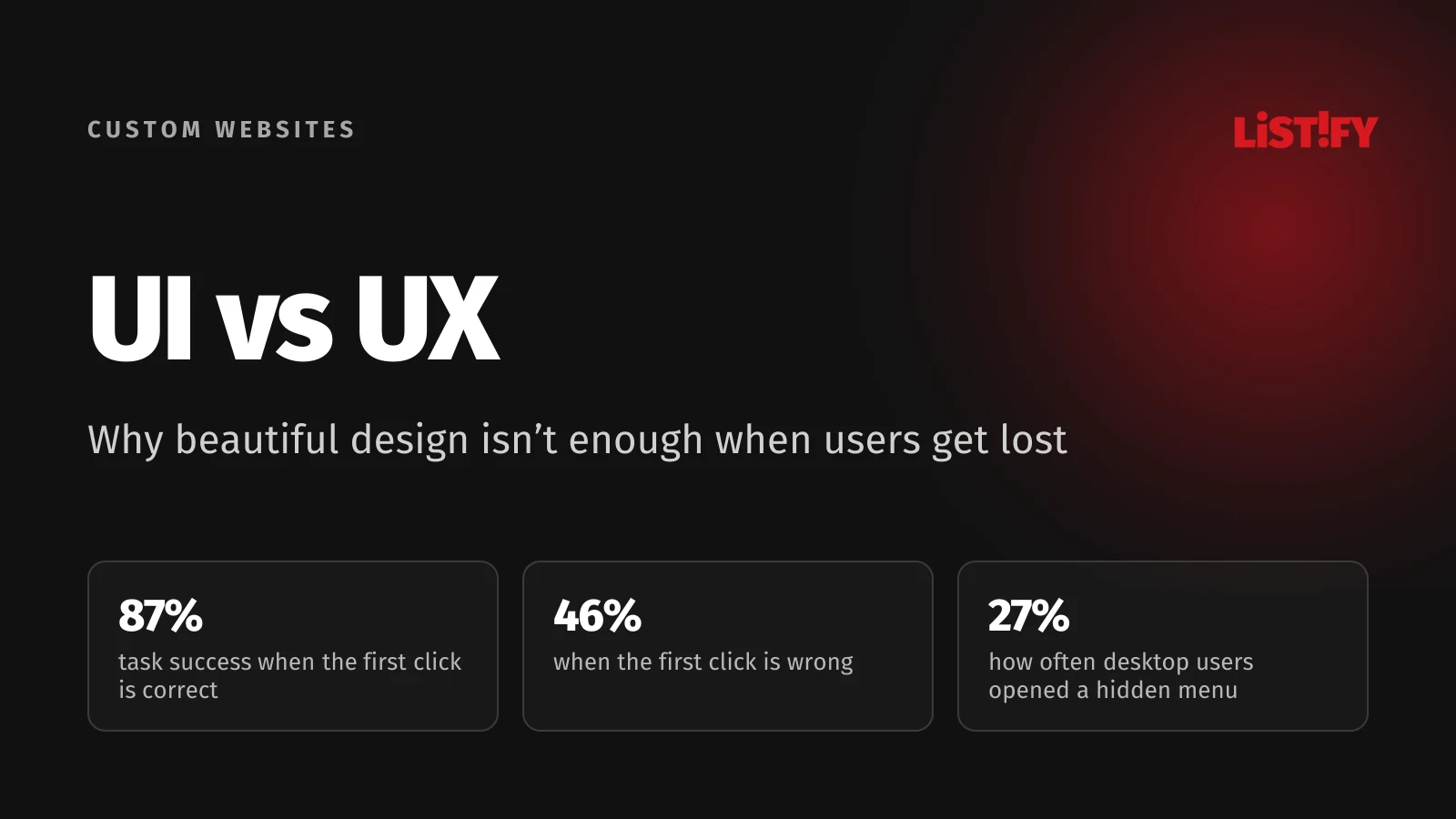
Bob Bailey and Cari Wolfson analyzed 12 usability studies on US government websites between 2006 and 2009. When people’s first click was correct, the probability of completing the task was 87%. When it was wrong, it dropped to 46%. First-click testing is fast, too: each scenario took participants less than 30 seconds. Show someone a page, give them a task (“Where would you look for service pricing?”) and note where they click.
- First click was correct87%
- First click was wrong46%
Summary of 12 studies on US government websites, 2006 to 2009. Range across studies: 72% to 100% and 29% to 70%. Source: Bob Bailey and Cari Wolfson (archived copy; the original site is offline).
Tree testing and card sorting
You can test your menu before any visual design exists. In a tree test, people get only a text version of your site structure and try to find specific items in it. You see exactly where they take a wrong turn, without the visuals skewing the result. In card sorting, people group your content themselves, so you learn how they think about your services. Based on data from Tullis and Wood, results from five participants correlate only 0.75 with the final result; with fifteen participants, it’s 0.90.
What your analytics can tell you
- What people type into site search. Every frequent query for something that’s already in the menu points to a bad label.
- Pages people leave soon after arriving, even though they’re supposed to lead to an inquiry.
- Clicks on elements that aren’t links. A heatmap or session recordings will show them.
- Questions in calls and emails. If customers keep asking about something that’s on the site, they didn’t find it.
Analytics shows you where people get lost. To learn why, you have to watch them use the site.
06Accessibility: the part of UX that’s now EU law
A site that screen readers can’t read, that can’t be used with a keyboard, or that puts light gray text on a white background shuts part of your audience out. In the EU, the European Accessibility Act (Directive 2019/882) has applied since June 28, 2025. It covers specific consumer services, including ecommerce, consumer banking, electronic communications, e-books and certain passenger transport services.
- Microenterprises providing services are exempt. The directive defines them as businesses with fewer than 10 employees and annual turnover or balance sheet total of no more than €2 million.
- Ecommerce is defined broadly: services provided at a distance through websites and mobile apps, at a consumer’s request, with a view to concluding a consumer contract.
- There’s a transition period. Services using products that were already in lawful use may continue until June 28, 2030.
- Enforcement is national. Member states were required to bring the act into their own law, so authorities and penalties differ from country to country (European Commission).
The technical yardstick is WCAG. The current version, WCAG 2.2, published in October 2023, added nine success criteria. Among them: if help or contact options appear on several pages, they should be in the same place each time, and click targets should generally be at least 24 × 24 CSS pixels. Both relate directly to whether people get lost. If you’re not sure whether the law applies to your business, check with a lawyer; this article isn’t legal advice.
07Who does UI, who does UX, and what it costs
A UX designer figures out who the users are and what they need, designs the site structure, user flows and prototypes, and validates them through testing. A UI designer focuses on the visual layer: color, typography, components and consistency across screens. Developers build on both.
On a smaller business website, one person often covers both. That’s fine as long as UX doesn’t get lost along the way. The real warning sign is a vendor who shows you visual mockups before asking who your customers are and what they look for on your site.
In the US, the Bureau of Labor Statistics doesn’t track “UX designer” as a separate occupation. The closest category is web and digital interface designers, whose job BLS describes as creating and testing the layout, functions and navigation of websites and interfaces for usability. Their median annual wage was $104,000 in May 2025, with the lowest 10% earning less than $53,750 and the highest 10% more than $201,550. Web developers had a median of $92,650; the median for all US workers was $50,980.
- All workers51.0
- Web developers92.7
- Web and digital interface designers104.0
BLS has no separate category for UX or UI designers; the closest is web and digital interface designers (SOC 15-1255). Source: US Bureau of Labor Statistics, Occupational Outlook Handbook.
What it means for you as a client: UX isn’t a surcharge for prettier visuals. It’s work that happens before the visual design and continues after launch. What to ask a vendor and what to prepare is covered in our website content checklist. You can also see how a project with us works.
08The process: from research to a beautiful interface
ISO 9241-210 rests on a simple idea: design for real people, involve them throughout, and validate the results. The standard itself notes that building systems on an inappropriate or incomplete understanding of user needs is one of the major sources of system failure. For a website, it looks roughly like this:
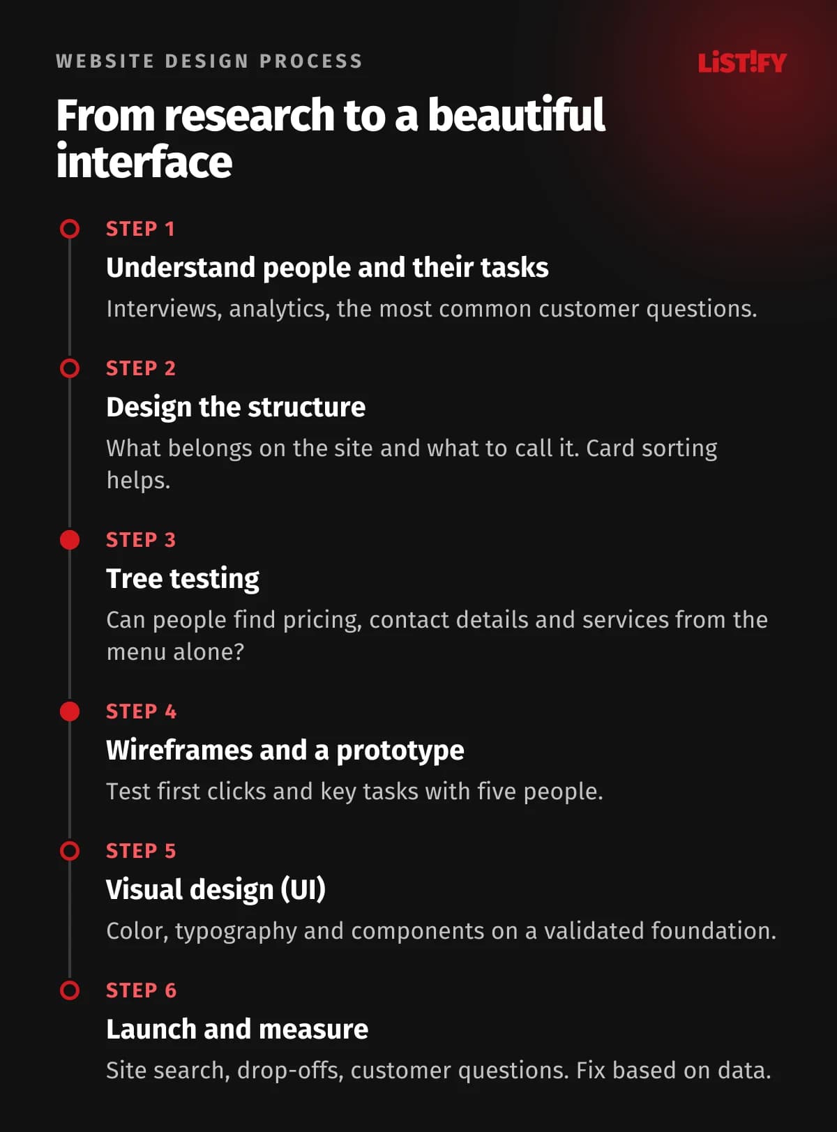
- Understand people and their tasks. Interviews with customers and sales staff, analytics data, the most common questions.
- Design the structure. What belongs on the site, what to call it and how to group it. Card sorting helps here.
- Validate the structure. A tree test shows whether people can find pricing, contact details or a specific service.
- Wireframes and a [prototype](/slovnik-pojmu#prototyp). Page layouts without color, used to test first clicks and key tasks with five people.
- Visual design (UI). Color, typography and components on a validated foundation, with contrast and sizing checked against WCAG from the start.
- Launch and measure. Site search, drop-offs, customer questions. Fix based on data, not gut feeling.
If your website exists mainly to generate leads, clear copy that tells people where they are matters just as much. What a page needs to say in its first few seconds is covered in The 3-Second Rule, and how to write landing page copy in our copywriting guide.
09Three UX statistics you shouldn’t trust
A few impressive UX statistics get copied from slide deck to slide deck. We traced where they came from.
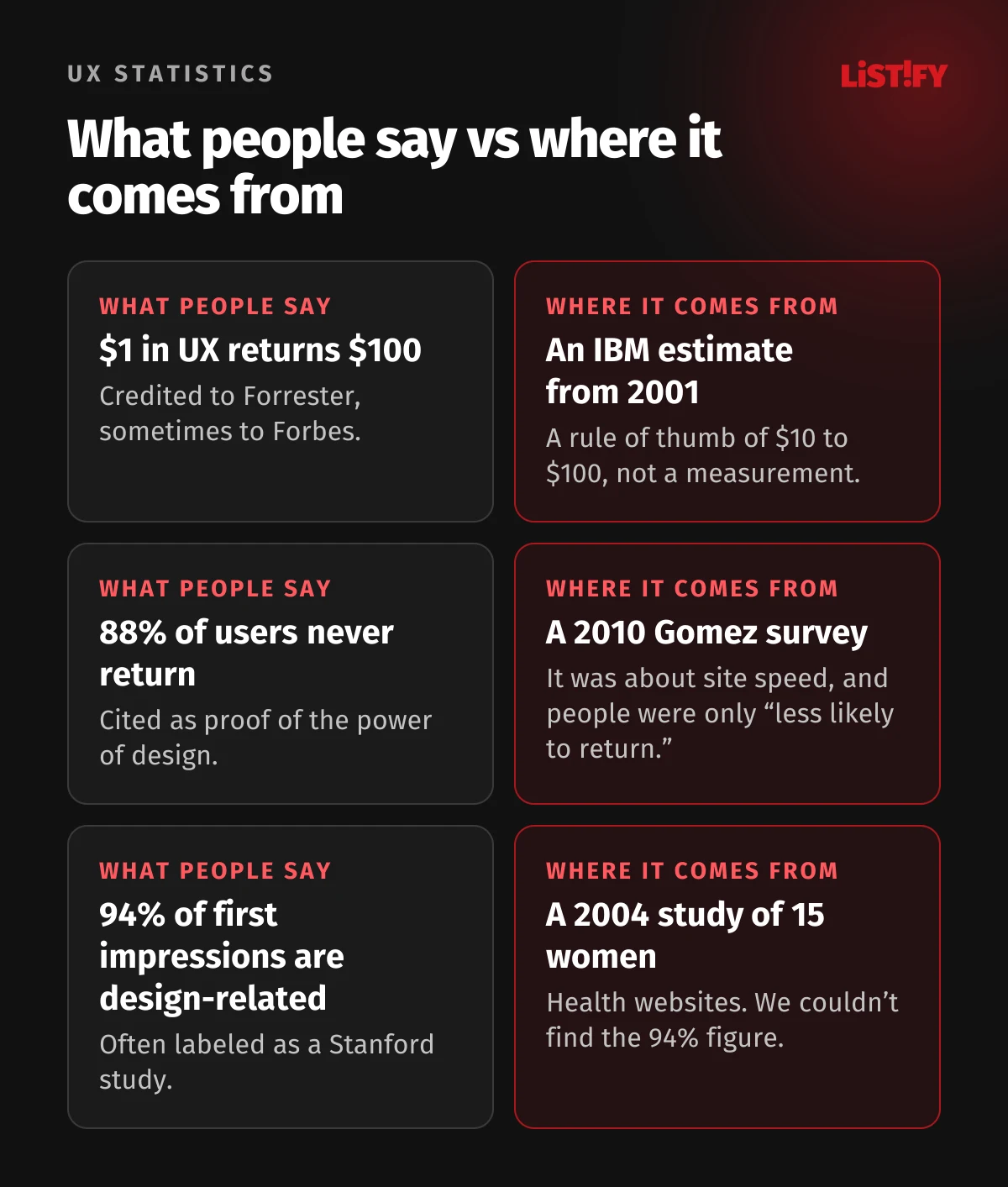
- “Every dollar invested in UX returns $100.” The earliest version we found is IBM’s, from 2001, presented as a rule of thumb of $10 to $100 per dollar. It draws partly on Roger Pressman, who was writing about the cost of fixing a defect: $1 in design, $10 in development, $100 or more after release. The Forrester report the figure is now attributed to is paywalled, and the number doesn’t appear in its public summary.
- “88% of users won’t return after a bad experience.” This comes from a 2010 Gomez survey of 1,500 consumers. It was about website speed and outages, not design, and it says people are “less likely to return,” not that they never come back.
- “94% of first impressions are design related.” It’s attributed to a 2004 Northumbria University study in which 15 women searched for health information. The researchers found that design drove which sites people rejected, while content drove which ones they trusted. We couldn’t verify the 94% figure itself in any available text.
You don’t need inflated numbers to make the case for UX. Just watch five of your customers try to find your pricing page.
10Checklist: are people getting lost on your site?
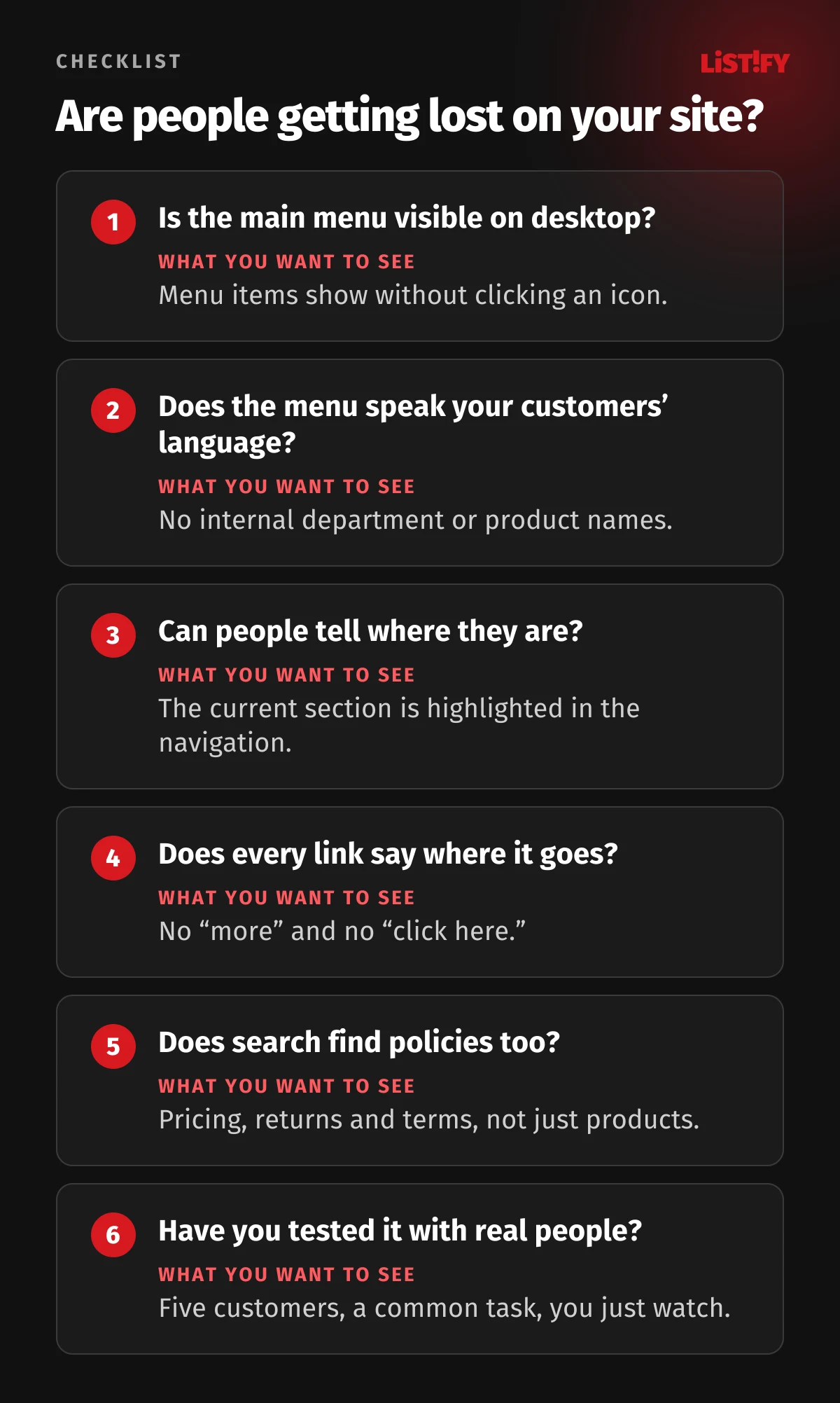
- Is your main navigation visible on desktop without clicking an icon?
- Are menu items named the way customers talk, not after internal departments and product codes?
- Can visitors tell which section they’re in on every page?
- Does the text of every link and button make clear where it leads? No “more” and no “click here.”
- Does site search find pricing, returns and terms, not just products?
- Does text have enough contrast, and are buttons easy to tap with a thumb?
- Have you ever watched five customers complete a common task on your site, such as “find the price and send an inquiry”?
If you answered no to three or more, you probably have a good-looking site that people get lost in. The same applies to web apps and internal systems, only with higher stakes; our article on web app UX goes into detail. And when you build a new site, start with structure and testing; visual design comes next. That’s how we approach custom websites too.
11FAQ
What’s the difference between UI and UX in one sentence?
UI is how a website or app looks and how you operate it; UX is whether people can easily reach their goal with it and how they feel along the way.
Is it better to have a beautiful website or a usable one?
You don’t have to choose. Good looks improve first impressions and make people more forgiving of small flaws. But if people can’t find their way, beauty won’t save the site. So the order is clear: structure and testing with real users first, visual design second.
How many people do I need for a usability test?
For a qualitative test meant to find the main problems, usually five people from your target audience. According to Nielsen and Landauer’s model, they’ll uncover about 85% of the problems. Three rounds of five with fixes in between beat one big test. For statistically reliable numbers, you need at least 20 people.
Does my website have to be accessible by law?
In the EU, the European Accessibility Act covers specific consumer services such as ecommerce, consumer banking and passenger transport, and exempts microenterprises providing services (fewer than 10 employees and no more than €2 million in turnover or balance sheet total). The directive targets services sold to consumers, so a purely informational B2B site is generally not its focus, but whether it applies depends on your services and national law. Check your specific case with a lawyer.
Who designs UX, a graphic designer or a developer?
Ideally a UX designer, who finds out what people look for on the site, designs the structure and validates it through testing. A UI designer or graphic designer builds on that, followed by developers. On smaller sites, one person often handles both UX and UI.
Is a hamburger menu a mistake?
On mobile, it’s standard and people recognize it. On desktop, NN/g’s testing shows hidden navigation significantly reduces how often people find and use it. If you have the space, keep the main menu items visible on desktop.
12Sources
- Nielsen Norman Group: The Definition of User Experience, 100 Years of UX, Aesthetic-Usability Effect
- Nielsen Norman Group: Hamburger Menus, Test with 5 Users, How Many Test Users, Tree Testing, Card Sorting, Card Sorting: How Many Users
- ISO: 9241-210:2019, 9241-11:2018
- Tractinsky, Katz, Ikar: What is beautiful is usable, 2000; Kurosu, Kashimura: Apparent usability vs. inherent usability, 1995; Google Research: first impressions of websites, 2012
- Bailey, Wolfson: FirstClick Usability Testing (archived copy)
- Baymard Institute: navigation, search, product lists, over-categorization
- Eurostat: problems with public authority websites, use of public authority websites, digital skills, difficulties using the internet
- US Bureau of Labor Statistics: Web Developers and Digital Designers
- EU: Directive 2019/882, European Commission on the EAA; W3C: What’s New in WCAG 2.2