UX design for web apps: why users come back and why they leave
People leave a web app because they can’t tell what it’s for in the first few minutes, because a slow or confusing interface gets in their way, and because they hit an error with no way forward. They come back to apps that let them do what they came for quickly, again and again. Here’s what data from the EU and from more than 10,600 digital products says about it, and how to find out where your own users drop off.
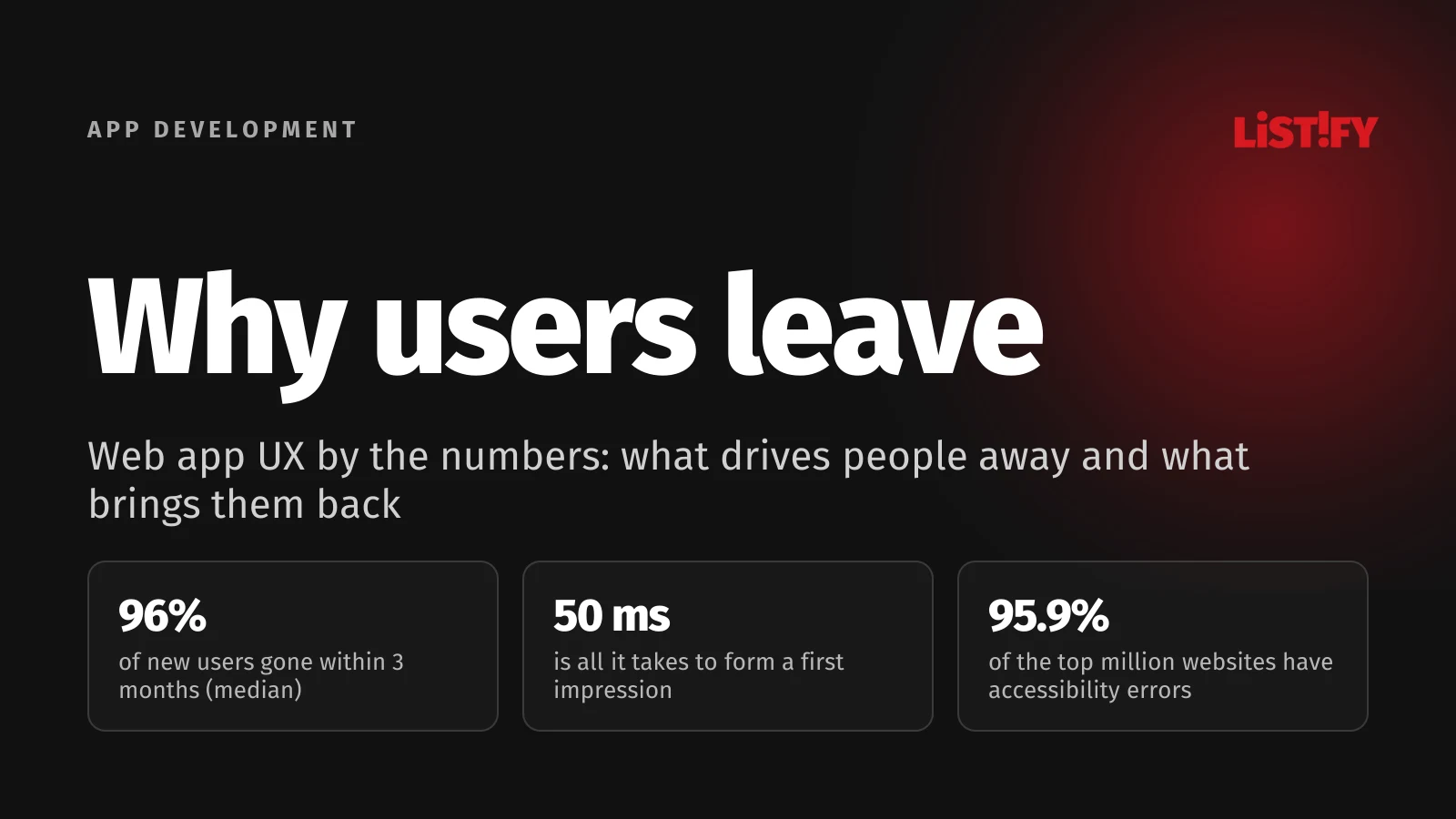
Winning a user is expensive, whether through ads, sales, SEO or referrals. So it hurts all the more when they never come back after the first visit. According to Amplitude’s benchmark of more than 10,600 digital products, half of them see fewer than 4% of new users return in month 3 after their first visit.
Usually there isn’t one big mistake but a pile of small ones: a slow load, an empty first screen, a form that asks too much, a message that just says “Something went wrong”. Below, each one comes with the numbers behind it and what you can do about it.
01The short answer: why people leave and what brings them back
| When it’s decided | Why people leave | What brings them back |
|---|---|---|
| First 10 seconds | They can’t tell what the app does. The page loads slowly or jumps around. | One clear sentence on what the app does, and a fast load on mobile too |
| Day one | An empty screen, a long tutorial and a sign-up form before they see any result | A first useful result within minutes, no manual needed |
| Everyday use | Too many features and settings, slow responses, unclear controls | Core tasks within reach, everything else tucked away until needed |
| When something breaks | An unexplained error, lost data, starting over | A clear message, saved work in progress, an obvious next step |
| Weeks and months later | No reason to come back, so they forget about it | Repeat value, saved state, notifications that actually matter |
UX (user experience) design is therefore about far more than looks. It covers how quickly someone understands what to do, how much time and patience it costs them, and whether they have a reason to return. Visual design is only one part of it.
02How many users actually come back
The clearest picture comes from Amplitude, which tracks user behaviour in web and mobile products. Its Product Benchmark Report 2025 draws on data from more than 2,600 companies and over 10,600 products between September 2023 and September 2024.
- Month 1Median product: 6.5%Top 10%: 26.0%
- Month 3Median product: 3.8%Top 10%: 18.5%
Share of new users who returned in the given month after their first visit. The month 1 value for top products is given in the report as “just over 26%”. Source: Amplitude, Product Benchmark Report 2025, data from September 2023 to September 2024.
So a typical product has lost 96% of its new users by the end of month 3. The top 10% keep almost five times as many. B2B software looks even tougher: three-month retention is 2.5% for the median product and 15.6% for the best.
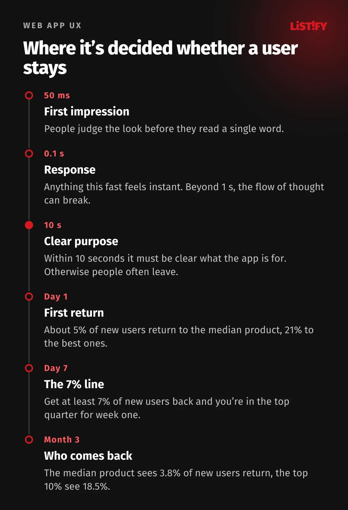
The report also shows how early and later retention connect. In the same report, 69% of products that were best at bringing users back in the first week were also among the best at three-month retention. Amplitude also offers a simple benchmark: if at least 7% of new users come back on day 7, the product sits in the top quarter for early activation. The first few days are a strong early signal of whether someone will stay.
03The first 10 seconds: impression, speed and a clear purpose
First impressions form faster than most people expect. A 2006 study by Gitte Lindgaard and colleagues found that people judge a website’s visual appeal within 50 milliseconds. Research from the University of Basel and Google in 2012 went further and suggested that visual complexity affects those judgements within 17 milliseconds. A cluttered, unusually laid out screen loses before anyone reads a word.
Then comes the content. Nielsen Norman Group, using Microsoft Research data, showed that people often leave a page within 10 to 20 seconds, and that the first 10 seconds largely decide whether they stay. A web app has to say on its very first screen what it will save or solve for the user. A generic “Welcome to the app” won’t do that.
Speed that people can feel
Jakob Nielsen described three response time limits back in 1993, and they still hold: under 0.1 seconds feels instant, under 1 second keeps the user’s flow of thought intact, and beyond 10 seconds attention drifts. In an app, that means every click has to show something straight away. If an action takes more than a second or so, show progress on screen instead of a frozen button.
Google measures web performance with three Core Web Vitals. The “good” thresholds are: the largest content element renders within 2.5 seconds (LCP), the page responds to input within 200 milliseconds (INP), and layout shift stays at 0.1 or below (CLS). INP replaced the older FID metric on 12 March 2024. In apps full of forms and buttons, INP is the metric most directly tied to how the interface feels.
- All three metricsMobile: 53.0%Desktop: 60.2%
- LCP (loading)Mobile: 65.8%Desktop: 78.7%
- INP (responsiveness)Mobile: 80.1%Desktop: 97.7%
- CLS (visual stability)Mobile: 83.1%Desktop: 74.0%
Share of websites meeting the threshold for 75% of page loads, based on Chrome UX Report field data. Source: HTTP Archive, Technology Report, August 2026.
Almost half of all websites still fail on mobile, and loading speed (LCP) is the weakest link. The Deloitte and Google study Milliseconds Make Millions (2020), based on 37 brands, looked at speed and conversions: a 0.1-second improvement in mobile site speed went hand in hand with 8.4% more conversions in retail and 10.1% more in travel. That’s a correlation, not proof of cause, and for lead generation sites the conversion rate actually fell.
Why template-based sites often fall behind on speed is covered in our article Why WordPress templates become a trap for growing businesses.
04Onboarding: get to the first result fast
Onboarding is everything a person goes through between signing up and the moment the app first proves useful. Amplitude’s data hints at how few get that far: on the day after their first visit, around 5% of new users return to the median product and about 21% to the best ones. For half of all products, more than 98% of new users are inactive after two weeks.
A common reaction is to add a ten-screen product tour. Nielsen Norman Group warns that onboarding tutorials interrupt people, don’t necessarily make tasks easier and are quickly forgotten. What works better:
- One clear first task. Instead of a tour of every feature, offer one action that produces a visible result. In invoicing software, the first invoice. In a booking system, the first booking.
- Sample data instead of an empty screen. A blank dashboard that says “Nothing here yet” tells people nothing. A prefilled example explains at a glance what the app looks like in use.
- Sign-up when it makes sense. Where you can, let people try the app first and ask for an account when they want to save their work.
- Help right next to the field. A short hint where people hesitate does more than a manual nobody opens.
- Pick up where they left off. Someone returning the next day should see their work in progress, not the welcome screen again.
How to test demand before you build is covered in From idea to MVP. For flows and prototyping as part of the whole development plan, see How to plan SaaS development.
05Too many features: an app nobody can find their way around
Every release adds more buttons, settings and tabs. Users don’t get as much out of them as you’d think. In 2019 Pendo analysed 615 of its customers’ software products and found that 80% of features are rarely or never used. Just 12% of features generated 80% of average daily usage.
Every little-used feature still takes up screen space and everyone’s attention. A well-established fix is progressive disclosure: core tasks are visible straight away, advanced options appear only when someone needs them. According to Nielsen Norman Group, this improves three of the five components of usability: the app is easier to learn, faster to use and less error-prone.
A practical tip: before adding another feature, check your analytics to see which features people actually use. What nobody uses can be hidden, simplified or dropped. That often helps an app more than something new.
06Forms, sign-ups and payments: where people give up
People most often drop out where the app asks something of them: to fill something in, sign up or pay. Across 50 studies, Baymard Institute puts the average online shopping cart abandonment rate at 70.22%. Among US shoppers who abandoned an order (excluding those who were just browsing), the reasons included:
- 40%: extra costs too high (shipping, tax, fees)
- 19%: didn’t trust the site with their card details
- 18%: the site wanted them to create an account
- 17%: checkout was too long or complicated
- 17%: the website had errors or crashed
- 12%: couldn’t see the total cost up front
Web apps face the same problem at every order, booking, application or plan change. In Europe, Eurostat asks online shoppers about it directly. In 2025, 11.5% of people in the EU who bought something online said a website had been too difficult to use or hadn’t worked properly.
- Netherlands23.7%
- Denmark21.1%
- Spain19.2%
- EU average11.5%
- France11.4%
- Germany8.2%
- Italy8.0%
- Poland4.8%
Share of people aged 16 to 74 who bought online in the previous 3 months. Source: Eurostat, dataset isoc_ec_iprb21, indicator I_BTFW1.
The Netherlands and Denmark, with some of the most experienced online shoppers in Europe, top the list. A higher number doesn’t necessarily mean worse websites. It may partly mean customers who notice problems and say so. Either way, demanding users will spot friction.
What works in forms
- Only ask for what you really need. A company’s address can often be filled in from a business register, and a city from a postcode.
- Show the full price, fees included, before the very last step.
- Offer guest checkout, or sign-in with an account people already have.
- Show errors right next to the field and explain how to fix them. Never wipe what someone has already typed.
- On mobile, open the right keyboard: numeric for phone numbers, email layout for email addresses.
07Errors and outages: trust is lost faster than it’s built
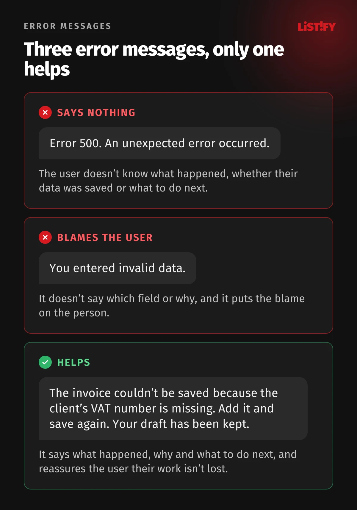
People often trust a web app with their data, their money or a whole day’s work. One unexplained error is enough to make them doubt everything else. A 2002 Stanford study on website credibility (1,481 participants) ranked a broken link, a site being unavailable and typos among the things that hurt credibility most. The authors concluded that simple technical errors can do as much damage to credibility as poor design.
You can’t avoid errors entirely. What matters is how the app behaves when they happen. Nielsen Norman Group recommends error messages that are clearly visible, explain what happened and what to do next, don’t blame the user and preserve the work they’ve already done.
On the engineering side, that means autosaving forms in progress, monitoring errors in production so the team hears about them before customers do, and a status page for outages. If your app handles sensitive data, add security to the list: work through our web app security checklist before launch.
08Mobile, and people who aren’t tech enthusiasts
According to StatCounter, in August 2026 mobile devices accounted for 49.3% of web page views worldwide and desktops for 49.1%. In the EU, 89.9% of people aged 16 to 74 go online on a mobile phone. A web app that only half works on a phone loses a large share of its visits.
Just as important is who’s using it. In the EU, 60.4% of people aged 16 to 74 have at least basic digital skills. Among people aged 65 to 74, it’s only 33.0%, even though 79% of that age group use the internet.
- Aged 16 to 2474.6%
- Aged 16 to 74 (all)60.4%
- Aged 65 to 7433.0%
Share of people with at least basic overall digital skills, EU27. Source: Eurostat, dataset isoc_sk_dskl_i21, indicator I_DSK2_BAB, 2025.
An app has to work just as well for an accountant, a receptionist or a sales rep on the road as it does for the developer who built it.
What this means for design
- Big enough tap targets. WCAG 2.2 requires targets of at least 24 × 24 CSS pixels for level AA, Apple lists 44 × 44 points as the default control size, and Google recommends at least 48 × 48 dp on Android.
- The main action within thumb reach. On a phone, the most important button belongs at the bottom, not in the top corner.
- Tables that adapt on mobile. Replace wide tables with cards, or show only the key columns.
- Plain language. “Save invoice” instead of “Confirm action”, “When would you like to come in?” instead of “Select a time slot”.
- Testing on real devices, including a cheap Android phone and a slow connection, not just a developer’s laptop.
09Accessibility: required for many EU services since June 2025
Accessibility means people with low vision or limited mobility, or who use a screen reader, can use your app. Since 28 June 2025 it’s been mandatory for a range of services under the European Accessibility Act (Directive 2019/882). It covers, among others, e-commerce, consumer banking, e-books and passenger transport, including their websites and mobile apps.
Each EU country enforces the rules through its own law and sets its own penalties. In Czechia, for example, fines go up to CZK 10 million (roughly €410,000), while Slovakia caps them at €6,000 to €30,000 depending on the breach. Microenterprises providing services, meaning fewer than 10 staff and annual turnover or balance sheet total of no more than €2 million, are exempt. Accessibility pays off anyway: high-contrast text is easier to read in sunlight, larger buttons are easier to hit on a train, and properly labelled form fields help autofill too.
And most websites aren’t there yet. Every year WebAIM runs automated tests on the home pages of the million most visited websites. In February 2026 it found WCAG failures on 95.9% of them, with an average of 56.1 errors per page.
- Low-contrast text83.9%
- Images without alt text53.1%
- Form fields without labels51.0%
- Empty links46.3%
- Empty buttons30.6%
- Missing page language13.5%
Share of the million most visited home pages where automated testing found the error. These six types account for 96% of all errors detected. Source: WebAIM Million 2026, data from February 2026.
All six are relatively easy to fix. Colour contrast, field labels and button text are usually quick changes, especially when they’re handled at the design stage.
10Why people come back
People come back for value they get every time they open the app, not for animations. According to Recurly’s 2026 State of Subscriptions report, 52% of consumers cancelled at least one subscription in the past year because they weren’t using it. At the same time, former subscribers drive nearly 1 in 4 new sign-ups. People who leave can return if they have a reason to.
- Repeat tasks get faster every time. The app remembers recent choices and offers templates and shortcuts for experienced users.
- Saved state. Work in progress, history and settings are still there, even when someone returns after a month or after cancelling.
- Predictability. The same things look and work the same way everywhere. Consistency is one of Nielsen Norman Group’s ten core usability heuristics.
- Notifications with substance. “Your client confirmed the appointment” is useful. “We haven’t seen you in a while” isn’t. Every pointless notification makes it less likely people will read the important ones.
- Visible progress. A summary of time saved, orders handled or tasks done reminds people why they use the app in the first place.
- Reliability. An app that is fast every time and never loses data builds trust on its own.
11How to find out why your users leave
Benchmarks point the way, but your users may be leaving for a completely different reason. A practical approach:
- Measure retention by cohort. Track how many people who signed up in a given week come back on day 1, day 7, in month 1 and in month 3. Compare with the figures above.
- Find where people drop off. Break the path to the first result into steps and measure how many people get through each one. The biggest drop is your first candidate for a fix.
- Track speed for real users. Core Web Vitals from your customers’ browsers tell you more than a test on a fast office machine.
- Watch five people. According to Jakob Nielsen, testing with five users uncovers about 85% of usability problems. Give them a task and watch quietly.
- Ask the people who leave. A short question when someone cancels (“What was missing?”) gives answers analytics can’t.
- Fix and measure again. After every change, compare the new cohort with the old one. Otherwise you won’t know whether it helped.
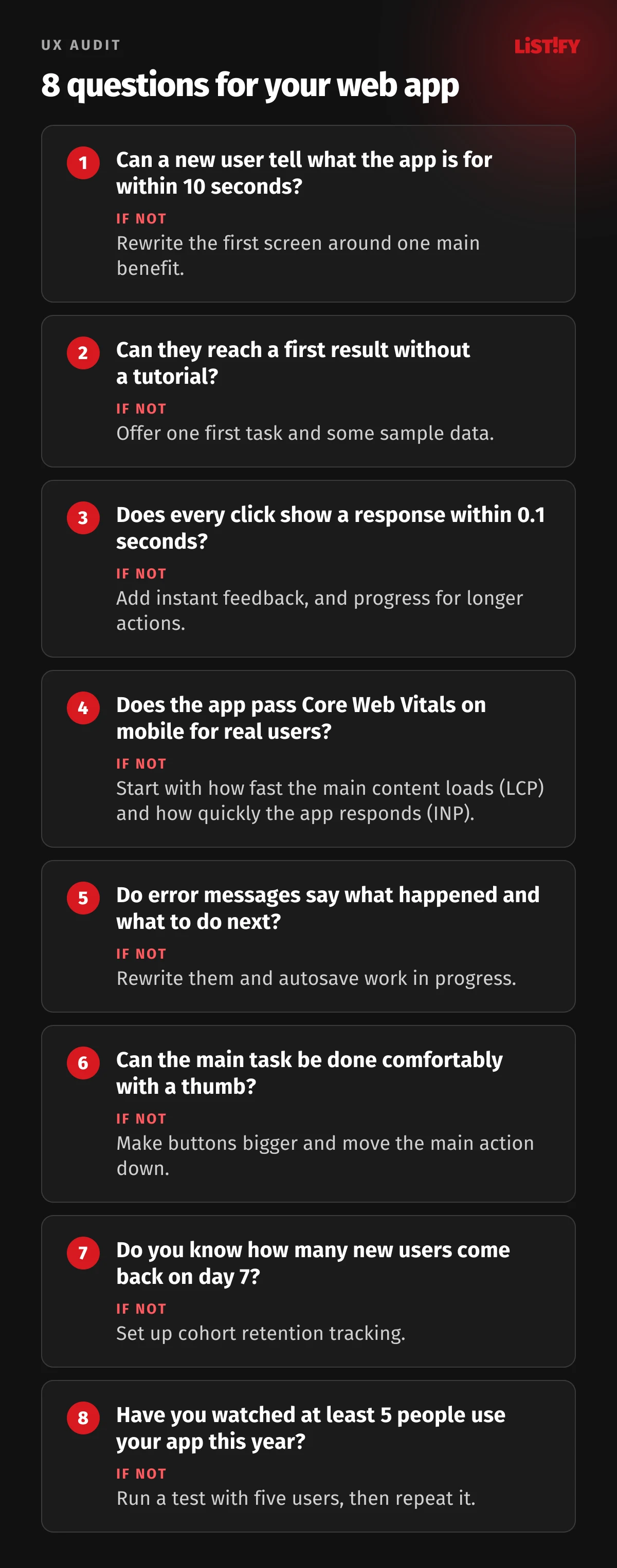
For a new app, the cheapest place to test the flows is a clickable prototype, before any code is written. That’s why our web app projects start with user flows, a prototype and a test with five people. You can see how a project runs step by step on our How it works page, and indicative prices are in our pricing.
12The most common UX mistakes in web apps
- A first screen that says nothing. A logo, “Welcome” and a “Continue” button. Nobody knows why they should continue.
- Sign-up before any value is shown. Every extra field is another reason to leave.
- Design that mirrors the company’s org chart, not what users want to do. The menu follows departments, not tasks.
- Testing only on a big monitor and fast broadband. Many real users are on a phone, on a train, on a patchy connection.
- Error messages written for developers. An error code and a stack trace mean nothing to users.
- New features instead of fixes. Adding is more fun than simplifying, but users usually need the latter.
- Decisions without data. Without measuring retention and drop-off points, it’s all guesswork.
13FAQ
What’s the difference between UX and UI design?
UI (user interface) is what people see and interact with: colours, type, buttons, layout. UX (user experience) is the whole experience: how quickly someone understands what to do, how many steps it takes, how the app handles errors and whether there’s a reason to come back. A beautiful UI with poor UX still won’t keep people.
What’s a good retention rate for a web app?
According to Amplitude’s 2025 report, the median product retains 3.8% of new users in month 3, while the top 10% retain 18.5%. For B2B software it’s 2.5% and 15.6%. As a quick benchmark, use the 7% rule: if at least 7% of new users come back on day 7, you’re in the top quarter for early activation.
Why do users leave right after signing up?
Most often because they don’t see any result quickly. They get an empty screen, a long tour or more forms. One clear first task, sample data and help next to the field work better than a long tutorial.
How fast does a web app need to be?
Google considers it good when the main content renders within 2.5 seconds (LCP), the app responds to input within 200 milliseconds (INP) and layout shift stays at 0.1 or below (CLS). From a human point of view, anything under 0.1 seconds feels instant, and beyond about a second it helps to show that something is happening.
Does the European Accessibility Act apply to my app?
Since 28 June 2025 it applies to services such as e-commerce, consumer banking, e-books and passenger transport offered to consumers in the EU, including their websites and apps. Microenterprises providing services are exempt. Each country has its own implementing law and penalties, so check with a lawyer whether it covers you.
How many users do I need for a usability test?
According to Jakob Nielsen, testing with five users uncovers about 85% of problems. Several small rounds work better than one big one: test with five people, fix what they found, then test again.
What is a UX audit and when should I do one?
A UX audit reviews an app from the user’s point of view: speed, clarity, forms, error states, mobile and accessibility, backed by analytics data. It’s worth doing when retention drops, people don’t finish sign-up or checkout, or before a major redesign so you’re not fixing things blind.
14Sources
- Amplitude: Product Benchmark Report 2025 (PDF, data from September 2023 to September 2024)
- Nielsen Norman Group: How Long Do Users Stay on Web Pages? (2011)
- Nielsen Norman Group: Response Times, The 3 Important Limits (1993)
- Nielsen Norman Group: 10 Usability Heuristics (updated 2024)
- Nielsen Norman Group: Why You Only Need to Test with 5 Users (2000)
- Nielsen Norman Group: Progressive Disclosure (2006)
- Nielsen Norman Group: Onboarding Tutorials (2023)
- Nielsen Norman Group: Error Message Guidelines (2023)
- Lindgaard et al.: Attention web designers, You have 50 milliseconds (2006)
- Tuch et al., Google Research: visual complexity and first impressions of websites (2012)
- web.dev: Core Web Vitals and INP replaces FID on 12 March 2024
- HTTP Archive: Technology Report, Core Web Vitals (August 2026)
- Deloitte and Google: Milliseconds Make Millions (PDF, 2020)
- Pendo: Feature Adoption Report (PDF, 2019)
- Baymard Institute: Cart Abandonment Rate Statistics
- Stanford: How Do People Evaluate a Web Site’s Credibility? (PDF, 2002)
- Recurly: State of Subscriptions 2026
- Eurostat: problems when buying online, isoc_ec_iprb21 (2025)
- Eurostat: digital skills, isoc_sk_dskl_i21 (2025)
- Eurostat: internet use by device, isoc_ci_dev_i (2025)
- StatCounter: desktop vs mobile vs tablet worldwide (August 2026)
- WebAIM Million 2026
- W3C: WCAG 2.2, Target Size (Minimum)
- Apple: Human Interface Guidelines, Accessibility
- Google: touch target size on Android
- Directive (EU) 2019/882, the European Accessibility Act