User Onboarding: How to Stop Losing New Users in the First Few Minutes
A new user signs up, swipes through three welcome screens, gets asked for location and notifications, and lands on an empty dashboard. A minute later they are gone for good. Every one of those steps was designed with good intentions. Together, they stand between the user and the reason they opened your app in the first place. We pulled together research from Apple, Google, Microsoft, Nielsen Norman Group and the EU to show what actually helps in the first minutes after sign-up, and what just gets in the way.
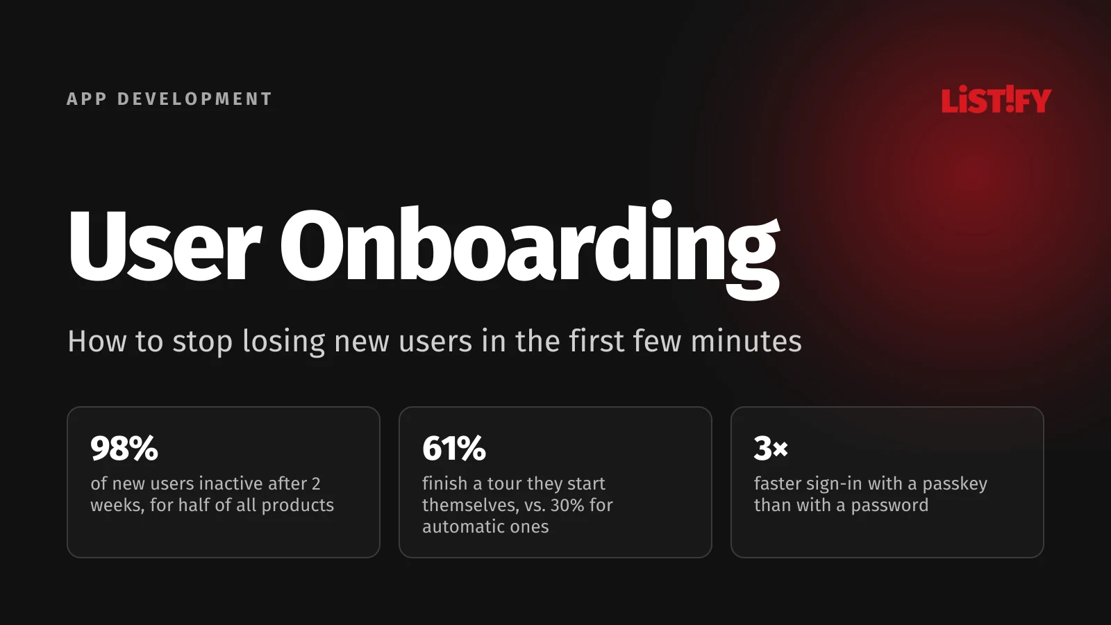
Onboarding is everything a new user experiences between opening your app for the first time and the moment it first does something useful for them. That window is short, and it doesn’t forgive much. Product analytics company Amplitude looked at data from more than 2,600 companies and found that for half of all products, over 98% of new users are no longer active after two weeks. Amplitude calls the first few days the moment when users decide whether a product delivers on its promise, and much of that decision happens in the very first session.
The share of sign-ups who reach that first moment of value is called activation. In a 2022 survey of more than 500 products run by Lenny Rachitsky’s newsletter, the average activation rate was 34% and the median 25%. In other words, for a typical product, three out of four people who sign up don’t get to the thing they signed up for.
This guide covers onboarding new users of web and mobile apps, client portals and online stores with accounts, not onboarding new employees. It picks up where our article on web app UX leaves off and covers everything that has to happen before push notifications, the subject of our guide to mobile app retention, are even worth thinking about.
01The short answer: what decides the first few minutes
- One clear first task. New users should reach the result they came for as fast as possible. A tour of every feature won’t get them there.
- Sign-up with only the essentials. Every field needs a reason. Offer passkeys, Sign in with Google or Apple, and fill in company details from a public register where one exists.
- No empty screens. Sample data or one obvious first action explains your app better than any copy.
- Short tours, on demand. Users finish tours they start themselves about twice as often as tours that pop up automatically.
- Ask for permissions in context. Request location, camera or notifications at the moment a feature actually needs them.
- Measure every step. Without a funnel from sign-up to first value, you don’t know where people drop off, so every fix is a guess.
- Stay within the rules. Pre-checked consent boxes, unnecessary required fields or no way to delete an account can cost you a fine or your spot on the App Store.
02Where exactly new users drop off
New users rarely leave because of one big mistake. It’s usually a string of small hurdles, each of which loses a few more people. That’s why it pays to break the first minutes into individual steps and know, for each one, how many people entered it and how many made it through.
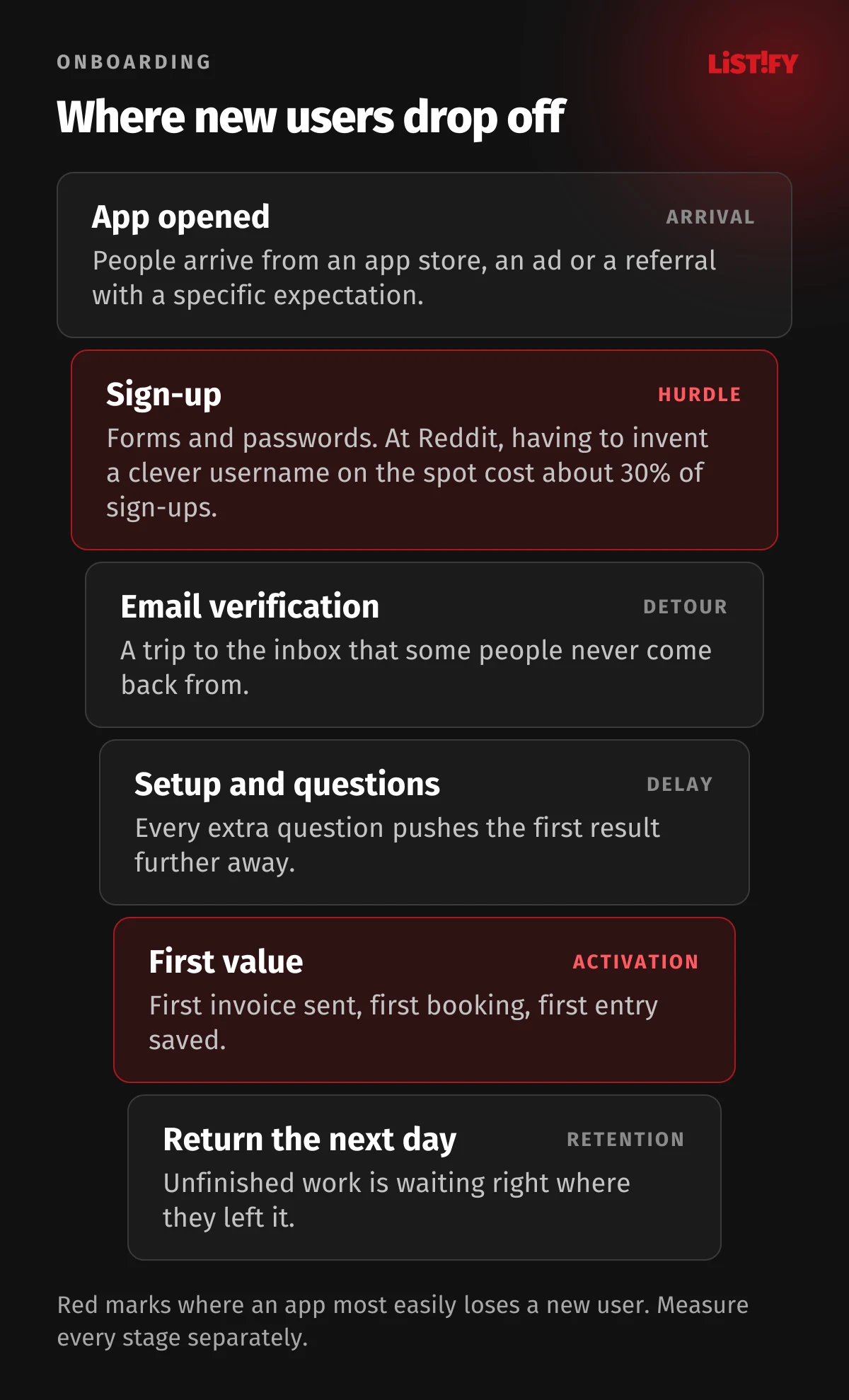
Google’s case study on Reddit shows how costly a single unnecessary hurdle can be. Having to come up with a clever username on the spot led to a drop-off of roughly 30% of new users. Online stores see the same thing. According to Baymard Institute, 18% of US shoppers who abandoned a purchase did so because the site wanted them to create an account. That figure excludes people who were just browsing.
- Extra costs too high40%
- Delivery too slow20%
- Didn’t trust the site with card details19%
- Site wanted me to create an account18%
- Checkout too long or complicated17%
- Site had errors or crashed17%
US online shoppers who abandoned a cart, excluding the 42% who were “just browsing.” Source: Baymard Institute, updated September 2025.
The funnel most often narrows at these points:
- Sign-up before any value. People don’t yet know whether the app is worth it, and they are already filling in a form.
- Email or phone verification right at the start. Many people switch to their inbox and never come back.
- Long setup. Questions, color themes, data imports and inviting teammates before the user has seen a single result.
- An empty dashboard. The app is ready, but there is nothing in it and nothing says what to do first.
- A burst of permission prompts. Location, notifications and camera in quick succession with no explanation.
03Find the moment your app first helps
Product managers call it the aha moment or the activation event. It’s the first action after which the user experiences real value. For an invoicing app, the first invoice sent. For a booking system, the first booking received. For a CRM, the first deal logged with a contact. Onboarding has a single job: get as many people to that action as fast as possible.
| App type | Possible activation event | What usually gets in the way |
|---|---|---|
| Invoicing | First invoice sent | Entering company details, numbering and templates |
| Booking system | First booking from a real customer | Setting opening hours, services and a payment gateway |
| CRM | First deal with a contact and a reminder | Importing contacts from spreadsheets, inviting teammates |
| Client portal | First document downloaded or request sent | Forgotten passwords, identity verification |
| Online store with accounts | First completed order | Forced account creation, hidden fees |
| Fitness app | First workout logged | Permission prompts, pairing a watch |
How do you find it? Compare users who stayed with users who left, and look for an action the first group took in their first days that the second group didn’t. Lenny Rachitsky suggests that users who hit your activation milestone should retain at least twice as well as those who don’t. Userpilot treats a gap of 10 to 15 percentage points in 30-day retention as a strong signal.
Take the famous magic numbers with a grain of salt
Facebook’s “7 friends in 10 days” and Slack’s “2,000 messages” get quoted as proof that all you need is one number. The Facebook line comes mainly from a 2012 talk by Chamath Palihapitiya, and no study behind it was ever published. Even Mixpanel calls such magic numbers “more like mantras” than the result of number crunching. According to an interview with Slack’s founder, the 2,000-message threshold was a judgment based on which teams stuck around (“we decided”), not a formal analysis. What you can take from them: pick an activation event that’s specific, easy to measure and reachable in the first few days.
04Sign-up: fewer fields, faster sign-in
Apple’s App Store rules state plainly that if your app doesn’t include significant account-based features, people should be able to use it without a login (guideline 5.1.1). The same logic works on the web. When people can try the app first and are asked for an account only when they want to save their work, they sign up once they already know why.
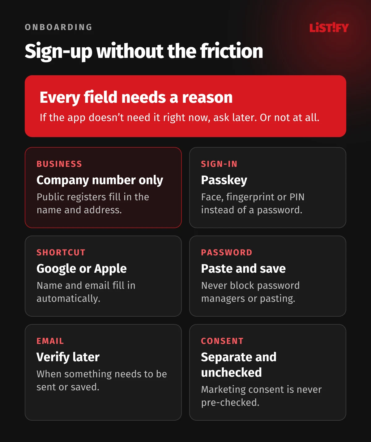
When sign-up is unavoidable, keep it as short as possible:
- Ask only for what you need right now. Phone number, job title or date of birth can wait until they are actually useful.
- Don’t make optional data mandatory. Under the GDPR, the default is to collect only the data necessary for each purpose (Article 25). European regulators flag even softer pressure: the EDPB cites a sign-up flow that shows an “Are you sure?” pop-up only to people who skip optional fields such as gender.
- Autofill business details. Many countries run free public company registers with APIs, so a business customer can type a registration number instead of retyping a name and address.
- Let people paste and save passwords. Password managers and pasting cut sign-up to seconds. Blocking them serves no purpose.
- Postpone email verification where you can. Let people start working right away and confirm their email when they need to send or permanently save something.
Passkeys and one-tap sign-in
Passwords are often the weak link in sign-up and in every sign-in after it. Microsoft found on its consumer accounts that passkey sign-ins succeed 98% of the time, compared with 32% for passwords, and are three times faster. The FIDO Alliance, drawing on nine large companies including Amazon, Google and PayPal, reports a 93% success rate for passkeys versus 63% for other methods, with an average sign-in time of 8.5 seconds compared with 31.2 seconds for traditional multi-factor authentication.
- Microsoft (2024)Password or other method: 32%Passkey: 98%
- FIDO Alliance, 9 companies (2025)Password or other method: 63%Passkey: 93%
Microsoft compares passkeys with passwords on its own consumer accounts. The FIDO Alliance compares them with all other methods, including Sign in with Google or Apple, one-time codes and multi-factor authentication. Sources: Microsoft, FIDO Passkey Index, October 2025.
For new users who don’t know what a passkey is, plain wording helps. Microsoft found that the term “passkey” was sometimes unfamiliar, while “face, fingerprint, or PIN” was generally well understood. Sign in with Google or Apple is another shortcut. Note that if an iPhone app offers sign-in with Google or Facebook, Apple’s guideline 4.8 requires an equivalent option that collects only name and email, lets users hide their email address and doesn’t track them for advertising without consent. Apps that authenticate users with a government- or industry-backed electronic ID are exempt from that rule. For the user’s side of passkeys, see our guide on how to secure your phone and accounts.
05The first screen: show a result, not an empty page
Nielsen Norman Group, one of the best-known usability research firms, takes a sober view of onboarding: avoid building app onboarding whenever possible and spend the money on a more usable interface instead. In their view, upfront onboarding makes sense mainly in three cases: the app needs information to get started, it is highly tailored to the user’s context, or its key workflows are unusual.
An empty dashboard that just says “Nothing here yet” wastes the most important screen you have. NN/g’s advice is to never default to a totally empty state. An empty state should explain what will appear there, how to get it there, and link straight to the first task. Sample data works well too. People can explore safely and then clear it with one tap.
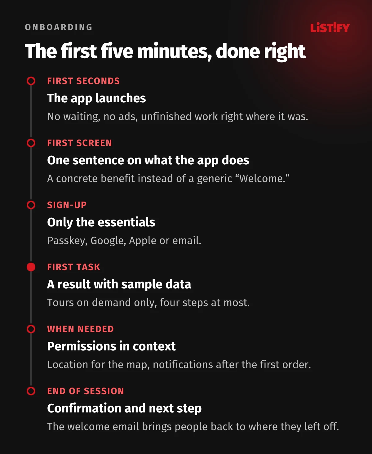
Apple’s design guidelines add three practical points. Apps should launch instantly, because people want to get started right away and sometimes won’t wait more than a couple of seconds. Returning users should find their work exactly where they left it. And any setup that isn’t essential should be postponed.
06Product tours: short and on demand
The welcome carousel with five screens of features is one of the most common onboarding patterns. The data doesn’t support it. NN/g tested four mobile apps with 70 participants: those who went through the tutorial completed tasks 91% of the time, and those who skipped it 94% of the time. The difference was not statistically significant, but people who saw the tutorial rated the tasks as harder. Another NN/g study found that tutorials interrupt users, don’t necessarily improve performance and are quickly forgotten.
If you do need a tour, length and who starts it matter most. Chameleon, which makes an in-app guidance tool, analyzed more than 550 million interactions, mostly from 2024, for its 2025 benchmark report. Tours with two to four steps are completed by 35% to 41% of users. At five steps, that falls to 22%.
- 2 steps37%
- 3 steps35%
- 4 steps41%
- 5 steps22%
- 10 steps18%
Product tours in apps run by Chameleon customers, mostly software companies. Source: Chameleon, User Onboarding Benchmark Report 2025.
The trigger makes an even bigger difference. Tours that users start with a click are completed 58.8% of the time. Tours that pop up after a fixed delay, just 14.6%.
- User clicks to start58.8%
- Behavior-based delay47.5%
- Immediately on page load33.4%
- Fixed delay14.6%
Source: Chameleon, User Onboarding Benchmark Report 2025, Chameleon customer data. Overall, 61% of user-launched tours are completed, compared with 30% of automatically triggered ones.
What this means for your design:
- Offer the tour, don’t force it. A “Show me how” button next to the first task works better than a full-screen overlay.
- Show how much is left. According to Chameleon, progress indicators improve completion by 12%.
- One step, one thing. Each step explains a single control and lets the user try it right away.
- Let people skip it and find it again. Apple recommends that you don’t present a skipped tutorial again, but keep it easy to find.
- Go easy on pop-ups. Chameleon found that 38% of users close a modal in under four seconds. Guidance embedded in the page gets acted on up to 1.5 times more often than a pop-up.
07Checklists and welcome questions
A getting-started checklist (“Upload your logo, add your first customer, send an invoice”) gives new users an overview and a sense of progress. On average, though, people don’t finish it. Userpilot measured an average onboarding checklist completion rate of 19.2% across 547 software companies. Chameleon found that tours launched from a checklist or help menu are completed 67% of the time, against 31% for tours overall.
So a checklist shouldn’t list every feature. Include three to five steps that lead to the activation event, mark the first step done as soon as sign-up is complete, and keep the rest in one place users can come back to.
For welcome questions (“What will you use the app for?”, “How big is your team?”), NN/g advises you to keep them brief and explain why you want the data, and its good examples always include a Skip option. If you can’t explain why you need something right now, ask later. Color themes and visual customization don’t belong in onboarding at all. The old rule of progressive disclosure applies as well: show only a few of the most important options at first and reveal advanced ones when people need them.
08Permissions and notifications: ask when it makes sense
Asking for location, camera or notifications the moment an app first opens makes people wary. Apple warns that asking for data before someone shows interest in a feature can make it hard for them to trust your app. It advises you to avoid requesting permission at launch unless the app can’t function without it, and to ask when people first use the feature that needs it. Google says the same and points out a hard limit on Android: if a user denies the same permission a second time, the system won’t show the prompt again.
- Explain first, then ask. A custom screen before the system prompt says what the permission is for. Apple wants it to have a single button labeled something like “Continue,” not “Allow,” so people aren’t nudged into tapping Allow in the system prompt without meaning to.
- Offer an alternative. Someone who won’t share their location should be able to enter an address manually. Under guideline 5.1.2, Apple doesn’t allow apps to require notifications or location services to use the app.
- Ask for notifications after the first action. On Android 13 and later, notifications are off by default for newly installed apps. Google suggests moments such as submitting an order or tapping a bell icon.
For more on when and how to ask for notification permission, see our guide to mobile app retention and push notifications. How to design the whole notification and email system so people actually want it is covered in app notifications and emails that don’t annoy.
09Day zero: the welcome email and the first return
Welcome emails get far more engagement than almost any other email. Across 4.4 billion emails sent by its customers in 2023, GetResponse measured a click-through rate of 16.6% for welcome emails, compared with 3.25% for all emails. Open rates are inflated by Apple Mail Privacy Protection, so clicks are the more reliable measure.
- Welcome emails16.60%
- All emails3.25%
Emails sent by GetResponse customers with at least 500 contacts in 2023. Source: GetResponse, Email Marketing Benchmarks.
A welcome email should do more than say “Welcome aboard.” It should take the user back to exactly where they left off and show one next step toward first value. If sign-up wasn’t finished, a link back into the half-done setup is enough. A second email the next day makes sense, but only for people who still haven’t taken that first step.
Service message or marketing email
Watch the line between service messages and marketing. Instructions for finishing account setup are a service message. An upsell or a discount is marketing. In the EU, the ePrivacy Directive generally requires prior consent for marketing emails, with an exception for existing customers who bought something from you, and only for your own similar products or services, provided they can opt out easily when you collect their address and in every message. In the US, the CAN-SPAM Act takes an opt-out approach: what counts is the primary purpose of the message, and every marketing email needs a working way to unsubscribe that you honor within 10 business days.
10The rules your onboarding has to follow
Onboarding is where an app collects data and consent, which is why regulators pay attention to it. Here are the rules you are most likely to run into when designing sign-up and the first screens:
| Rule | What it means for onboarding | Source |
|---|---|---|
| GDPR, Articles 7 and 25 | Consent separate from other text and as easy to withdraw as to give. By default, collect only the data needed for each purpose. | Regulation (EU) 2016/679 |
| EDPB Guidelines 03/2022 on deceptive design patterns | Written for social media, but the GDPR reasoning applies to any sign-up. Account registration is its own use case. Repeated pop-ups asking for a phone number, or an “Are you sure?” prompt only when users skip a field, are flagged as problematic. | EDPB, version 2.0, February 14, 2023 |
| Digital Services Act, Article 25 | Online platforms, such as marketplaces and social networks, may not design interfaces that deceive or manipulate users. The Commission can issue guidance on practices such as making cancellation harder than signing up. | Regulation (EU) 2022/2065 |
| European Accessibility Act | Since June 28, 2025, it covers a set list of consumer services, including e-commerce, consumer banking, e-books and passenger transport. Microenterprises providing services are exempt. | Directive (EU) 2019/882 |
| Apple App Store rules | If you offer account creation, you must also offer account deletion in the app (since June 30, 2022). Permissions and notifications can’t be a condition of use. | App Review Guidelines, account deletion |
| WCAG 2.2, criterion 3.3.8 | Sign-in can’t require memorizing or transcribing anything without an alternative. Blocking paste for passwords or codes fails the criterion. | W3C, WCAG 2.2 |
| US: FTC and CAN-SPAM | The FTC’s click-to-cancel rule was struck down in July 2025 and a new rulemaking began in March 2026. CAN-SPAM applies to every marketing email. | FTC, CAN-SPAM guide |
A fair exit is part of onboarding too. An app that people can’t leave makes them more cautious the next time they are asked to sign up for something.
11How to measure onboarding
Without data, onboarding gets tuned by whoever knows the app best, usually the developers and the owners. They haven’t experienced a new user’s first minutes in years. A handful of events is enough:
- Every funnel stage as an event. App opened, sign-up started, sign-up completed, verified, setup completed, activation event.
- Time from sign-up to the activation event. Userpilot measured a median of 1 day, 12 hours and 23 minutes across 547 software companies. For a simple app, it should be minutes.
- Day 1 and day 7 return. According to Amplitude, getting just 7% of new users to come back on day seven puts a product in the top 25% for activation. We cover this in more detail in our article on web app UX.
- Cohorts by source and device. People from ads, referrals and search behave differently, and so do mobile and desktop users.
- Where people skip or close. A skipped tour or a dismissed modal tells you something useful about the design.
Numbers show you where people leave. To find out why, sit five people who have never seen your app in front of it and quietly watch where they hesitate. Then validate changes with an A/B test if you have enough sign-ups. With only a few dozen new users a week, compare whole weeks before and after a change instead, and keep an eye on seasonality and where your traffic came from.
12Onboarding myths that keep getting repeated
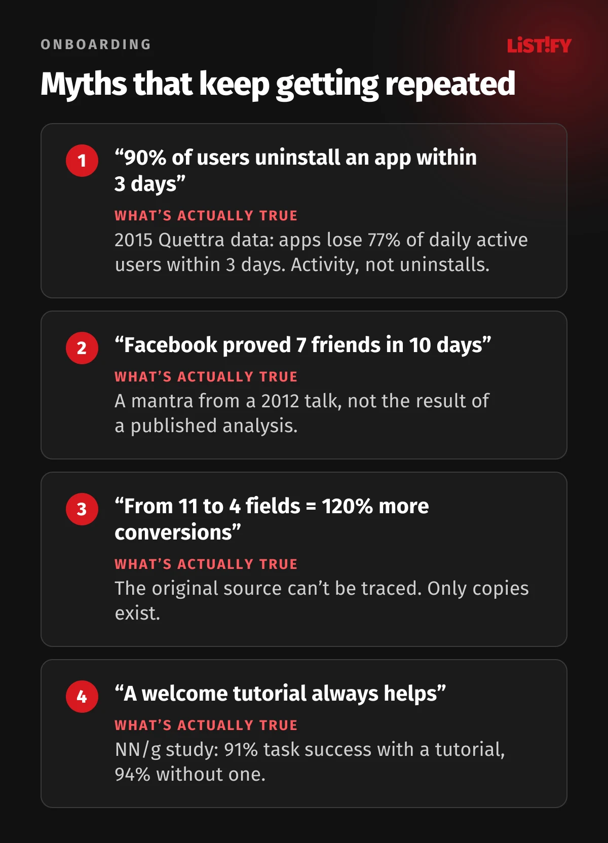
The most-quoted number of all, “90% of users uninstall an app within three days,” is a garbled version of 2015 data from Quettra. Looking at Android phones, it found that the average app loses 77% of its daily active users within three days of install and 90% within 30 days. It measured activity, not uninstalls, and the data is eleven years old. The equally popular claim that “cutting a form from 11 fields to 4 raised conversions by 120%” has no traceable original source.
13Common mistakes
- Asking people to sign up before they have seen a single result.
- Required fields the app doesn’t need in the first few days.
- A five-screen welcome carousel with no skip button.
- A tour that pops up on its own after a few seconds and tries to explain everything at once.
- An empty dashboard with no sample data and no obvious first action.
- Asking for location, notifications and camera on first launch.
- A verification link that only works in the browser where sign-up started.
- A pre-checked marketing consent box, or consent hidden in the terms.
- Onboarding nobody measures, so it never changes.
We design onboarding as part of every web app and mobile app from the first prototype, funnel tracking included. You’ll find ballpark prices on our pricing page, and how we work walks through the process from design to launch.
14FAQ
What is user onboarding?
Everything a new user experiences between first opening an app or website and the moment it first delivers real value. It includes sign-up, the first screens, setup, any product tour and the first emails. In HR, the same word means onboarding new employees.
How long should onboarding be?
Short enough to get people to first value as quickly as possible, within a few minutes for a simple app. According to Chameleon, tours with two to four steps are completed by 35% to 41% of users, and five-step tours by just 22%.
Are product tours worth it?
Only when users want them. A Nielsen Norman Group study found no benefit from welcome tutorials for task success in simple mobile apps. According to Chameleon, 61% of users finish a tour they start themselves, compared with 30% for tours that start automatically.
What are activation and the aha moment?
The first action after which a user experiences an app’s core value, such as sending a first invoice or receiving a first booking. The activation rate is the share of sign-ups who get there. Users who activate should retain much better than those who don’t.
What is a good onboarding completion or activation rate?
It depends on the product. In a 2022 survey of more than 500 products by Lenny’s Newsletter, the average activation rate was 34% and the median 25%, rising to 36% and 30% for SaaS. Userpilot measured an average checklist completion rate of 19.2% across 547 software companies.
When should I ask for notification and location permissions?
When a feature needs them, with an explanation of why. On Android, the system stops showing the prompt after a user denies it twice. People who decline should have an alternative, such as entering an address manually.
15Sources
- Amplitude: The 7% retention rule
- Lenny’s Newsletter: What is a good activation rate
- Chameleon: User Onboarding Benchmark Report 2025
- Userpilot: Time to value
- Userpilot: Product Metrics Benchmark Report
- Nielsen Norman Group: Mobile-App Onboarding
- Nielsen Norman Group: Onboarding Tutorials vs. Contextual Help
- Nielsen Norman Group: Mobile Tutorials
- Nielsen Norman Group: Empty States
- Nielsen Norman Group: Progressive Disclosure
- Apple: App Review Guidelines
- Apple: Offering account deletion in your app
- Apple Human Interface Guidelines: Onboarding
- Apple Human Interface Guidelines: Launching
- Apple Human Interface Guidelines: Privacy
- Android Developers: Request runtime permissions
- Android Developers: Notification runtime permission
- Google: Reddit case study
- Microsoft: Convincing a billion users to love passkeys
- FIDO Alliance: Passkey Index, October 2025 (PDF)
- Baymard Institute: Cart abandonment rate
- GetResponse: Email Marketing Benchmarks
- Andrew Chen: Quettra data on mobile user loss
- Mixpanel: Magic numbers are an illusion
- First Round Review: Slack’s founder on its launch strategy
- EDPB: Guidelines 03/2022 on deceptive design patterns (PDF)
- GDPR (Regulation 2016/679)
- Digital Services Act (Regulation 2022/2065)
- European Accessibility Act (Directive 2019/882)
- ePrivacy Directive (2002/58/EC)
- W3C: WCAG 2.2, Accessible Authentication
Figures current as of September 30, 2026.