Mobile design for thumbs: Touch targets, spacing and reach
A mobile button must be easy to hit, distinguish from nearby actions and understand after a tap. We explain how to review touch targets from the design file to the working product.
Consider a customer changing a service appointment on their phone. They need to choose a new time and confirm it, with a separate option to cancel the visit. We will use this illustrative task to examine hit areas, thumb reach and mistakes. It is not a measured client case study.
Our mobile-first design guide covers wider content and layout decisions. Here, we focus on individual controls and the evidence you should ask for when accepting a mobile interface.
01Separate the visible icon from its actual touch target
A calendar icon can be 24 CSS px across while the area that opens the date picker is much larger. The visible symbol communicates the action; the complete interactive area determines where a tap works. Empty space around an image does not automatically make it interactive. It must belong to the actual control.
During a review, we ask to see the boundaries of those areas and try their edges as well as their centres. An enlarged target must not overlap a neighbouring action. The same point should not ambiguously trigger two different controls.
Include dialog close buttons, switches, labelled checkboxes, calendar arrows and overflow menus in the inventory. A large primary button can distract reviewers from smaller supporting controls that are equally necessary to complete the task.
02Button sizes for the web, iOS and Android
Keep each measurement with its unit and purpose. CSS pixels on the web, iOS points and Android dp are not counts of physical display pixels. Do not transfer one platform’s number to another as a universal requirement.
| Environment | Touch target guidance | How to interpret it |
|---|---|---|
| Web, WCAG 2.2 AA | 24 × 24 CSS px, or a qualifying exception | Criterion 2.5.8 sets a minimum; it is not the ideal size for every primary action. |
| Web, WCAG 2.2 AAA | 44 × 44 CSS px, with listed exceptions | Enhanced criterion 2.5.5 applies at a higher conformance level. |
| iOS and iPadOS, Apple HIG | Default 44 × 44 pt; the table lists a 28 × 28 pt minimum | Start from a comfortable default for ordinary touch interactions and consider context. |
| Android, Google guidance | At least 48 × 48 dp | Measure the interactive target, even when its visible icon is smaller. |
Both web criteria have specific exceptions. Check their applicability in WCAG 2.5.8 and WCAG 2.5.5, rather than judging the icon alone.
Application values come from Apple HIG and Android accessibility guidance. Meeting one size requirement does not demonstrate accessibility of the whole screen. For an important action, we would adjust the layout before using a minimum or exception to justify a cramped row of controls.
03Test thumb reach through a task, not a universal heat map
A single green zone cannot describe every hand and phone. People hold a device in either hand, use both hands or place it on a surface. Device size, grip and mobility also vary. Lower placement may help with a frequent action, but it is not automatically comfortable for everyone.
For the appointment task, we review the whole sequence: open available dates, move through the calendar, select a time and confirm. An accessible final button offers little benefit if every preceding choice requires an awkward reach into the top corner.
- Try both hands on smaller and larger devices that customers actually use.
- Observe repeated grip changes, information hidden by a finger and accidental neighbouring actions.
- Include people with limited dexterity when they are part of the audience, rather than substituting the team’s assumptions.
- Let participants use their normal approach. One-handed use is a test condition, not an obligation placed on the customer.
04Design spacing and neighbouring actions together
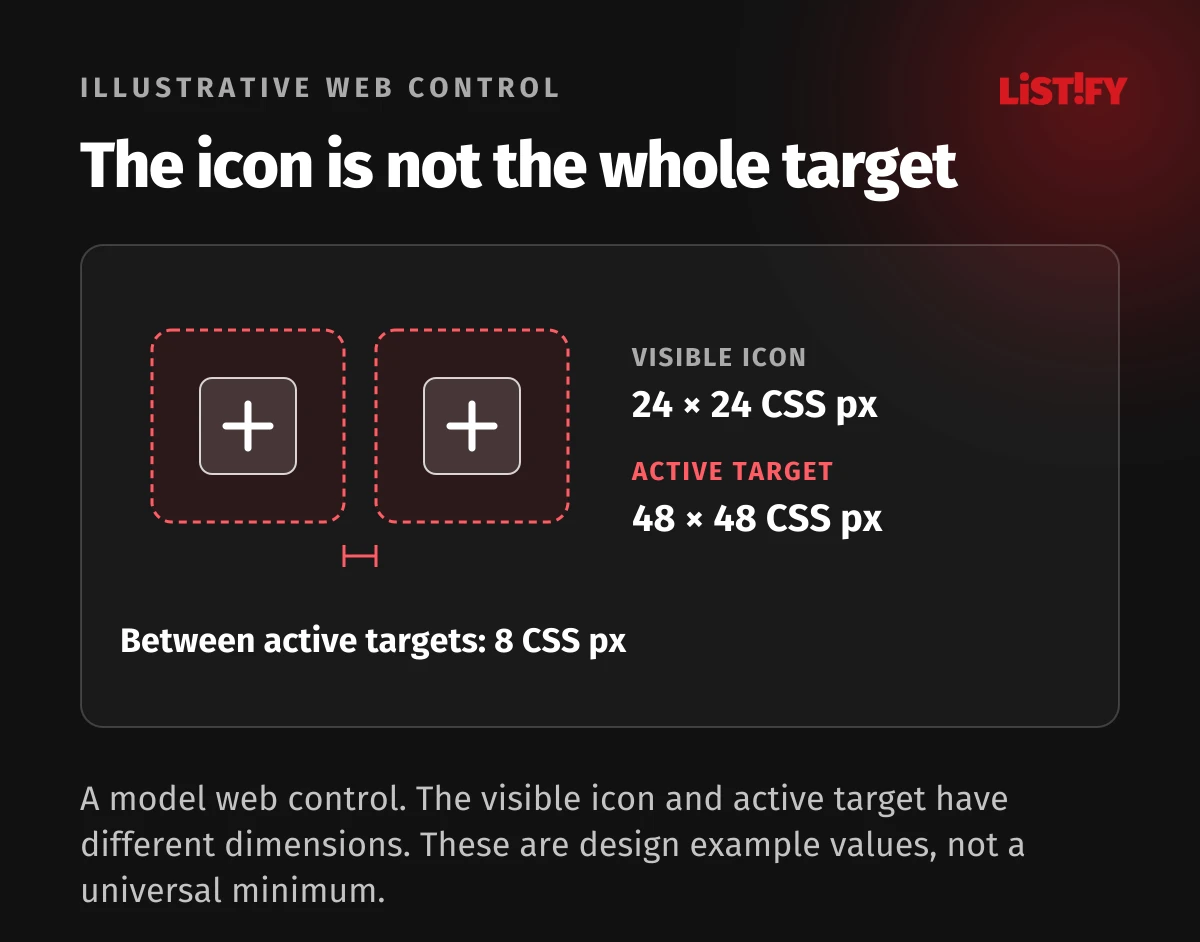
For our illustrative website, we might place a 24 × 24 CSS px icon inside a 48 × 48 CSS px touch target. This is a chosen web design example, not a conversion from Android dp. The whole outer area must respond, and neighbouring targets must remain separate. Evaluate the gap while using the actual layout. For this example, we choose an 8 CSS px gap between the active areas. This is a design choice for the model, not a universal WCAG requirement.
Do not squeeze “Cancel visit” beside “Confirm new time”. Give the destructive action its own location and an explicit label. Choose an appropriate confirmation for an irreversible consequence; for a reversible change, an undo option may be more useful.
If available times form a dense grid, enlarging invisible hit areas cannot solve every problem. Increase the complete row, split the selection into steps or show fewer options at once. A checkbox and its label should form a coherent control rather than two competing actions.
05Check the keyboard, fixed bars and feedback
Open the notes field and check whether the keyboard hides the primary action or the text being entered. Then display a validation error and a longer translated label. A fixed bottom bar must work within the available space and respect the phone’s system controls.
When submission starts, the customer needs to recognise that it is in progress. Repeated taps should not create uncontrolled duplicate appointment changes. Define waiting, failure and safe retry behaviour for a slow connection. That belongs in the development brief as well as the button design.
Follow a touch review with a separate assessment of VoiceOver, TalkBack and larger text. Comfortable thumb operation does not establish screen-reader support, keyboard access or meaningful control labels.
06An acceptance scenario: changing a service appointment
Give the participant a task: “You cannot attend the original appointment. Move it to an available time next week and add a note.” Do not tell them which icon to press. Observe independent completion first, then ask about unclear moments.
| Check | Record | Resolve before acceptance |
|---|---|---|
| Open the calendar near the target edge | Whether the area around the icon responds | Inactive padding or overlap with another action |
| Choose between neighbouring times | Wrong taps and selection corrections | Cramped rows or an unclear selected state |
| Enter a note | Visibility of the field and primary action | Obscured content or no way to continue |
| Confirm with a slow response | Recognition of waiting and completion | Duplicate submission or an uncertain result |
| Leave without making a change | Any accidental cancellation of the visit | Ambiguous labels or adjacent destructive controls |
For each issue, record the device, screen state, expected behaviour and reproduction steps. A screenshot of a crowded calendar alone does not reveal whether the cause is size, overlap or controls moving during loading.
07What designers and developers should hand over
The handover should specify interactive dimensions in the target platform’s units, spacing, pressed and waiting states, and keyboard behaviour. Agree which failures block release and who will verify each fix on a real device. A clickable prototype may use different hit areas from the implementation, so check the working build as well.
For a new interface, use an interactive prototype before development. For an existing product, this review can form part of a UX audit with prioritised improvements. If you are adding a mobile app to a web product, first identify the task that needs to work well on a phone.
At Listify, we can review that mobile journey, refine the screens and prepare a development brief with verifiable acceptance criteria. Share a product or prototype link, the main customer task and who performs it to give us a useful starting point.
If you also need implementation, we can continue with mobile app design and development for iOS and Android. The scope follows the customer task and issues identified.
08Frequently asked questions about mobile touch targets
Does every web button need to be 44 × 44 pixels?
No. WCAG 2.2 AA criterion 2.5.8 specifies 24 × 24 CSS px with exceptions. The 44 × 44 CSS px size belongs to enhanced criterion 2.5.5 at AAA. We may choose a larger target for comfort, especially for frequent or consequential actions.
Is making the icon bigger enough?
Not necessarily. Check the actual interactive area and its relationship to neighbouring targets. A small icon can have a generous target, while part of a large graphic background may not respond at all.
Should the primary button always be at the bottom?
Choose placement through the task and testing. A bottom action must not obscure content, the keyboard or system controls. Include left-handed use and different phone sizes.
Can an automated audit check everything?
It may find some sizing problems. Grip comfort, confused actions, real hit areas and successful task completion also need hands-on checks on the device.