Landing Page Copywriting That Sells: How to Write Copy People Actually Act On
Most landing page copy never gets read, and the top of the page does almost all the work. Nielsen Norman Group’s eye-tracking research found that desktop users spend 57% of their viewing time above the fold, and an earlier NN/g analysis estimated that people have time to read at most 28% of the words on an average page. That makes the headline, the first paragraph, the proof and the button text do almost all the work. Below is a step-by-step way to write them, what the most quoted copywriting statistics actually measured, and what EU consumer law says you can’t put on the page.
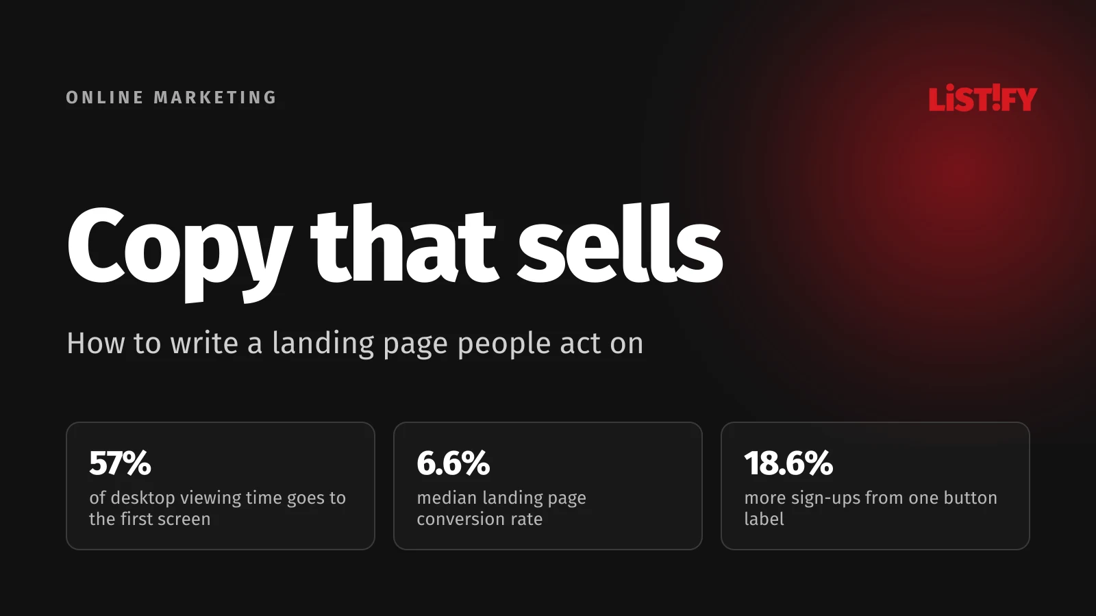
The short answer: a landing page that sells has one goal and one offer. The headline promises the same thing as the ad people clicked. Under it come specific benefits, proof you can back up and a single button that says what happens next. Keep the top short and put the detail further down, where people who are still unsure go looking for answers. Every number, discount and review has to be verifiable, and in the EU that’s also a legal requirement.
This guide is for business owners, marketers and anyone who writes their own web copy or briefs a copywriter. Figures are current as of late September 2026, and sources are linked throughout and listed at the end.
01What a landing page is and how it differs from a regular page
A landing page is the page people reach after clicking an ad, an email or a link, and it asks them to do one thing: send an inquiry, place an order, sign up or download something. Google’s own help center defines it as the page people end up on after they click your ad (Google Ads).
The main difference from a homepage is that a landing page doesn’t offer choices. A homepage has to serve customers, job seekers, journalists and suppliers. A landing page speaks to one kind of person in one situation, which is why it usually drops the main menu and any links that lead elsewhere.
| Aspect | Homepage | Landing page |
|---|---|---|
| Goal | Introduce the business and point people to other pages | One action: an inquiry, an order or a sign-up |
| Visitor | Anyone looking for the company | Someone from a specific ad or email with a specific need |
| Navigation | Main menu and dozens of links | No menu, only links that help people decide |
| Copy | General, written for everyone | Picks up the ad’s promise and answers one type of customer’s doubts |
| Success metric | Traffic, time on site | Conversion rate: the share of visitors who take the action |
For a sense of what’s normal, one of the biggest public benchmarks comes from Unbounce, which sells a landing page builder. Across more than 41,000 pages and 464 million visitors between July 2023 and July 2024, the median conversion rate for all industries was 6.6%. Half the pages converted more than 6.6% of visitors, half converted fewer. The data covers only pages built in Unbounce and counts every click or form submission, not order value, but it works as a rough yardstick (Unbounce).
- Entertainment12.3%
- Education8.4%
- Finance and insurance8.3%
- All industries6.6%
- Legal6.3%
- Commercial and professional services6.1%
- Health and wellness5.1%
- Travel and hospitality4.8%
- Ecommerce4.2%
- SaaS3.8%
Landing pages built in Unbounce, July 2023 to July 2024. For ecommerce, the same Unbounce page gives both 4.2% and 5.2%. Source: Unbounce Conversion Benchmark Report.
02How people read landing pages: mostly, they don’t
In 1997 Jakob Nielsen, co-founder of the US usability firm Nielsen Norman Group, found that 79% of test users (15 of 19) always scanned a new page and only 16% read it word by word (NN/g). A later analysis of browsing logs from 25 people showed they had time to read at most 28% of the words on an average page, and more likely around 20% (NN/g). Both studies are old and small, but NN/g’s later eye-tracking work, reconfirmed in 2017 on desktop and mobile, shows the same thing: people scan web copy rather than read it (NN/g).
A 2018 eye-tracking study shows where that attention goes. 120 people on 1920 × 1080 desktop screens spent 57% of their viewing time above the fold and 74% within the first two screenfuls (NN/g). The study used desktop screens, so don’t expect the same split on a phone. The pattern is still clear: almost everyone sees what’s at the top, and only people the top has convinced keep going.
- First screenful57%
- Second screenful17%
- Rest of the page26%
Eye tracking with 120 desktop users, 2018. Source: Nielsen Norman Group, Scrolling and Attention.
What this means for your copy
- Put the core message above the fold. A headline, one or two lines under it and the button. Google gives the same advice for ad landing pages: put important information near the top so people don’t have to scroll to find it (Google Ads).
- Make subheadings work on their own. Someone who only skims the headings should still get what you offer and why to trust you. “Our services” says nothing. “Installed within 30 days of signing” does.
- Lead with the important word. The first lines of text and the first few words of each line get more attention than the rest (NN/g).
- Use short paragraphs, lists and bold text. In NN/g’s 1997 study, concise copy scored 58% higher in measured usability, scannable copy 47% higher and objective copy without marketing hype 27% higher. All three together scored 124% higher. Note that this measured usability (speed, errors and recall), not sales (NN/g).
You’ll often hear about the F-pattern: people read the first lines in full, then less of each line, then run their eyes down the left edge. Nielsen Norman Group itself says the F-pattern is bad for users and businesses. It shows up when a page is a wall of unformatted text, and it means readers miss most of what you wrote. If you spot it on your own page, break up the text.
03Before you write a word: the customer, their language and one offer
Weak landing pages get written from the company’s side of the desk: what we do, how long we’ve been around, what we believe in. Strong copy starts with the customer. Before you write, answer five questions in writing:
- Who’s arriving, and from where? Someone who searched “heat pump installation cost” is in a different place from someone who saw a video on Instagram.
- What exactly do they want to fix? Not “a heat pump” but lower heating bills, a grant without the paperwork or an install before winter.
- What are they worried about? That the grant won’t come through, that the install will drag on for months, that nobody will pick up the phone a year from now.
- Why should they choose you? One or two things you can prove.
- What should they do right now? One thing. Not “call, email, download the brochure and follow us”.
The words for your copy are already out there, in the customer’s own voice: in emails with questions, in sales call notes, in your reviews and your competitors’ reviews, and in the search terms report in Google Ads. If customers write “how much with installation”, don’t write “transparent pricing policy”. Use their sentence.
The page has to keep the ad’s promise
If someone clicks an ad for “Heat pump installed in 30 days”, that’s what they expect to see at the top of the page, not a generic welcome. Google’s own example: if your ad promises 20% off shoes, people should find those shoes at that price on the landing page and be able to buy them (Google Ads). Landing page experience is one of the three components of Quality Score, the diagnostic Google uses to rate search ads (Google Ads).
If you serve different types of customers or sell different offers, build different landing pages. One page for homeowners and one for businesses will beat a single page trying to talk to both.
04The headline and the first screen
The headline is the one part of the page nearly everyone reads. In Confessions of an Advertising Man (1963), David Ogilvy wrote that on average five times as many people read the headline as read the body copy. That was his experience with print ads, not a measurement. The widely shared “8 out of 10 people read the headline, 2 out of 10 read the rest” from Copyblogger has no source at all. The web data shows a similar pattern, though: the top of the page gets most of the attention, and the rest gets far less.
A good landing page headline says what people get, who it’s for and what makes it different. The subheadline adds a detail or a proof point that didn’t fit.
Headline formulas that work
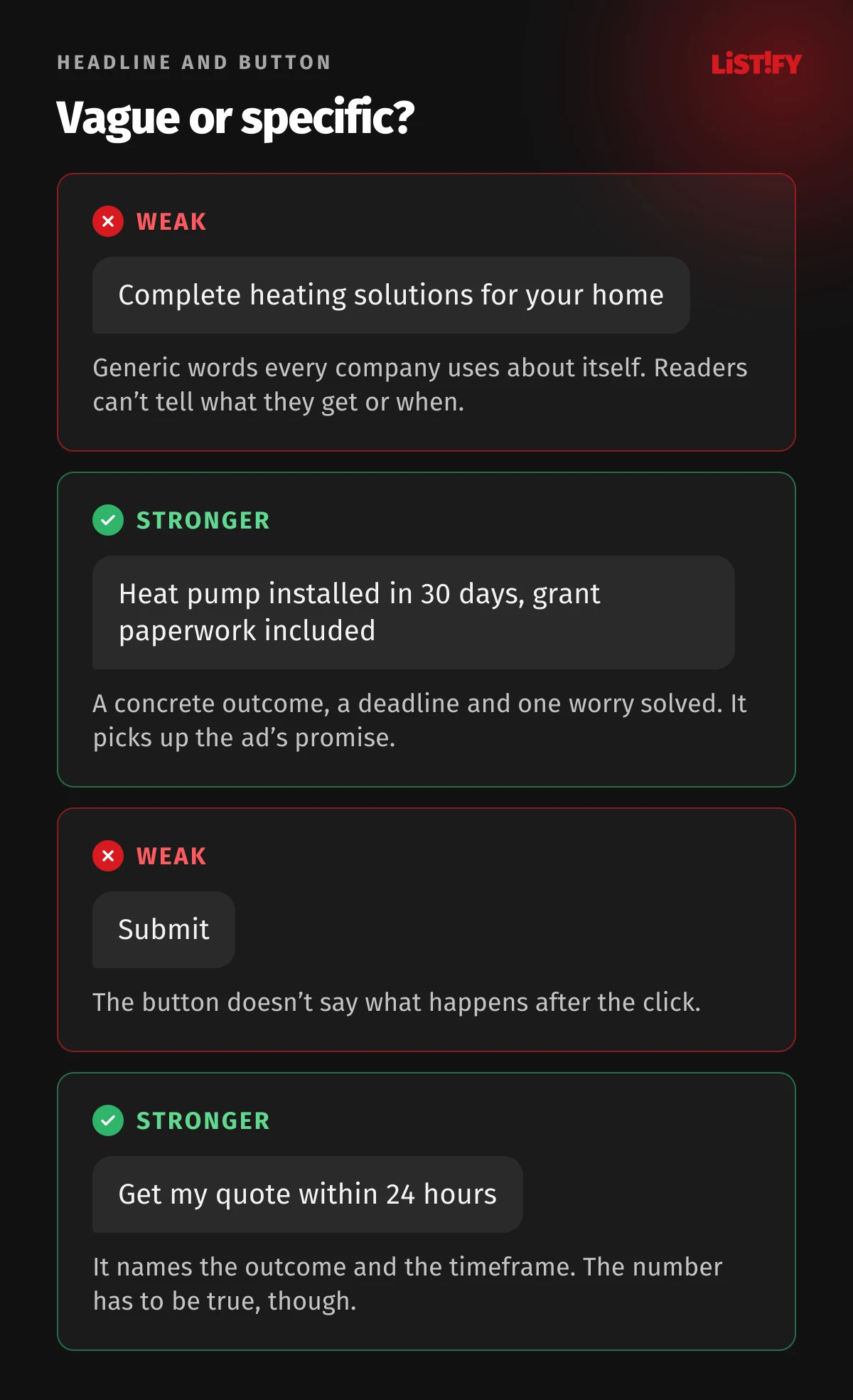
- Outcome plus timeframe: “Heat pump installed in 30 days, grant paperwork included”.
- Problem plus fix: “Bookkeeping without chasing receipts. Snap a photo in the app and we handle the rest”.
- Who it’s for plus what: “Websites for dental practices, with online patient booking”.
- A specific number: “We reply to every inquiry within 24 hours, weekends included”. The number has to be true, or it becomes a misleading claim (more on that below).
How much a headline matters showed up in a 2009 test by 37signals on the sign-up page for Highrise. A headline that led with the 30-day free trial got 30% more clicks on the sign-up button than the original “Start a Highrise Account”. The test ran on just 4,000 page views, and the authors point out that they changed the headline and subheadline at the same time (Signal v. Noise). Treat it as a reason to run your own test.
What to avoid
- Empty words: complete solutions, professional approach, tailored service, high quality. Everyone says them, so readers skip them.
- Jokes only the writer gets. A pun slows down someone who needs to know within seconds whether they’re in the right place.
- Headlines about you. “Serving you since 1998” tells people what you want to say, not what’s in it for them. Your founding year belongs with the proof, further down.
05The body: benefits over features, short sentences
A feature describes the product. A benefit describes what changes for the customer. “Cloud-based app” is a feature. “Send invoices from your phone, even on site” is a benefit. Keep the features, because people comparing options look for them, but spell out what each one means.
| Feature | What the customer gets |
|---|---|
| Cloud-based app | Send invoices from your phone, even on site, with nothing to install |
| Team of 12 developers | Your project doesn’t depend on one person who might get sick or leave |
| ISO 27001 certified | An independent auditor regularly checks how your data is protected |
| Installed within 30 days | You’ll be warm this winter |
| Own local warehouse | Spare parts arrive the next day, not after weeks of waiting for imports |
Write simply, even when you sell complex things
Unbounce’s 2023 to 2024 data showed that pages written at a US 5th to 7th grade reading level converted at 11.1%, compared with 5.3% for copy written at a professional level. The more long words with three or more syllables a page used, the lower its conversion rate tended to be. That’s a correlation, not proof that long words cause lower conversion. Financial services were the exception, where more complex language could actually help (Unbounce).
- 5th to 7th grade11.1%
- Professional5.3%
Conversion rate of Unbounce landing pages, English copy scored with US readability formulas, July 2023 to July 2024. Source: Unbounce.
Plain language means short sentences, everyday words, one idea per paragraph and jargon only where your customers use it themselves. A quick test is to read the copy out loud. If you run out of breath, the sentence is too long.
Short page or long page?
In the Unbounce data, longer copy tended to convert worse on average. Individual tests go both ways. Conversion Rate Experts wrote a page for Moz six times longer than the original, and sales of the paid membership went up 52% (Conversion Rate Experts). In 2011, 37signals tried a long page for Highrise that brought 37.5% more sign-ups (Signal v. Noise), then watched a shorter version beat it with 47% more paid sign-ups (Signal v. Noise).
What decides the length is how many doubts the page has to settle. A free app sign-up needs a few lines. A €30,000 kitchen renovation needs a page that covers price, timing, guarantees, references and the process. Keep the top short, go as long as you need to below it and give every section a subheading so people can skip what they don’t need.
06Proof: references, reviews and numbers people believe
A claim is a promise. Proof is the reason to believe it. On a landing page, these work best:
- Reviews and ratings, with the number of reviews and a link to where they’re from, such as Google or Trustpilot.
- Testimonials with a concrete result: name, company, photo and what changed. “Great to work with” won’t persuade anyone. “We get twice as many inquiries from the website as last year” will, as long as the client really said it and agreed to be quoted.
- Numbers: projects delivered, years in business, average delivery time. Only ones you can back up.
- Client logos, certifications and awards, real ones only and with permission.
- Examples: project photos, a video of your team at work, a sample report or an app screenshot.
Northwestern University’s Spiegel Research Center studied how much reviews matter, together with review platform PowerReviews. At one retailer of higher-priced gifts, a product with five reviews was 270% more likely to be bought than one with none. The effect was stronger for more expensive products (380%) than cheaper ones (190%), and purchase likelihood peaked at an average of 4.0 to 4.7 stars, not a perfect 5.0 (Spiegel Research Center). That’s data from one online gift retailer, so don’t expect the same jump on a service inquiry page. It does show that a handful of real reviews goes a long way, and that a flawless rating can look suspicious.
Mind the rules. In the EU, buying, selling or posting fake reviews to promote products is explicitly banned, and businesses must tell consumers how they handle reviews. You can only present reviews as coming from real customers if you’ve taken reasonable and proportionate steps to check that (Your Europe). When national authorities checked 223 websites in 2022, they couldn’t confirm that 144 of them did enough to make sure their reviews were genuine (European Commission).
07The call to action and the form
The button is the last thing people read before they decide, so it should say what happens when they click, not just “Submit”. Google’s help center puts it this way: the more specific your call to action, and the closer it matches your keywords and landing page, the better your chances of a conversion (Google Ads).
The best-known button test ran in December 2007 on the splash page of Barack Obama’s presidential campaign. The page asked for an email address and ZIP code, and the button originally said “Sign Up”. With “Learn More”, 18.6% more people signed up, even though the form stayed exactly the same. More than 310,000 visitors saw the test. Combined with a different photo, the page got 40.6% more sign-ups than the original (Optimizely). The often quoted extra $60 million in donations is the test author’s extrapolation, not a measured result.
- Learn More8.91%
- Join Us Now7.62%
- Sign Up (original)7.51%
- Sign Up Now7.34%
Estimated sign-up rate for each button label, 310,382 visitors, December 2007. Source: Optimizely.
Don’t copy “Learn More” onto every button. A likely reason it won is that it sounded like a smaller commitment to people who hadn’t made up their minds yet, but the test didn’t measure why. On your page something else may win, which is exactly why you test.
How to write button copy
- Start with a verb and name the outcome: “Get my free quote”, “See pricing”, “Download the price list”.
- Add a line under the button that takes the worry away: “We’ll reply within 24 hours. No sales calls unless you ask for one.”
- Keep one main action on the page. You can repeat the same button several times.
The form: every extra field is a reason to leave
Baymard Institute, which tests ecommerce usability, found that the average checkout in its ecommerce benchmark had 11.3 form fields in 2024, while most need only 8 (Baymard). An inquiry form has even less room. Ask only for what you need to reply: a name, an email or phone number and one question about the job. You’ll learn the rest on the first call. If you collect personal data, say right next to the form what you’ll use it for.
08Doubts, pricing and FAQs on the page itself
Anyone who has read halfway down the page is interested but still hesitant. The lower half of the page is where you answer their doubts, and they’re almost always the same: what it costs, how long it takes, what happens if it doesn’t work and why you.
- Price: if you can’t give an exact figure, give a range or a starting price and explain what drives it. A page with no hint of pricing brings in inquiries that die after the first email.
- Process: three to five steps from click to result. People want to see what they’re signing up for.
- Risk: a trial period, easy cancellation, a guarantee. Always with the specific terms spelled out.
- A short FAQ at the bottom. Base it on questions customers actually send you.
Don’t hide information behind the form. Someone who has to hand over a phone number just to see a price will often leave. Google also looks at how useful and relevant the information on the page is and how easy the page is to navigate when it assesses landing page experience (Google Ads).
09What you can’t say on a landing page in the EU
If you sell to consumers in the EU, your landing page falls under the Unfair Commercial Practices Directive and the national laws based on it. Each country writes the details into its own law, so check local rules, but the core is the same everywhere. Factual claims must be true and provable. Obvious exaggeration that nobody takes literally is fine.
| On the page | What the rules say | How to write it |
|---|---|---|
| “The best”, “No. 1” | A factual claim you must be able to prove if a regulator asks | Say in what and according to whom: “Highest-rated in the category on Trustpilot as of 1 Sept 2026” |
| “50% off” | A discount on goods must show the lowest price charged in the 30 days before the discount | Show that lowest price and calculate the discount from it |
| “Offer ends at midnight”, countdown timers | Falsely claiming limited time is banned outright | Only real deadlines. If the offer carries on after midnight, drop the countdown |
| “Free” | Misleading if the customer has to pay anything beyond the unavoidable cost of responding to the offer and collecting or paying for delivery | Only call free what really costs nothing, and put conditions right next to it |
| Reviews and ratings | Fake reviews are banned, and if you show reviews you must say whether and how you check them | Put the verification note right next to the reviews |
| “Eco-friendly”, “green”, “climate-friendly” | Generic environmental claims are banned unless you can prove recognised excellent environmental performance (from 27 Sept 2026) | Be specific: “We deliver only with electric vans” |
Authorities do check. In a sweep of Black Friday and Cyber Monday offers run by authorities from 23 EU countries plus Iceland and Norway and published in March 2026, 30% of the 314 traders checked referenced discounts incorrectly, and 18% used pressure-selling tactics such as claiming a product was running out or showing countdown timers. More than half of those cases were misleading (European Commission).
- Referenced discounts incorrectly30%
- Used pressure-selling tactics18%
Coordinated check of Black Friday and Cyber Monday offers, published 26 March 2026. Source: European Commission.
Green claims: new EU rules since 27 September 2026
Directive (EU) 2024/825 has applied since 27 September 2026. It bans generic environmental claims such as “environmentally friendly”, “eco-friendly”, “green” or “climate friendly” unless the business can show recognised excellent environmental performance relevant to the claim. It also bans sustainability labels that aren’t based on a certification scheme or set up by public authorities, and claims, based on emissions offsetting, that a product has a neutral, reduced or positive impact on the environment in terms of greenhouse gas emissions (European Commission, Q&A).
Member states had until 27 March 2026 to write the rules into national law, and not all of them made it. Slovakia’s amendment took effect on the day the directive started to apply, while Czechia’s bill was still waiting for its final vote in parliament on 28 September 2026. Don’t bank on the delay. Vague green claims you can’t back up can already count as misleading under existing law. The safe move is to swap general words for specifics: instead of “eco-friendly delivery”, say what you deliver with and how.
10Mobile and speed: copy that fits on a phone screen
Worldwide, StatCounter recorded 49.36% of page views on mobile, 49.11% on desktop and 1.54% on tablets in August 2026 (StatCounter). Landing pages skew further toward mobile. In the Unbounce data, 83% of visits were on mobile, although desktop visitors converted 8% better on average (Unbounce).
- Mobile49.36%
- Desktop49.11%
- Tablet1.54%
StatCounter measures page views on sites that use its tracking code, not people. Source: StatCounter.
- A headline that fits in three lines or fewer on a phone.
- The button visible on the first screen, on mobile too.
- Paragraphs no longer than three or four lines on a phone screen.
- A phone number people can tap to call.
- A form you can fill in with your thumb, with a number keypad for the phone field.
None of this matters if the page doesn’t load. A 2020 Deloitte study for Google across 37 brands found that a 0.1-second improvement in mobile site speed went along with 8.4% more conversions in retail and 10.1% more in travel (Deloitte). That’s a correlation, not proof of cause. We look at what people manage to see and understand in those first moments in The 3-Second Rule.
11How to structure a landing page, top to bottom
The order varies by industry, but this outline works for most lead generation pages:
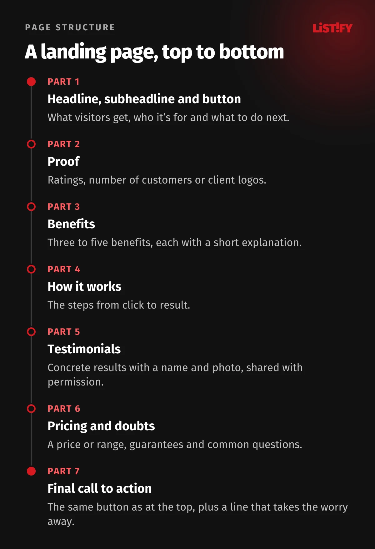
Remove the main menu and links to the rest of your site, or keep them only in the footer. Every link out is another way for visitors to leave before they do the one thing the page is for.
12Testing: how to find out which copy sells
Even experienced copywriters are guessing. A test gives you a far more reliable answer: show half your visitors one version and half another, then compare how many people in each group take the action. Many landing page builders can do this, and Google Ads has a built-in experiments feature.
- Change one thing at a time. If you change the headline, photo and button together, you won’t know what worked.
- Wait for enough data. The Highrise headline test above ran on only 4,000 page views, too few to trust small differences. With little traffic, test big changes like a completely different headline, not button colors.
- Run tests for whole weeks, so both versions see every day of the week.
- Measure what makes money. More button clicks mean nothing if inquiries and orders don’t go up.
If you don’t have enough traffic to test, show the page to five people from your target audience and ask what you offer, who it’s for and what they should do next. If they can’t tell you within five seconds, the copy isn’t done.
13Pre-launch checklist
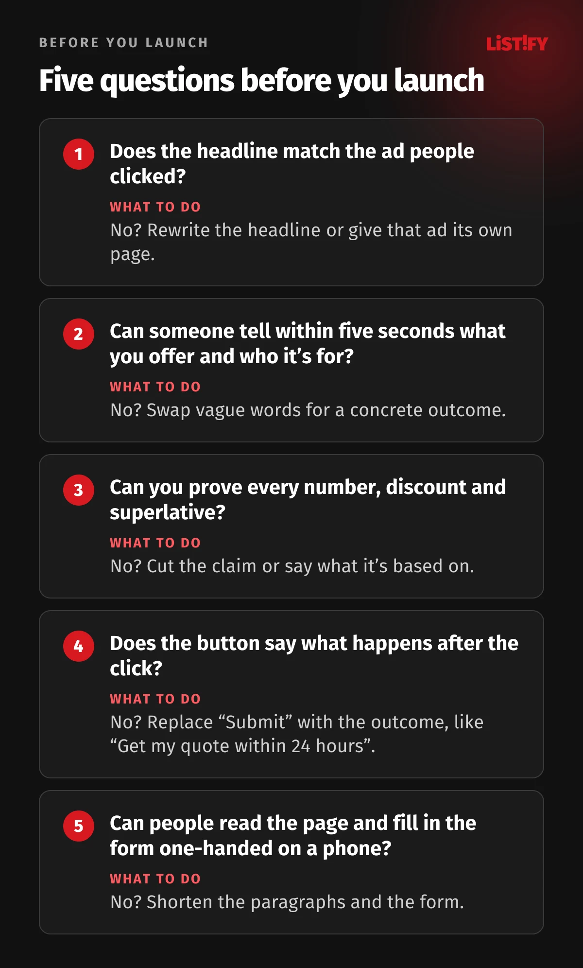
- The page has one goal and one main button.
- The headline promises the same thing as the ad.
- The core message and button are above the fold on mobile and desktop.
- Subheadings make sense on their own.
- Every feature comes with its benefit.
- Reviews are real, and a note next to them says how you check them.
- Discounts are calculated from the lowest price of the last 30 days.
- The form asks only for what you need and says how the data will be used.
- The page shows a price or range and answers the most common questions.
- The page loads fast on mobile and works with one hand.
14FAQ
What’s a good landing page conversion rate?
It depends on your industry and what you count as a conversion. In Unbounce’s 2023 to 2024 data, the median across industries was 6.6%, ranging from 3.8% for SaaS to 12.3% for entertainment. The best benchmark is your own page, though: compare results before and after each change.
How long should landing page copy be?
As long as it takes to settle the reader’s doubts. A simple, low-cost offer needs a few sentences, while an expensive purchase needs pricing, process, testimonials and answers to common questions. Always keep the top short and put the detail below under clear subheadings.
Is there a landing page copywriting formula?
The most reliable one is simple: headline with the outcome, subheadline with a detail or proof, a button that names the next step, then benefits, proof, process, price and FAQ. Classic formulas such as problem, agitation and solution can help you draft, but the customer’s own words matter more than any template.
Can AI write my landing page copy?
It can help with a first draft, headline variations or trimming copy. It doesn’t know what your customers worry about, which testimonials you have or which numbers you can back up. Check every claim it makes, because you’re responsible for what the page says.
Do I need a separate landing page for every ad?
For every offer and every type of customer, yes. If your ads make the same promise, one page is enough. If one ad talks about price and another about speed, each should lead to a page that opens with that promise.
Can I say we’re the best?
Only if you can prove it and say what it’s based on. Under EU consumer law, regulators can ask you to back up factual claims, and claims you can’t support can be treated as inaccurate. Obvious exaggeration that nobody takes literally is fine.
15Bottom line: fewer words at the top, more proof below
A landing page that sells picks up the ad’s promise, says on the first screen what people get, proves it and makes one action easy. It doesn’t need to be long or clever. The rest of the copy is for people who are still on the fence. Write in their words, back up every number and keep testing.
A landing page is only one part of a campaign. How much to spend on the ads that bring people to it is covered in How Much to Spend on Online Marketing, and if you sell to other businesses, see B2B Lead Generation With Paid Ads and SEO. If you’d like us to build your landing page, see how we handle online marketing and how we work.
16Sources
- Unbounce: Conversion Benchmark Report 2024 and methodology
- Nielsen Norman Group: How Little Do Users Read?
- Nielsen Norman Group: How Users Read on the Web
- Nielsen Norman Group: Concise, Scannable, and Objective
- Nielsen Norman Group: F-Shaped Pattern of Reading on the Web
- Nielsen Norman Group: Scrolling and Attention
- Google Ads: landing page, Quality Score and optimizing ads and landing pages
- Signal v. Noise: Highrise headline tests (2009), long form page (2011) and final results (2011)
- Conversion Rate Experts: Moz case study
- Spiegel Research Center: How Online Reviews Influence Sales (2017), PDF
- Optimizely: How Obama raised $60 million by running a simple experiment
- Baymard Institute: checkout form fields
- Deloitte and Google: Milliseconds Make Millions (2020), PDF
- Your Europe: unfair commercial practices and unfair pricing
- European Commission: sweep of online reviews (2022), PDF
- European Commission: EU check reveals misleading sales practices online (2026)
- European Commission: sustainable consumption and Directive 2024/825 and Q&A (September 2026), PDF
- StatCounter: desktop vs mobile vs tablet worldwide