Logo Design: 7 Rules for a Logo That Lasts for Years
A logo’s value has nothing to do with what it cost and everything to do with how it makes people feel. Here are the seven rules every great logo follows, the mistakes we see again and again, and the routes to a logo you won’t regret two years from now.
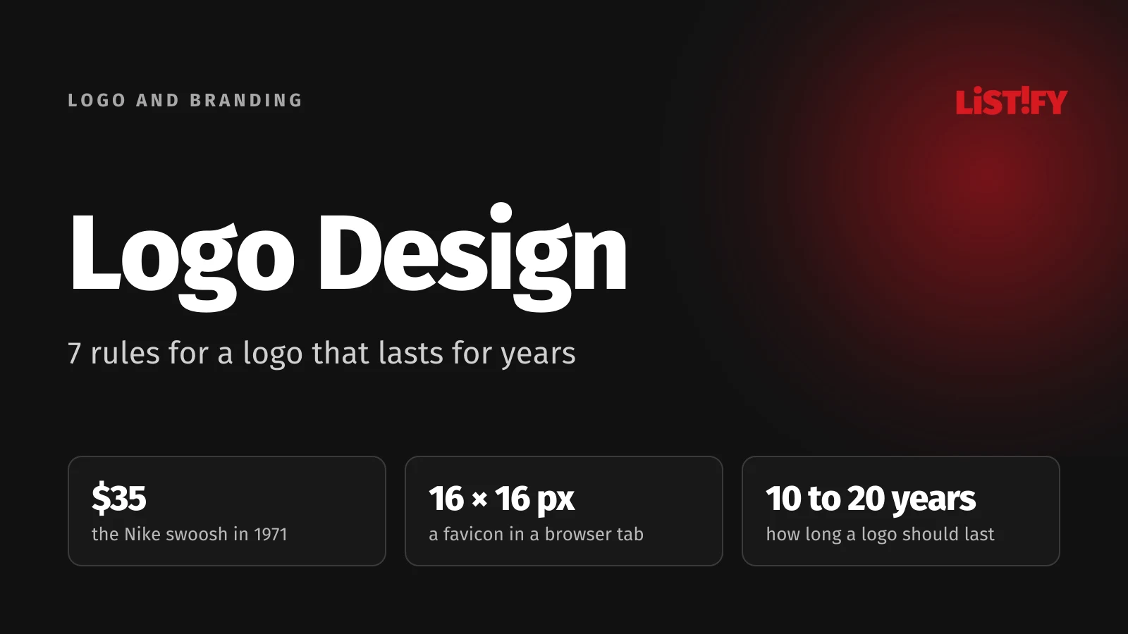
In 1971, Phil Knight, whose company would become Nike, paid a graphic design student named Carolyn Davidson $35 for the swoosh. Today it is one of the most valuable symbols in the world. In 2010, Gap swapped its logo for a new one, and after about a week of public backlash, it brought the old one back.
Two stories, one lesson. A logo’s value has nothing to do with what it cost and everything to do with how it makes people feel. Get that right and it pays off for decades. Get it wrong and it gets expensive.
We’re writing from experience. Over 18 years, we’ve designed hundreds of logos for sole traders, small businesses, mid-sized companies and large corporations. We’ve seen logos that lifted businesses up and logos that quietly held them back. Here is the most important stuff we’ve learned along the way.
01Why your logo deserves serious thought
Your logo is the first thing people see, often before they read a single word. In a split second, they decide whether you look trustworthy, premium, cheap, modern or out of date.
Your logo works while you sleep. It’s on your website, your invoices, your vans, your shop window, your email signature and your social media profiles. It shakes hands with customers on your behalf a thousand times a day.
It’s a shortcut to trust. When customers recognize a logo, their brain doesn’t have to investigate. Familiar feels safe. That’s why a consistent brand pays off far more than a yearly “refresh”.
A bad logo costs you twice. Once when you create it and again when you have to replace it. And replacing it means more than a new file. It means reprinting stationery, vehicle graphics and signage, and updating your website, apps and every document you own. For a small business, that easily runs into thousands. For a larger one, far more.
It changes slowly, and that’s a good thing. You might rebuild your website every few years and swap campaigns every few weeks. Your logo should last ten or twenty years. That’s exactly why it deserves more thought than anything else in your branding.
027 rules every great logo follows
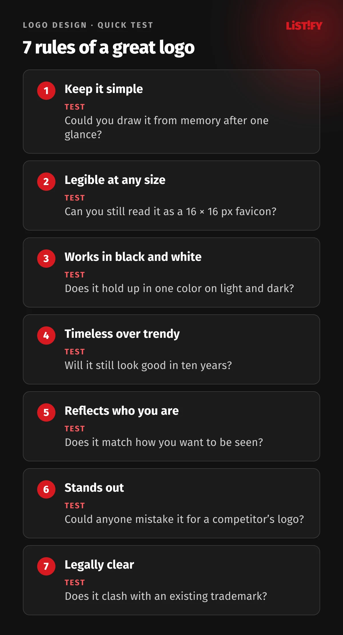
A great logo is simple, legible at any size, works in one color, ignores fashion, fits the business, stands out from competitors and is legally clear. Each rule comes with a quick test you can run yourself.
1. Keep it simple
Try drawing the Apple, Nike or McDonald’s logo from memory. Most people can. That’s the simplicity test: the fewer elements a logo has, the easier it is to remember and the better it works everywhere. The rule is simple. Keep taking things away until you can’t.
2. Make it legible at any size
Your logo has to work on a billboard and as a 16 × 16 pixel favicon in a browser tab. Fine lines, small details and a tagline inside the logo turn into an unreadable blur at small sizes. That’s why most brands today also have a simplified version, usually a symbol or a monogram.
3. Make sure it works in black and white
If your logo relies entirely on color or a gradient, you have a problem. Stamps, engraving, embroidery and single-color printing all strip the color away. A strong logo holds up in just one color.
4. Choose timeless over trendy
Trends like 3D effects, glossy gradients or this year’s favorite font age fast. You can spot a 2008 logo with shiny highlights a mile away. Whatever is hot this year will look like an old yearbook photo in five years.
5. Reflect who you are
A law firm and a bakery need a very different tone. Shapes, typefaces and colors all carry emotion. Rounded shapes feel friendly, sharp edges feel dynamic, serif fonts feel traditional and sans serif fonts feel modern. Your logo doesn’t have to show what you do (Apple doesn’t sell apples), but it does have to match how you want to be seen.
6. Stand out from the crowd
If your logo looks like your competitor’s, you’re doing their marketing for them. Before you make a final decision, look at the logos across your whole industry and choose a direction that sets you apart.
7. Make sure it’s legally clear
A logo that closely resembles someone else’s registered trademark could force you to change it, even after years of building your brand. Before launch, it’s worth running a trademark search (with your national trademark office, the EUIPO for the European Union or the USPTO in the United States) and considering registering your own.
03The mistakes we see again and again
- Cramming everything in. A symbol, the company name, a tagline, the founding year and three colors. A logo isn’t a noticeboard. The more it tries to say, the less people remember.
- Deciding based on “I like it”. Your logo isn’t for you, it’s for your customers. The question isn’t whether you like it, but whether it fits your target audience and works in the real world.
- Design by committee. When the owner, their partner, the sales rep and the accountant all weigh in, you end up with a compromise that excites nobody. Pick one person to make the call.
- Skipping the test. The logo looks great full size on a monitor. Then someone shrinks it down to a favicon or prints it on a pen, and it falls apart.
- Missing files. The company only has a JPG from social media and nobody knows where the vector file is. Every printer redraws the logo “somehow” and the brand slowly starts to fall apart.
- Copying competitors or big brands. “We want something like Apple” is fair inspiration for simplicity, not a brief for a piece of fruit with a bite taken out of it.
04Ways to get a logo: pros and cons
There’s no single right route. It depends on what stage your business is at, how much you can invest and how much your business relies on its visual identity.
| Option | Pros | Cons | Best for |
|---|---|---|---|
| DIY | Free, fast, full control | Usually lacks typography and legibility know-how, often looks amateur | Testing an idea, side projects |
| Online logo maker or AI | Done in minutes, hundreds of variations, low cost | Generic results, risk of looking like someone else’s logo, unclear copyright, often no proper vector file | A temporary fix before launch |
| Freelancer | Personal approach, reasonable price, original design | Quality varies widely, depends on who you choose and their portfolio | Small businesses and new brands |
| Design studio or agency | Strategy, research, full brand guidelines and every file format | Higher cost, longer process | Businesses building a brand for the long term |
Whichever route you choose, at the end you should have:
- vector files (SVG, PDF or AI/EPS),
- versions for light and dark backgrounds, plus a single-color version,
- a simplified version or symbol for small sizes,
- exact color codes (HEX, RGB, CMYK) and font names,
- ideally, a short set of brand guidelines covering clear space and incorrect use,
- clearly transferred copyright or a license.
With a logo from us, you get complete brand guidelines (a brand booklet) covering all logo versions, colors, fonts and usage rules. You, your printers, your web developers and your marketing team never have to guess or go hunting for files.
05Logo redesign: evolution, not revolution
Changing your logo makes sense when there’s a clear reason for it, not just because you’re tired of looking at it. You see it every day. Your customers only see it now and then.
When to go for it: your business has changed direction or target audience, you’ve gone through a merger, your logo doesn’t work in digital (it’s unreadable at small sizes or won’t fit an app icon), or it looks so dated that it’s hurting trust.
When to hold off: when it’s just to follow a trend, because a new CEO wants to leave a mark, or when your brand relies on strong recognition.
The best redesigns are often the ones almost nobody notices. Mastercard, Google and Shell simplified their logos gradually, in small steps, and kept what mattered. Tropicana did the opposite. In 2009, it replaced its familiar orange packaging with a minimalist design. Shoppers complained, and less than two months later the company announced it would bring back the original packaging.
06Quick check: is your logo ready?
- Could someone draw it from memory after a single glance?
- Is it readable at favicon size?
- Does it work in one color on both light and dark backgrounds?
- Does it stand out from your biggest competitor’s logo?
- Do you think it will still look good in ten years?
- Do you have vector files and know where they are?
- Have you checked that it doesn’t conflict with an existing trademark?
If you answered yes to every question, you’re in great shape. If not, that’s fine. Now is the right time to fix it, while it still costs you very little.
07Logo design FAQ
How much does a logo cost?
It depends on the scope. A standalone logo, a logo with full brand guidelines and a complete visual identity including print and web are very different projects. The number of concepts, the depth of research and the size of your business also play a part. A cheap logo often ends up costing more when you have to replace it a year later.
How long does logo design take?
Usually a few weeks. Most of the time doesn’t go into drawing. It goes into understanding your business, researching competitors, developing concepts and working through feedback.
What are brand guidelines and why do I need them?
Brand guidelines (sometimes called a brand book) are a manual for using your logo: versions, colors, fonts, clear space, minimum size and examples of incorrect use. They make sure your brand looks the same on your website, your vans and your business cards, no matter who is working with it.
Is a logo from a logo maker or AI good enough?
As a temporary solution, yes. For a business that wants to build a brand, the risk is too high: a generic look, possible conflict with an existing trademark and unclear copyright.
Should I register my logo as a trademark?
If you plan to use it for years, it’s worth it. Registering with your national trademark office or the EUIPO protects you, within the registered territory and classes of goods and services, from anyone else using the same or a similar logo.
08Want a logo that lasts?
A logo is small, but it carries a lot of weight. It’s a promise you make to your customers every time they see it. So make it a promise you can stand behind.
Planning a new brand, or feel like your current logo is holding your business back instead of helping it? We’d be happy to take a look. With 18 years and hundreds of logos behind us, we know how to turn an idea into a brand that works everywhere, from a favicon to a billboard. And your logo comes with complete brand guidelines.
Get in touch through our contact form or call us on +420 771 166 199 to book a free, no-obligation consultation.