Accessibility: Designing interfaces for people with disabilities
A designer delivers attractive screens, but nobody has specified where keyboard focus goes when a dialog opens or how someone corrects an error without a mouse. Accessibility then becomes a series of guesses during development. A better brief describes the task, important states and different ways of operating the interface. Here is how to make that part of ordinary product design.
Accessibility should enable people with disabilities to use a service independently. This guide turns that goal into design requirements and acceptance criteria. Our broader website accessibility guide covers technical and legal context; this article does not assess the conformance of a particular product.
01Start with a specific activity and the person’s needs
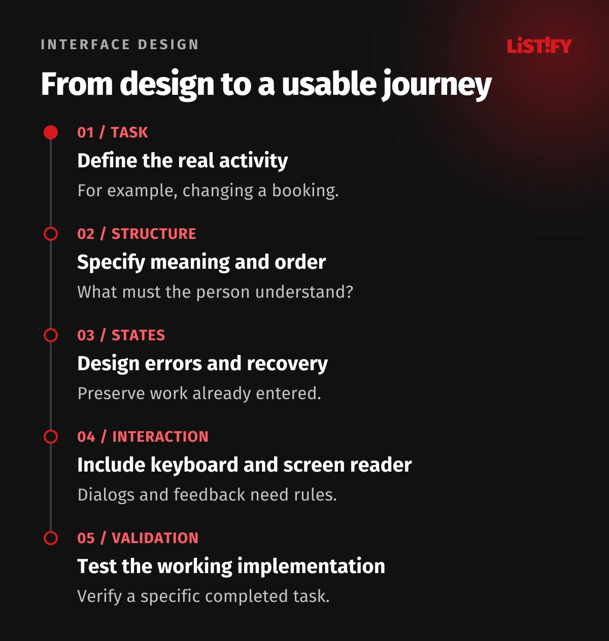
Replace “make the app accessible” with a concrete task: a customer opens a booking, changes its date and verifies that the change is saved. Include an unavailable date, back navigation and interruption. Decide which screens and components are needed only after the whole task is understood.
Do not invent one generic persona for all disabled people. Someone may use a screen reader, magnification, alternative input or less demanding instructions. Ask about working methods and barriers instead of unnecessary medical information. One person may combine several ways of operating a device.
Identify what information someone needs for the next decision and how they can obtain it. A booking date should not be available only on hover. A price should not exist only in an image. Preserve meaning across different ways of perceiving the interface, rather than merely reproducing its appearance.
02Add sequence, meaning and behaviour to each screen
Specify headings, control purposes and a logical reading order. A button performs an action; a link navigates somewhere. A calendar icon needs a meaningful purpose such as “Change date”, rather than the technical icon name. Repeated actions must be distinguishable in the context of the booking they affect.
Document keyboard order and what happens when content changes alongside the visual design. Do not prescribe arbitrary positive tabindex values to patch an incoherent sequence. Fix the underlying structure first. Prefer familiar standard controls when they meet the task instead of creating an unfamiliar interaction for decoration.
Wireframes and prototypes help validate the journey and wording. An image-based clickable prototype cannot itself establish correct programmatic names, roles and values in the final app. Final verification needs an implementation that exposes the relevant behaviour.
03Design component states, not only the default appearance
| State | What the design must explain | Booking-change example |
|---|---|---|
| Default | Purpose and current value | Current date and available action. |
| Focus | Where input is currently directed | A visible indicator on the active control. |
| Loading | What is happening and whether to continue | Searching for available appointments. |
| Error | Cause and recovery | That appointment is unavailable; choose another. |
| Success | What actually completed | The new date is saved against the booking. |
For every state, ask whether its meaning survives without colour, animation or sound. A green outline may not explain what changed. A grey disabled button does not explain which prerequisite is missing. Put the explanation where someone can find it before repeatedly attempting the same action.
Include these states in the shared design system. Fixing a reusable pattern can improve several screens. Still verify each real use: a technically correct field can be attached to an incomprehensible question or placed in an unusable sequence.
04Selection must not depend on precise dragging
Dragging an appointment across a calendar can be a useful shortcut, but also offer a “Change date” action with a clear selection process. WCAG 2.2 Dragging Movements requires a single-pointer alternative without dragging, subject to its exceptions. A keyboard alternative alone does not address that pointer requirement.
Check the actual activation area and spacing around small icons. Target Size Minimum uses 24 by 24 CSS pixels at Level AA, with specified exceptions such as sufficient spacing. A minimum threshold is not automatically a comfortable design target.
Avoid making cancellation easy to confuse with confirmation. Consider an understandable confirmation step or undo route according to the consequence of the action. Unnecessarily changing button order between similar dialogs adds searching and increases the chance of a mistaken selection.
05Specify a dialog as a complete interaction
The dialog brief should cover its name, initial focus, internal sequence, closing behaviour and return destination. The W3C APG modal dialog pattern describes keyboard behaviour and focus management. A darkened background cannot create these properties by itself.
For a longer explanation, immediately focusing the first small button may skip useful introductory context. For a short confirmation, forcing someone through a large unnecessary text block is equally unhelpful. Record the decision according to the content, and test closing the dialog without changing the booking.
After closing, the person should continue from a logical position. If the original trigger no longer exists, choose an appropriate next point in the workflow. Do not leave this state to accidental browser or library behaviour.
Planning a new interface or a complicated form change? Send Listify the design and main user task. We can help specify states, interaction and testable development requirements.
06Sign-in and forms should preserve unfinished work
Before typing, people need to understand the requested information, format and reason. The label should not disappear as soon as input begins. When changing an appointment, avoid unnecessarily requesting the name and other details already safely held in the booking. Offer review and correction of relevant values.
WCAG accessible authentication guidance includes assistance with remembering or transcribing information, such as password-manager and paste support. Design invalid one-time-code handling and account recovery as well. Assess security together with usability rather than treating it as an automatic reason to block assistive mechanisms.
Preserve correct entries after an error, explain the repair and help the person find the affected field. Time and format validation must also make sense in translated versions. Our business form design guide covers the wider requirements for questions and completion.
07After submission, communicate the real outcome
The customer has confirmed a new appointment, but the server is still saving it. Distinguish waiting, success and failure. Briefly showing success before silently discovering that the slot is unavailable is misleading. Preventing duplicate submission should still leave information about the work in progress.
WCAG Status Messages addresses programmatically available status updates that do not move focus. “Your appointment change is saved” can be announced by a screen reader without jumping elsewhere. This is not a reason to announce every typed character as an urgent event.
In the illustrative design, success shows the new date, applicable conditions and a useful next action. Failure preserves the original booking and offers a retry or another date according to the known state. The saved outcome matters more than the duration of a success animation.
08Involve users and evaluate the working interface
Let people complete the task using their usual method. Observe how they navigate, where they expect an explanation and which changes they miss. W3C recommends combining involvement of disabled users with standards evaluation. One participant cannot represent every need or assistive technology.
Prepare the scenario around the objective and test environment, rather than a prescribed sequence of correct clicks. The moderator should not reveal the route to completion. Distinguish a product barrier from a limitation of the prototyping tool. A screen exposed only as an image cannot answer every question about the final application.
On phones, add the checks described in our mobile accessibility guide. Manual review and automated checks complement each other. Report the environment combination and known limitations, including which behaviours were not available to test.
09Hand over verifiable behaviour rather than “meet accessibility”
| Deliverable | Specific requirement | Acceptance evidence |
|---|---|---|
| Component design | Names, states and order specified | Working examples of important states. |
| Interaction scenario | Keyboard behaviour, focus changes and return | A repeatable journey without a mouse. |
| Content and errors | Clear meaning and next action | Correction without losing valid input. |
| User evaluation | Task, environment and observed barriers | Outcome record and repair verification. |
Fix serious barriers in the original component rather than maintaining a separate page that gradually becomes outdated. For an external calendar or sign-in service, verify the combined journey. The module provider and website team need agreement about who repairs failures at their boundary.
Repeat affected scenarios after significant changes. For an existing product, a UX audit can help select important journeys. Technical accessibility evaluation still requires its own clearly defined scope and appropriate expertise.
10Frequently asked questions
Should we build a separate version for disabled people?
Usually a single maintained service with different interaction options is preferable. A separate simplified copy can fall behind in content and functionality and adds maintenance.
Is accessible design only the visual designer’s job?
No. Designers specify structure and behaviour, developers implement them and editors preserve content meaning. The result needs shared verification.
Does a clickable prototype prove accessibility?
Not completely. It helps assess the journey and wording. Keyboard operation, programmatic names, screen readers and dynamic changes require an appropriate working implementation.
Are large buttons enough?
No. The interface must also communicate purpose, current state, errors and the next step. Target size is only one part of a usable journey.
Will this automatically establish WCAG conformance?
No. Conformance concerns a specific scope, standard version and level. This process helps prepare and verify the design, but does not replace a complete evaluation or legal assessment.