When does your product need a design system?
Three teams ship three versions of the same form. Each looks acceptable in isolation, but labels, errors, spacing, and keyboard behavior differ. The next change must be repeated everywhere. A design system becomes useful when it gives these repeated decisions a shared home and a reliable path into the product.
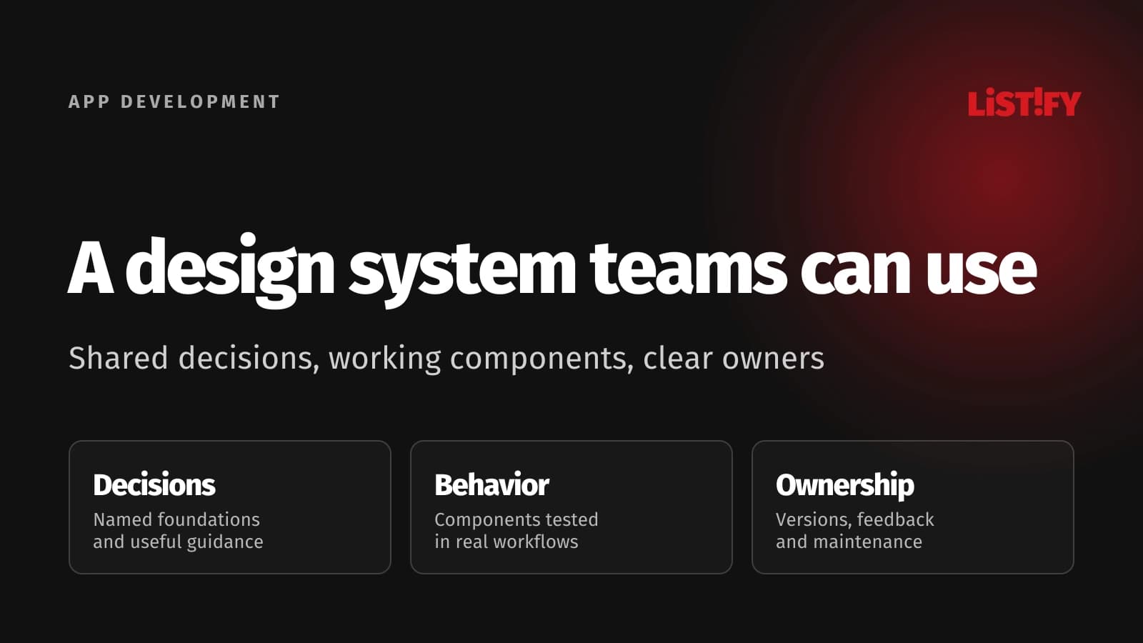
A design system combines reusable foundations, components, patterns, guidance, and the process for maintaining them. A color palette, a design file, or a component package can be part of it. None covers the complete task on its own.
For a growing SaaS product, customer portal, or family of websites, the aim is to make recurring choices easier to use and change. Start with the problems your teams repeatedly solve. The useful system is the one they can adopt in their everyday work, with enough flexibility for different user needs.
01Look for repeated decisions before starting a large library
Review recent screens and changes. Where do teams repeatedly debate button meaning, form errors, navigation, status labels, or data-table behavior? Where does an approved design turn into a different implementation? Collect examples and the work they cause, including rework, support questions, and inconsistent interactions.
For a small product with a stable interface, shared styles and a modest set of tested components may be enough. Multiple teams, brands, platforms, or frequently changing workflows create a different coordination need. A system adds maintenance work too, so size it around demonstrated repetition rather than an ambitious catalog.
Choose one recurring workflow as the first use case. A customer portal's create-and-edit form can expose labels, validation, save states, navigation, permissions, and responsive behavior. A new set of marketing banners may prove visual consistency while missing the interaction problems your application needs to solve.
IBM's Carbon overview describes working code, design resources, guidelines, and reusable patterns as parts of its system. It is an example of the scope, not a reason every organization needs IBM's scale. Begin with the smallest shared set that can solve your actual problem.
02Give each layer a clear job
| Layer | What it holds | What teams still need to decide |
|---|---|---|
| Foundations and tokens | Named choices for color, typography, spacing, motion, and related properties | Meaning, allowed combinations, themes, and the source of approved values |
| Components | Reusable controls with states, behavior, and implementation | Inputs, events, accessibility, content limits, and supported variations |
| Patterns | Ways to combine components for tasks such as forms or account recovery | The user need, sequence, errors, exceptions, and suitability for the context |
| Content guidance | Language, labels, instructions, errors, and status conventions | Meaningful wording, localization, tone, and product-specific information |
| Documentation and governance | Usage guidance, ownership, versions, evidence, and contribution process | Who approves change, handles feedback, and helps products adopt updates |
Keep the distinction visible. A reusable input does not decide the entire checkout or onboarding flow. A shared error style does not explain which information the customer needs to fix the problem. Our UI and UX guide covers this wider relationship between an interface and the experience of completing a task.
Define where product-specific decisions belong. A warehouse screen may need a dense table, while a mobile customer flow needs a different layout. They can share naming, status meaning, and controls without forcing identical page structures. Consistency should help users recognize behavior; it should not erase useful context.
03Connect design tokens to working code deliberately
A token gives a design choice a name that tools and people can reuse. A raw palette value says what a color is; a semantic name explains its role, such as primary text or an error border. That meaning helps a theme change without making every product team select replacement values independently.
Keep naming understandable and avoid creating a token for every accidental one-off value. Document which choices are approved and which are local. Check combinations as well as individual values: a text color that works on one background may fail on another, and a focus style may disappear against a changed surface.
The Design Tokens Community Group's stable format specification defines a file format for exchanging token data between tools. It is a Community Group specification, not a W3C Standard. Check the actual support and conversions in your tools instead of assuming a format removes every integration task.
Choose an approved source and a review process for changes. Test exports and generated code in a real component. Watch for lost units, unresolved references, theme differences, and values that someone overrides directly in the application. Automated synchronization needs ownership and validation just as a manual handoff does.
Keep the design library, code, and documentation aligned to known versions. If they cannot update simultaneously, state the difference and the migration route. A designer should know which behavior exists in the release engineers can actually use. A shared name is not sufficient when the implementations disagree.
04Specify behavior, content, and accessibility together
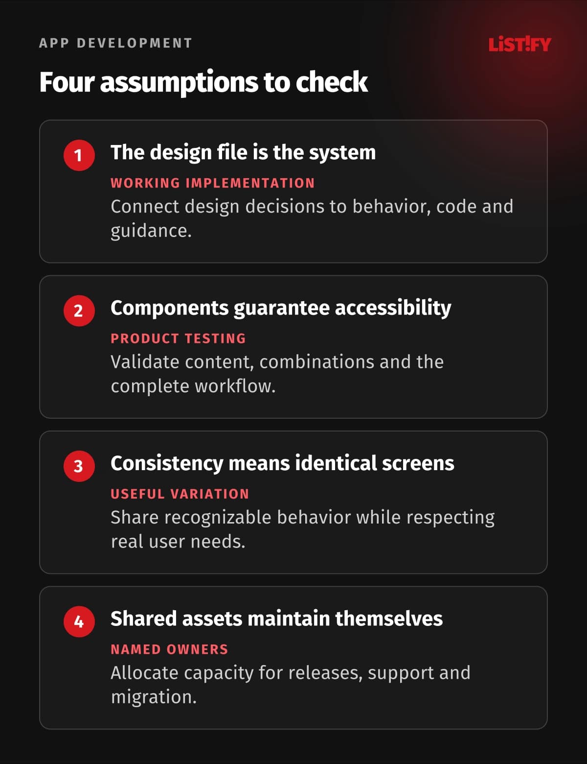
Document the states a person can encounter: default, focus, loading, empty, error, disabled, and success where relevant. Explain the action and recovery path. If submitting a form fails, preserve useful input and show what happened. If a button starts a slow request, prevent accidental repeated work while giving clear feedback.
Prefer appropriate native HTML controls where they meet the task. For custom widgets, the W3C ARIA Authoring Practices Guide provides patterns for semantics and keyboard interaction. Adding a role alone does not implement focus management, expected keys, or a meaningful accessible name. Test the complete behavior.
Include practical accessibility criteria in component reviews: labels, keyboard operation, visible focus, contrast, zoom, error communication, and relevant assistive-technology behavior. WCAG's target-size guidance explains the Level AA minimum of 24 by 24 CSS pixels with defined exceptions. It is not a blanket instruction that every button must use that exact size.
Test with real content: long names, translated labels, missing data, and narrow screens. A status conveyed only by color, a clipped action label, or a tooltip essential to understanding can create a problem that the clean design example never shows. Include examples of acceptable content limits and alternatives.
An accessible component is a useful starting point, not a guarantee for the whole application. GOV.UK's accessibility guidance explicitly says its system still requires service-level research, design, development, and testing. Assess the product's actual requirements and applicable rules separately.
05Choose adoption, extension, and exceptions consciously
An established library can save you from rebuilding basic controls, but evaluate its fit: framework, browser support, accessibility evidence, theming, release policy, maintenance, license, and the patterns you need. Use it in a representative workflow before committing to widespread adoption.
Keep a clear boundary between the upstream library and your additions. Prefer documented extension points over private internals. Record why a wrapper or custom component exists and how upgrades affect it. Copying a library into your project may give immediate control while transferring the ongoing maintenance responsibility to your team.
Allow justified exceptions with an owner and review date. A specialized editor may need behavior outside your standard form patterns. Document the user need and avoid silently creating a second general-purpose input. Repeated exceptions are evidence that a shared component or the system's scope needs reconsideration.
Use published examples as tested starting points, not universal solutions. GOV.UK's getting-started guidance explains its research context and recommends checking untested ideas in your own service. A pattern successful in one setting still needs validation with your users and task.
Our web application UX guide covers the surrounding workflow. A recognizable interface is useful when it helps someone complete a task. If standardization makes the task harder, investigate that evidence instead of defending the component for its own sake.
06Assign ownership and measure the work it changes
Name a responsible owner and establish a route for contributions, defects, and questions. Define how a proposal moves from a product need to reviewed design, implementation, documentation, and release. A system shared across teams requires scheduled capacity; hoping someone will maintain it between other deadlines rarely provides reliable support.
Require evidence before adding another component. GOV.UK's contribution criteria ask whether an idea is useful and distinct, then review usability, consistency, and versatility. Adapt that principle to your scale: explain the repeated need, compare existing options, and test the implementation.
Publish release notes and migration instructions. Distinguish a visual adjustment from a change that affects API use, interaction, or content. Give product teams a feasible adoption window and help identify dependencies. A deprecated component needs a replacement path rather than an indefinite warning with no owner.
Measure what you hoped to improve: adoption in relevant workflows, duplicated components, repeated defects, time spent on a comparable change, and support needs. Keep the context visible. A complex new feature and a routine form update cannot prove a time-saving percentage merely because they used different component sets.
Review whether teams can find the right example and understand when to use it. Low adoption may reflect missing behavior, difficult integration, weak documentation, or a legitimate product difference. Treat it as a diagnostic question. The number of components in the library is a poor measure of the value it delivers.
07Roll out one useful workflow first
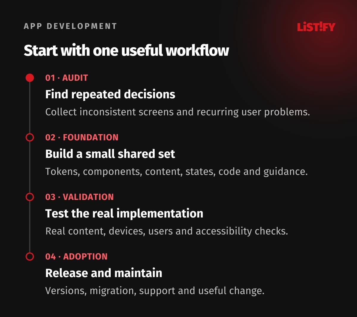
- Audit the repetition. Collect inconsistent screens, recurring decisions, user problems, and the teams affected. Choose a concrete pilot workflow.
- Build the smallest shared set. Connect tokens, components, content, states, code, and guidance for that workflow, with an owner for each part.
- Test the actual product. Use realistic data, devices, accessibility checks, and representative users. Record exceptions and implementation gaps.
- Release and maintain. Document versions and migration, support adoption, review useful measures, and add components when repeated needs justify them.
Expand from the learning rather than migrating everything at once. Retire duplication as teams touch relevant workflows and prioritize changes that matter to users. A coherent foundation can grow incrementally, provided its owners keep design decisions and running implementations aligned.
08Questions about building a useful design system
How is a design system different from a UI kit?
A UI kit provides reusable visual assets. A design system also covers working behavior and implementation, usage guidance, content, evidence, ownership, and change. The kit can be one part of that larger arrangement.
Does a small company need one?
It needs shared decisions where repetition causes problems. That may mean a small foundation and a few tested components, rather than a dedicated large system. Size the investment around actual product and coordination needs.
Should we build or adopt a library?
Evaluate an established option on a real workflow, including framework, behavior, theming, maintenance, and license. Build or extend where your needs justify it, while recording the responsibility for updates and compatibility.
Do design tokens keep every tool synchronized?
They give decisions reusable names and an exchange structure. Your tools still need supported imports, exports, transformations, and a review process. Test the resulting code and themes rather than assuming automatic equivalence.
Does an accessible component make the page accessible?
No. The complete page and workflow still need appropriate content, semantics, focus, errors, and testing. Components reduce repeated work but cannot guarantee every combination or product context.
Can teams deviate from shared components?
Allow a documented exception for a demonstrated need, with an owner and review. Repeated exceptions may justify improving the shared component; silent copies make later maintenance harder.
What shows the system is worth maintaining?
Look for relevant adoption, fewer repeated defects and decisions, easier comparable changes, and useful support evidence. Track the maintenance cost too. Avoid treating catalog size or an unsupported productivity percentage as proof.