Mobile app accessibility: VoiceOver, TalkBack and larger text
The button is visible, but a screen reader cannot name it. Increasing the text size hides the order confirmation. Accessibility determines whether someone can finish a task independently. Test complete journeys on iPhone and Android with screen readers, larger text and alternative controls.
01Start with a task someone can complete
A usable application lets a person find the right function, understand its state and finish their work. Accessibility is relevant beyond blindness. Readable text, generous controls, understandable errors and alternatives to gestures also support people with low vision, limited movement or one-handed use.
Choose the essential journeys: registration, sign-in, finding an item, ordering, payment, cancellation and contacting support. Define the successful outcome for each. “The reader says something” is insufficient. A customer needs to understand what they are ordering, what it costs and whether the action succeeded.
02Define scope, platforms and ownership
List supported operating systems, devices, languages and important external screens. A payment provider, embedded website and external sign-in are all part of the journey. Assign responsibilities across design, development, testing and product ownership. Every issue needs somebody who can make a decision about its resolution.
W3C publishes draft, informative guidance for applying WCAG to mobile applications. The document does not itself set requirements. Distinguish native applications, embedded web content and mobile websites in your brief. Neither a scanner nor the use of system components establishes conformance with an entire standard. Specify the scope and assessment method for any contractual standard.
03VoiceOver: Navigate by listening
VoiceOver is the iPhone screen reader. Enabling it changes interaction gestures, so complete the system practice first and prepare a quick way to switch it off. Test with headphones without reading the display, while recognising that learning to use a reader is different from being an experienced user.
Move through the controls and record what is announced. Does a button have a meaningful name? Can you identify a switch and its current state? Is content repeated unnecessarily? When a dialogue opens, its purpose and available actions should be clear. After closing it, check where focus returns.
Ten identical “Details” buttons in an order list do not identify ten different orders. Include enough context to distinguish the item without repeatedly reading the entire row. Decorative icons should not create empty stops. Provide another way to obtain important information from a custom chart or map.
04Test TalkBack independently on Android
Android documents manual testing with TalkBack alongside automated checks and user feedback. Enable the reader in accessibility settings; menus may vary by device. Complete its tutorial before attempting the same product journey you tested on iPhone.
Shared source code does not guarantee identical accessibility behaviour. Check reading order, combined labels, error announcements and keyboard interaction. Pay particular attention to bottom sheets, dialogues, date pickers and custom controls. They can look polished while remaining difficult to operate without sight.
Record the device, operating system, application and reader versions. “Broken on Android” is not enough to reproduce a fault. Include the precise steps, expected announcement and observed behaviour.
05Give controls a name, role and state
A basket icon needs a useful name, a switch needs its state and a field needs a persistent label. “Icon 3” does not explain an action. Avoid adding “button” mechanically when the proper role already supplies it. The name should support a decision rather than describe decoration.
Android accessibility principles emphasise meaningful labels and usable targets. Build your component rules around those needs. For a product card, decide what should be announced together and which actions must remain individually reachable.
| Situation | Weak implementation | What to verify |
|---|---|---|
| Delete icon | No name, or “icon” | Action and item context |
| Notification switch | Only the text is announced | Role and current state |
| Field error | A red outline only | Error text, announcement and reachable field |
| Loading | An unexplained animation | Understandable progress and result |
| Spending chart | Coloured bars alone | A text summary or values table |
06Larger text needs a flexible layout
On iOS, account for Dynamic Type and changes in layout as text grows. Enlarging letters inside a fixed-height card is not enough. Use long names, large amounts and every supported language. Short demonstration copy hides many failures.
On Android, test both system font size and display size. Text should respect the user's settings. Essential information and confirmation controls must remain available. Two columns may need to become one, a short row may need to wrap and a card may need to grow with its content.
WCAG describes resizing web text to 200% without loss of content or function, with stated exceptions. Do not treat that number as the sole universal test for a native application. Test supported system sizes, including accessibility settings, and completion of the actual task.
07Check targets, contrast and motion
Apple recommends controls of at least 44 × 44 points; Android guidance uses 48 × 48 dp. These are platform interface units, not physical screenshot pixels. A touch area can extend beyond an icon, but must not overlap a neighbouring action.
Measure contrast instead of judging it on a convenient monitor. WCAG specifies 4.5:1 for normal text and 3:1 for large text, subject to the criterion's definitions and exceptions. Check light and dark appearances, text over photographs, error states and selected options.
Colour should not carry meaning alone. Explain errors with text and expose the selected state. Respect reduced-motion settings and offer a calmer interaction. If moving an item is essential, provide an accessible alternative to accurately dragging it across the screen.
08Test forms and changing states as a journey
Submit both valid and invalid information. A persistent label should remain available while typing; a placeholder does not replace it. Check the keyboard, movement between fields, confirmation controls and error messages. Correcting one field should not erase unrelated work. Explain time limits and what happens to unfinished input.
Saving, a price change and an unavailable appointment matter without a visual alert. Announcements should arrive at useful moments without repeatedly interrupting the reader. During refreshes, check that focus does not disappear or jump to the beginning of a long screen.
09An illustrative booking journey
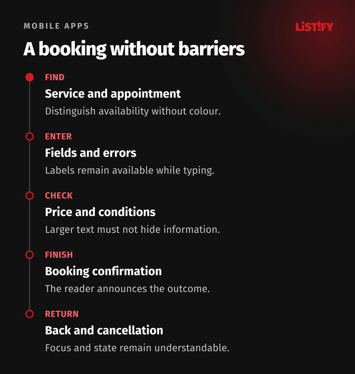
- Find a service using the reader and open its details.
- Select a date and time, distinguishing unavailable slots without colour.
- Enter contact information and deliberately trigger an error.
- Correct it, check the price and continue with larger text.
- Finish the booking and find its confirmation and cancellation route.
- Go back and verify that no unintended duplicate was created.
This is an illustrative testing scenario, not a measured result from an application. Replace it with your product's most important task. Include loss of connectivity and recovery from an external service error. An accessible confirmation screen cannot compensate for an unusable date picker.
10Shared code still needs two platform tests
For React Native, Flutter and other cross-platform approaches, evaluate the actual result on both systems. A proven component can support consistency, but an update or custom library can change its behaviour. Our native and cross-platform comparison discusses the wider technology decision.
Create a small set of approved components: button, field, switch, dialogue, list and status message. Document names, roles, states, focus behaviour and larger text. A designer then hands over more than an image, and developers do not need to infer expected behaviour repeatedly.
Pay attention to transitions between native screens and embedded web content. Returning from payment, opening a consent screen or using an external identity provider can change focus and reading order. Include those boundaries in acceptance rather than testing only screens your team directly built.
11Use automation and involve experienced users
Run automated checks during development and before release. They can help with some labels, contrast issues and dimensions. Verify meaningful wording, orientation within a dialogue and completion of complex tasks manually. A clean scan is not evidence of complete accessibility.
Involve people who regularly use screen readers or other assistive technology. Give them a realistic task without guiding them along the preferred route. Ask where they lost orientation, what they expected and whether they could finish independently. Agree compensation, recording consent and safe test data.
Prioritise problems by consequence. An inability to pay takes precedence over an unnecessarily verbose icon label. After a fix, repeat the original scenario and surrounding steps. Keep device and version details, settings, observations, severity, ownership and retest results in the report.
Review changed copy and new translations before release too. A longer label can push confirmation out of reach without a code change. Accessibility therefore belongs in content review and routine maintenance as well as engineering checks.
12Support interaction without precise touch or sound
Alongside screen readers, test an external keyboard and supported alternative input. Android documents Switch Access and voice control, for example. Verify that important actions can be selected, focus remains visible and a dialogue does not trap the user.
Do not communicate success through sound alone. Provide captions and necessary text for instructional video. Where time limits apply, test slower typing and alternative input instead of using the fastest tester as the baseline.
Describe defects specifically: “After opening the terms, keyboard users cannot reach order confirmation.” That gives developers a reproducible problem and explains the consequence to the product owner. A request to “improve accessibility” lacks a usable acceptance condition.
13Common questions about mobile accessibility
Is simulator testing enough?
It helps during development, but a physical phone tests gestures, keyboards, readers and external steps. Use supported physical devices on both platforms for acceptance.
Must larger text preserve the original layout?
No. Preserving information and function matters more. Rearrange content, allow wrapping and keep confirmation reachable.
Does an automated audit establish conformance?
No. It covers only part of the problem. The standard's scope, manual review and documented journeys require a separate assessment.
When should accessibility work begin?
During journey and component design. Repeat checks for significant releases and after library or operating-system behaviour changes.
Planning or accepting a mobile product? Agree concrete accessibility journeys and evidence through our mobile application service. Start with the task every customer needs to complete.