Shopping Cart UX: How to Reduce Abandoned Orders
A customer chooses a product, adds it to the cart and disappears. Unexpected delivery costs, forced registration, an unclear arrival date or a payment problem could be responsible. Better checkout UX starts with finding the specific obstacle and ends with a verified order. Learn how to review the whole purchase, prioritise repairs and assess their business value.
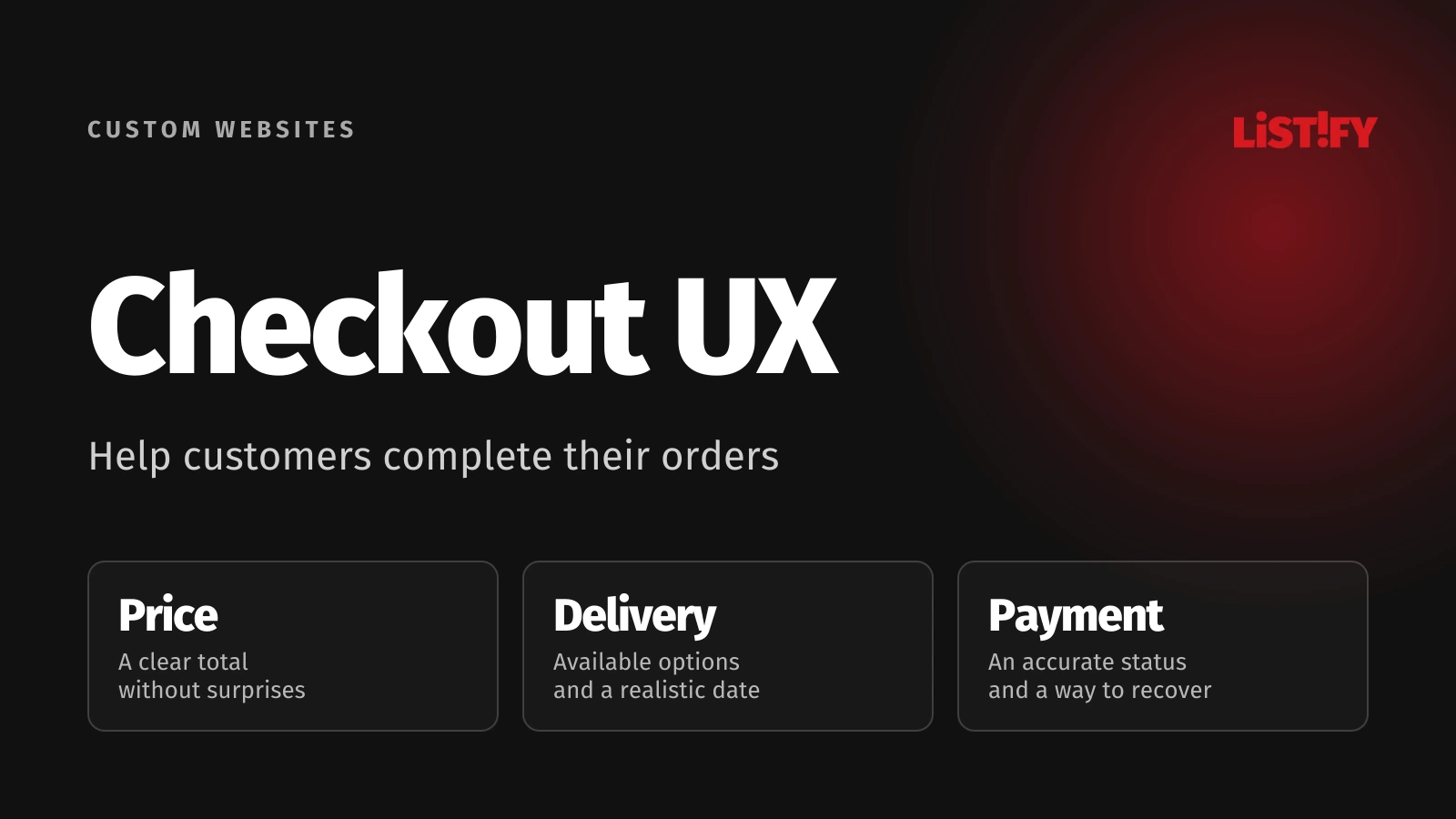
Another discount or a larger advertising budget may not help when customers get stuck in the final purchasing steps. Improve the cart together with the offer, delivery options and payment journey. Changing a button’s appearance will not fix an unavailable collection locker or an order that was never created after payment.
01Separate the cart, checkout and actual order
Adding an item to a cart does not always mean someone has decided to buy. They may be comparing prices or preparing a purchase for later. Starting checkout is a different step. Measure the two separately and define the time window in which completion belongs to the original journey. Mixing visits or devices can produce a misleading abandonment rate.
Break down the journey by device, country, delivery option and payment method where the data supports it. A problem affecting one payment route on a phone may disappear inside a sitewide average. For the wider journey from an ad to receipt of the goods, use a customer journey map.
Baymard’s checkout research highlights problems including interruptions and unpredictable progress. Use it to guide the search for obstacles. It does not establish how much your store will improve; you need evidence from your own journey and data.
02Do not leave price and delivery surprises until the end
Customers need to know what they are buying, what they will pay and when the goods should arrive. Keep the variant, quantity and an edit option recognisable in the cart. Recalculate totals and delivery conditions after changes. If the final amount depends on an address, explain that and make it possible to check before completing a long form.
| Customer question | What to show | What to check after a change |
|---|---|---|
| Total price | Items, delivery and applicable additional charges. | Quantity changes, discounts and delivery selection. |
| Arrival date | A clear delivery estimate with relevant conditions. | Orders after the cutoff and mixed item availability. |
| Collection point | The selected branch or locker and its address. | Carrier changes and temporarily unavailable locations. |
| Discount | Whether the code worked and why it was rejected. | Validity, excluded products and minimum order value. |
Distinguish “in stock”, “dispatches on” and “arrives on”. If operations cannot support an exact date, the interface should not invent one. A discount field can remain available without dominating the page or encouraging customers to leave and search elsewhere for a code.
03Offer an account and ask for details when they are needed
For an ordinary one-off purchase, make guest checkout easy to recognise. Explain the benefits of an account after the order. Where sign-in is necessary for trade pricing or permissions, explain why and provide a route for new customers. A hidden “continue as guest” link creates avoidable friction.
Do not request information again when you already have it within the same process. WCAG 2.2 on redundant entry describes prepopulation or selection of previously supplied information, with exceptions. A practical example is confirming that billing and delivery addresses are the same, with an option to edit.
Require a phone number according to the actual delivery process. Reveal business purchasing details when relevant rather than asking everyone to navigate company fields. Our guide to business forms explains how to specify fields and their downstream purpose.
04Payment needs more outcomes than a green tick
Before redirecting the customer, explain what will happen. When they return, show the status you actually know and a useful next action. “Checking payment” is different from “paid”. Do not handle technical uncertainty by asking someone to pay again before checking the first attempt.
| Situation | What the customer should know | What the system must handle |
|---|---|---|
| Confirmed payment | The order has a known status and reference. | Connect payment confirmation to the correct order. |
| Rejected payment | Another available method can be tried. | Preserve the order and prevent unintended duplicates. |
| Processing payment | The result is not confirmed yet. | Check status and process a later confirmation. |
| Connection lost on return | A new order is not required blindly. | Provide a secure way to check the existing order. |
Stripe’s documentation, for example, requires server notifications for reliable payment handling and covers delayed outcomes. A visit to the confirmation page alone is not sufficient for fulfilment. For another gateway, verify its own mechanism and handling of repeated notifications.
Include these situations in both the design and the integration test. Our article on payments in applications explains the connections in more detail. Customers do not need to understand the technical mechanism, but they immediately experience its consequences.
If you cannot tell whether orders are being lost because of a form, delivery selection or a payment gateway, send us the store URL and a description of the problem. Listify can propose an appropriate review and repairs based on documented obstacles.
05Test mobile checkout with the keyboard open
A narrow desktop browser window is not enough. On a phone, test the open keyboard, rotation, switching to a banking app and returning. The action button must remain reachable, and correcting an address should not silently erase the selected collection point. Long product names, unfamiliar name formats and international phone numbers expose problems that short sample data hides.
Describe an error beside the relevant field and offer an understandable correction. W3C recommends clear outcome messages and navigation to specific errors. Also test keyboard control, a screen reader and enlarged text; a red border alone does not explain what happened.
A mobile-first approach helps address these situations during design. Slow checkout can also have different causes from a slow homepage. Measure the actual purchase steps using the principles in our guide to website speed.
06Design a continuous journey through confirmation
Customers should always understand where they are and what the next action will do. A progress indicator must match the real sequence of a multistep checkout. Returning to correct an address should not force a fresh start. During completion, limit offers that distract from the order the customer has already chosen.
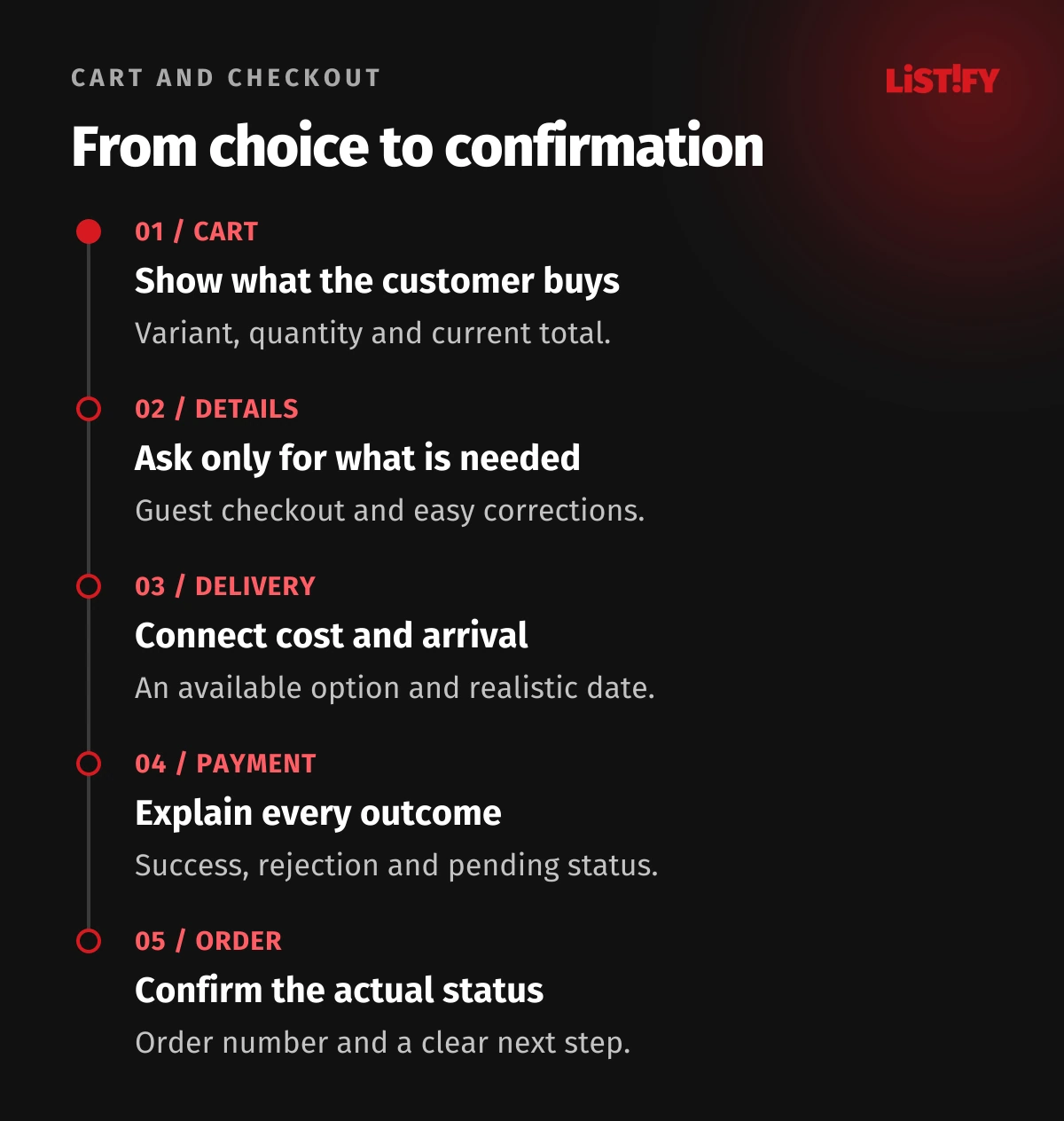
Finish with the order reference, the important details and next steps that reflect the actual status. A bank-transfer order may be awaiting payment. A cash-on-delivery order is not paid yet. The confirmation email, administration record and on-screen wording should not contradict each other.
07Measure the journey and verify the result in order records
GA4 provides begin_checkout, add_shipping_info, add_payment_info and purchase events. Implementation must reflect the real steps. Naming an event correctly does not establish that it fired at the right moment or only once.
Document what starting checkout, creating an order and receiving payment mean. Depending on the agreed definition, a purchase report may include accepted orders payable later; it must not be presented as cash collected. Check transaction identifiers, currency and repeated confirmation-page loads. Compare the analytics you have with order records and payment statuses.
Consent choices, tracking blockers and device changes limit analytics completeness. Do not make every discrepancy disappear by changing definitions. For error diagnosis, collect a general code and step rather than addresses, payment details or customer field contents. Session recordings require appropriate privacy settings and an approved purpose.
08Calculate value without promising a universal uplift
Consider an illustrative cohort of 1,000 checkout starts that produces 600 paid orders by an agreed cutoff. Completion is 60%. If equivalent conditions produced 650 orders, that would be an increase of five percentage points and 50 additional orders. This is an arithmetic scenario, not a forecast for a particular repair.
- Model: 600 of 1,00060%
- Scenario: 650 of 1,00065%
Illustrative arithmetic, not measured results or a promised uplift. Both scenarios have 1,000 starts and the same completion window. The difference is five percentage points, or 50 paid orders.
With an illustrative contribution of €20 per order after goods, seller-funded delivery, payment fees and other variable costs, those 50 orders would add €1,000 in contribution. You still need to account for the change itself, marketing and fixed operating costs. This contribution is not net profit, and cancellations and returns also matter.
A before-and-after comparison can be affected by seasonality, stock and a different campaign. Where volume and conditions support it, design a proper experiment. For a smaller store, fix verified errors, observe people completing the task and monitor trends with clear limitations. A weekly movement of a few orders is not certain evidence of a winning design.
09Prioritise repairs and brief the work clearly
First address obstacles that block purchases or create incorrect orders. Then tackle uncertainty about price, delivery and data entry. Prioritise visual changes using evidence rather than the strongest opinion in a meeting. Every finding should include a scenario, impact, implementation estimate and a way to verify the repair.
- Complete a representative purchase on a phone and a computer.
- Repeat a rejected payment, delivery change and return to customer details.
- Check order creation, payment status and measurement.
- Observe a customer who does not know the interface, without guiding them.
- Agree on initial repairs, ownership and checks after release.
Sometimes a few changes inside the existing platform are enough. Other cases need work on payment integration, performance or the ordering logic itself. A UX audit should distinguish these situations and produce an actionable brief, rather than automatically turn into a complete store rebuild.
10Frequently asked questions
Is one-page checkout always better?
No. Clarity and the complexity of the purchase matter. Understandable steps can work better than one long page. Test returning, correcting information and actually finishing on a phone.
What abandonment rate is normal?
There is no single correct number for every store. It depends on the cart definition, products, devices, traffic sources and time window. Start with your own comparable data and specific obstacles.
Should we offer a discount to everyone who leaves?
Investigate the cause first. A discount will not fix a broken payment or missing delivery option, and it can unnecessarily reduce margin. Handle reminders and offers separately under the applicable marketing communication rules.
Is tracking the confirmation page enough?
It is not sufficient as the only evidence of a business outcome. A customer may never open it or may reload it. You need a connection to the accepted order and actual payment status.
Do we have to replace the whole store?
No. The scope depends on the causes and platform capabilities. An audit, repairs to a few steps and payment-integration checks can be the first stage. Consider a rebuild when documented limitations justify it.