Form design: Validation, error states and autofill that help people finish
Someone completes an enquiry form, presses Submit and loses half their answers. Another customer enters a valid international phone number and gets an unexplained rejection. A useful form supports completion and recovery, including when the connection fails.
01Give every field a job
For each requested detail, identify who uses it and which decision it supports. An initial project enquiry may need a problem description and a contact route. Billing details or a full company profile can often wait. Do not remove fields simply to make the design shorter. Aim for the smallest useful set of information that allows the current task to be completed responsibly.
Mark required details consistently and explain unusual requests. If a phone number is essential, tell people why. For an optional attachment, explain what would help and which formats you accept. Organise a longer application around recognisable tasks rather than your internal departments. People should understand what remains and be able to revisit a step without losing their work.
02Keep labels visible after typing begins
Give each control a clear label and associate it programmatically. W3C recommends using label with matching for and id values for ordinary fields. This also makes the correct label available to assistive technologies. The WAI labelling tutorial explains the approach.
Use text inside an empty field as an example, if helpful, rather than its only name. Once someone has typed, they still need to know what the value means. Separate the label from the instruction: “Phone number” identifies the detail; “Include your country code” explains the expected input. Do not hide essential help behind a hover interaction that a touch or keyboard user may not discover.
A custom website design should show filled states as well as empty ones. Test long company names, unfamiliar address formats and enlarged text. A tidy mock-up with short sample words cannot demonstrate whether someone will be able to correct a real submission.
03Validate when the answer can reasonably be checked
Validation checks whether input meets defined requirements. Browsers provide basic checks for required fields and common input types. A correctly formatted email address is not proof that the mailbox exists. WAI's validation guidance covers required fields and native controls.
Avoid declaring an error before the person has had a reasonable chance to finish. A half-written email address is not necessarily a mistake. For a simple field, checking when focus leaves it can be appropriate; check the complete form on submission. Once someone is correcting a known error, provide timely feedback that the correction worked. Test the timing with your particular task rather than applying one rigid rule everywhere.
Distinguish syntax from a business rule. A date can be valid while the appointment is no longer available. Explain the availability problem and offer another choice. Likewise, do not reject names, phone spacing or international addresses merely because they differ from a narrow domestic example. Restrictions should reflect an actual downstream requirement that you can explain.
04Make errors actionable and preserve valid work
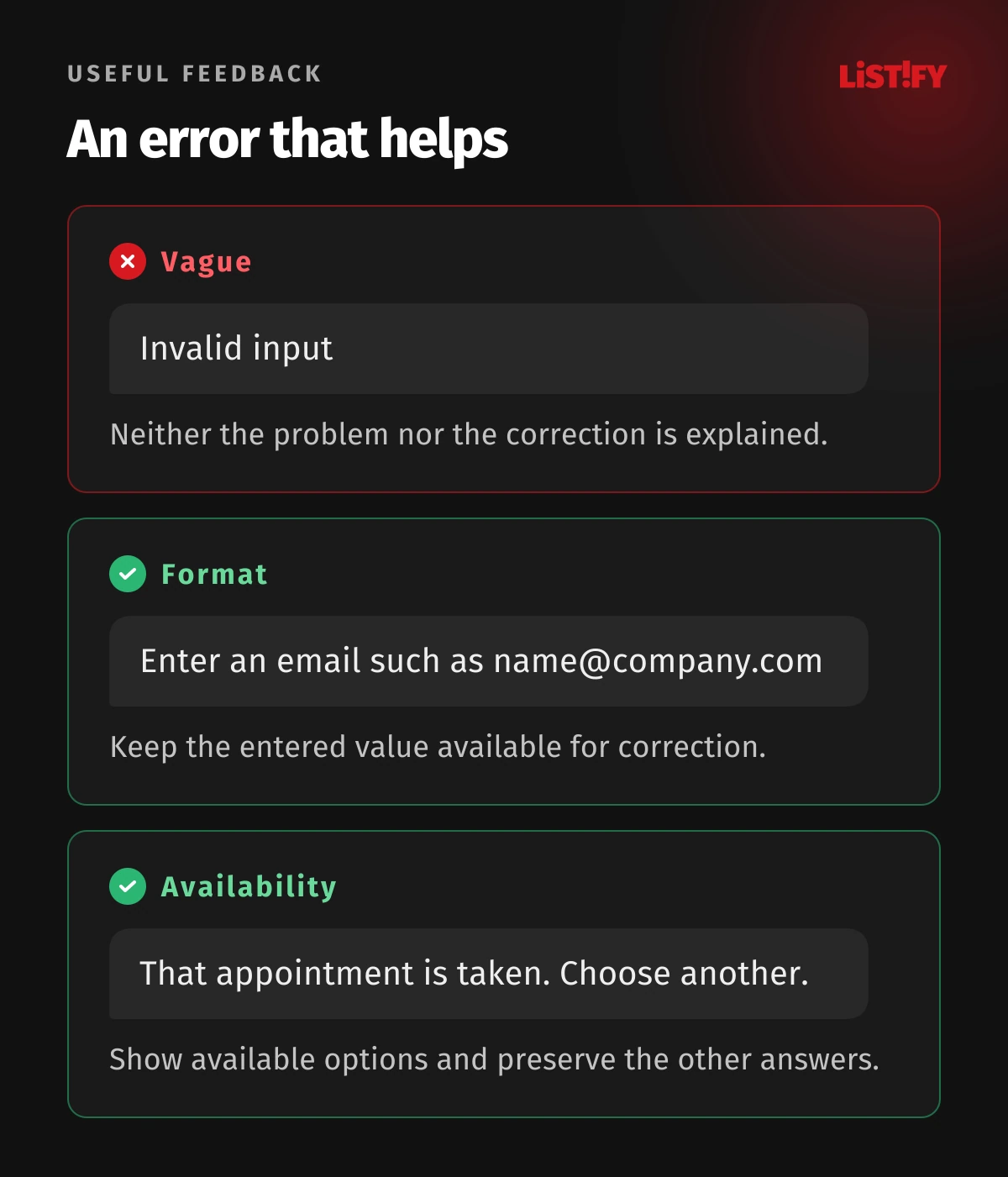
WAI's notification guidance recommends concise, understandable feedback. A longer form can use both a summary and messages beside affected fields. aria-describedby can associate error text with a control for assistive technologies. Colour alone cannot explain what went wrong.
| Unhelpful message | More useful wording | Keep available |
|---|---|---|
| Invalid input | Enter an email address such as name@company.com | The existing value for correction |
| File rejected | Choose a PDF or a supported image format | Other completed answers |
| Invalid appointment | This appointment is no longer available. Choose another. | Available appointment options |
These are illustrative examples. Your wording must match the actual field rules, including any file size limit. Do not recommend an input the system will reject. When a connection or server fails, avoid blaming the customer for incorrect details. Preserve their work safely and offer a meaningful next action rather than returning them to an empty form.
For the wider effect of errors and recovery on repeat use, read our guide to UX design for web apps.
05Let autofill help without taking control away
Autocomplete describes field purpose through tokens such as email, name and postal-code, with distinctions for billing and shipping details. Browser validation is not a security mechanism: the server must validate independently. Both points are defined in the HTML standard.
Make suggested or prefilled values visible and editable. If you look up a company from a registration number, identify the source and provide a route forward when the registry is unavailable. A late lookup result should not silently overwrite an address the person has already corrected. Suggestion lists must also be usable with a keyboard, rather than requiring a mouse click to select the result.
Do not ask for the same detail repeatedly within a process without good reason. W3C's redundant entry criterion explains prepopulation or making earlier information selectable, with exceptions. Browser autofill alone does not satisfy this content requirement. A practical option might be “Billing address is the same as delivery address”.
Keep the scope of convenience clear. Reusing an address within checkout is different from keeping a personal profile indefinitely. Let users understand when information is remembered and give them the opportunity to correct it. A form that saves keystrokes but repeatedly selects an old address has not solved the underlying task.
06Treat uncertain submission as a distinct state
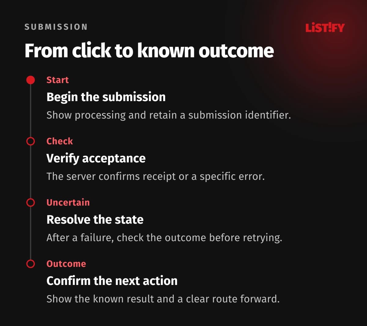
After Submit is pressed, show that processing is under way and discourage accidental repeated clicks. That is only the interface layer. The server should recognise a retry of the same submission and avoid creating unintended duplicates. For processes with side effects, agree on a submission identifier and the rule that distinguishes a retry from a genuinely new request.
A lost connection does not necessarily mean the server rejected the form. If the outcome is unknown, do not confidently display “Not sent”. Offer a status check or a safe retry with the same identifier. Confirm success after verified acceptance and explain the next step. Sending the confirmation email is a separate operation that can fail after the request has been stored successfully.
For a web application, design these states with the development team. Do not automatically save sensitive drafts on a shared device without considering the consequences. Choose storage and retention according to the information involved and the user's expectations. Passwords, access codes and the content of answers do not belong in ordinary analytics events.
For enquiry forms, the journey continues after submission: see who should own the enquiry and the first reply.
07Accept the form through recovery scenarios
Write the test scenarios before finalising the design. Include someone unfamiliar with the form and observe whether they can identify and fix a problem without coaching. Count technical failures and troublesome fields without collecting the sensitive answers themselves. Completed submissions alone do not reveal how much work people lost before reaching the end.
- Complete the form using only a keyboard and check focus order.
- Check labels and error announcements with assistive technology.
- Use a phone, enlarged text and long realistic values.
- Correct several errors without re-entering valid answers.
- Interrupt the connection during submission and inspect recovery.
- Repeat the same submission and verify the agreed duplicate handling.
Ask to see a native browser validation error and a server rejection during acceptance. They have different causes, but both need a comprehensible recovery route. Give someone responsibility for recurring problems after launch. The design is useful when people can complete the task and recover from predictable failures, not merely when the empty screen looks finished.
08Frequently asked questions
Is a shorter form always better?
No. It needs the smallest reasonable amount of information for the task. Removing a helpful explanation may create more difficulty than retaining one necessary field.
Should Submit remain disabled until everything is valid?
If you choose that behaviour, make the reason and missing requirements clear. Allowing a submission attempt followed by specific guidance is often easier to understand.
Is browser validation enough?
No. It helps with entry, while the server must independently check data and business rules. The two layers should provide compatible explanations rather than contradictory restrictions.
Should every abandoned form be restored automatically?
Only when that behaviour has been deliberately designed and tested. Saving sensitive drafts requires explicit product decisions, particularly on devices shared by several people.
09Have your form reviewed
Send us the form and the problems people report. We can review its fields, error states and submission confirmation against the task your customers need to complete.