Forms people complete: Design, validation and confirmation
A customer fills in a form, clicks the button and cannot tell whether their enquiry arrived. Another gets stuck because their phone number contains spaces. A useful form needs clear fields, proportionate checks and an unmistakable ending. Design them together.
01Decide what needs to be completed
An enquiry might aim to arrange an initial conversation. A complaint needs to identify an order and understand the problem. These tasks do not require identical fields. For each piece of information, write down who will use it and for which next step. If you cannot answer, remove the field or ask later.
W3C recommends requesting only information needed to complete the process. Make a working list with the information, reason, required status and recipient. For a phone number, decide whether the request genuinely cannot be handled without a call. A salesperson possibly finding it useful someday is a weak reason to make it compulsory.
Explain at the beginning what the person will get and what happens next. Do not promise a reply within an hour if the team cannot deliver it. Agree the process with the people handling requests. A form sending the right details to an unattended inbox still has an unresolved outcome.
02Give every field a persistent label
A field's name should remain visible while someone types. An example inside an empty box can illustrate the expected format, but it does not replace a label. Add a brief hint where information is easily confused, such as whether you need an order number or an invoice number.
Mark required and optional fields consistently. Group related choices and explain the question for each group. W3C's labelling guidance describes associating labels with controls. The developer brief must therefore specify more than the visual position of the text. It also needs a programmatic relationship with the field.
Try a long name, a company name containing accents and a multi-line address. Short sample content will not reveal what happens when text wraps. Base each hint on a real system constraint. If attachments must use a particular format and size, disclose that before the person selects a file.
03Make mobile entry easier
An email field should support email entry, a phone field should offer an appropriate keyboard and autofill should reflect the information's purpose. Do not automatically treat identifiers, such as postcodes or order references, as numbers for calculations. They may contain leading zeroes or letters.
W3C's validation guidance discusses different phone formats and international postal codes. Accept ordinary spaces and country codes where you can process them safely. Impose a strict format to meet an actual requirement, rather than because one regular expression makes it easy to check.
Work through the form on a phone with its keyboard open. Check that the current error, action and important hints remain usable. Splitting a short enquiry into several pages may not help. Divide a longer process around meaningful decisions and allow people to return without losing their answers.
04Validate when the person can act on the result
Do not mark an untouched empty field as wrong immediately after the page opens. Our practical starting point is to check completed input when the field loses focus and again on submission. Once an error has appeared, checking during correction can show that it has been resolved. Test the behaviour with the form's intended users.
A password and an available username may need different feedback. For a remote check, do not announce availability before receiving the response. If someone changes their entry in the meantime, an older result must not appear to validate the new value. Include slow connections in the design scenarios before launch.
MDN's validation documentation explains that browser checks can be bypassed. Validate input again on the server. A green tick beside an email address confirms only the check actually performed; it does not automatically establish that the mailbox exists or verify the person's identity.
05An error needs a problem and a next step
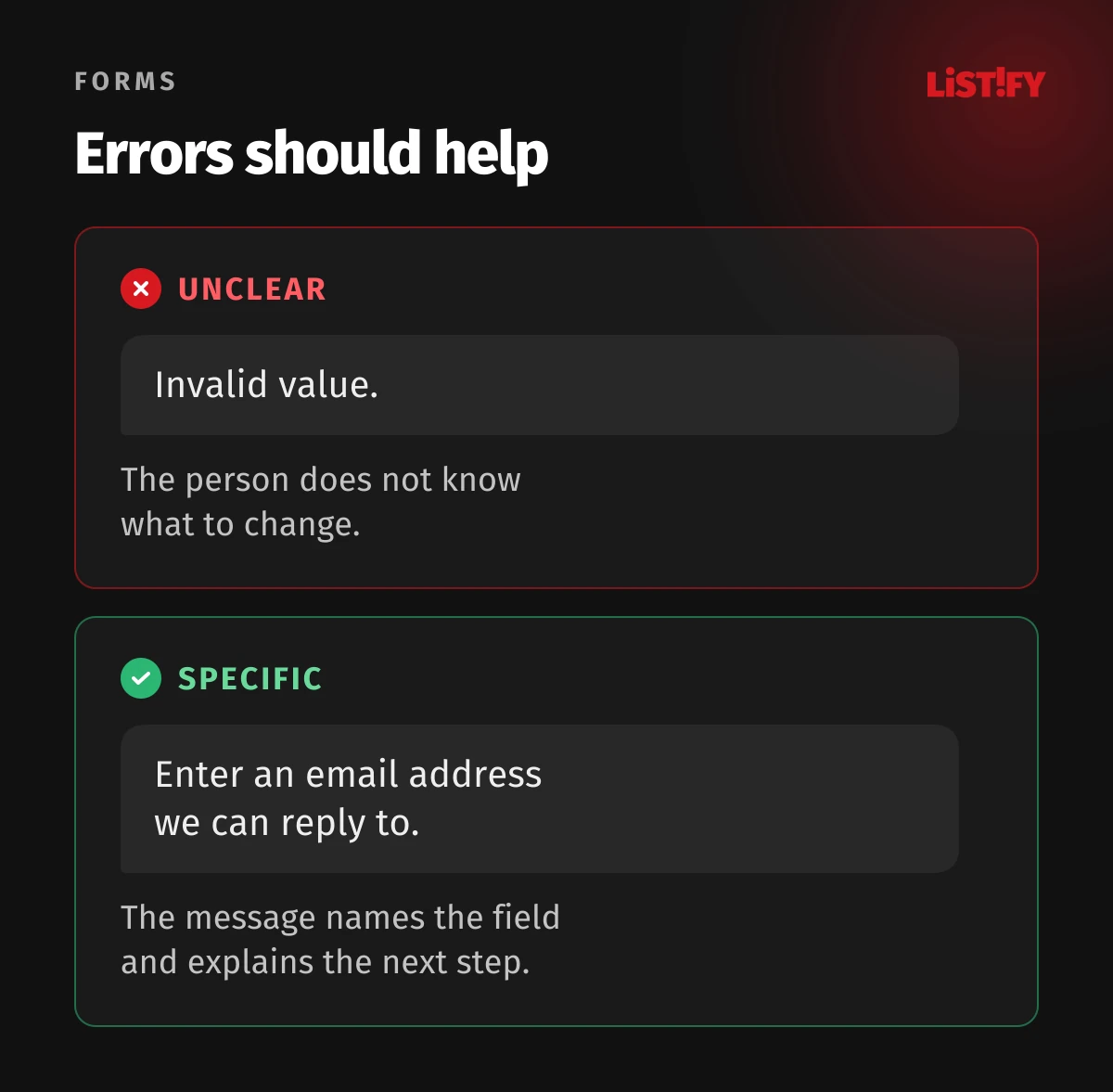
“Invalid value” does not tell someone what to change. A better message identifies the relevant information and explains a correction. Place it beside the field, preserve the entered content and use more than a red border. The wording should help the person continue, without blaming them.
After an unsuccessful submission of a long form, add an error summary with links to the affected fields. The GOV.UK error summary pattern combines the summary with messages at individual inputs. Verify focus handling and how assistive technology announces the errors, as well as their visual appearance.
| Situation | Unhelpful message | Clearer example |
|---|---|---|
| Missing contact | Error 1002 | Enter an email address we can reply to. |
| Oversized file | Invalid file | This file exceeds the 10 MB limit. Choose a smaller file. |
| Service failure | Check your details | We could not submit your request. Your entered details have been kept. |
06Distinguish invalid input from an unavailable service
A customer can correct a mistyped postcode. They cannot repair your server. For a service failure, avoid telling them simply to check their details. Explain whether the request was accepted, what has been retained and how they can continue. If its status is unknown, acknowledge that uncertainty instead of showing a false confirmation.
Show progress while submitting and account for repeated clicks. For orders and bookings, design protection against duplicate processing on the server. Disabling a button alone does not cover another request after a page refresh or connection failure. Make clear whether and how the action can safely be repeated after an error.
07Include confirmation in the design
Announce success only after the corresponding system confirmation. State what was received, what happens next and where further information is available. A more complex application may benefit from a review screen before submission. The GOV.UK check answers pattern shows a route back to edit individual answers.
Also design for a delayed confirmation email. People should not need to complete the form again simply because a message is missing from their inbox. If the process provides a request reference, show it on the confirmation page too. Avoid unnecessarily repeating sensitive content there.
08Measure completion and request quality
Distinguish viewing the form, starting it, encountering an input error, attempting submission and receiving confirmed acceptance. A button click is not a completed enquiry. Keep field contents, email addresses and message text out of analytics events. A field identifier and problem type will usually be enough to investigate usability issues.
When comparing versions, include valid contacts and additional work for the receiving team. More submissions are unhelpful if they create more requests that cannot be handled. Separate mobile and desktop and record what changed. Without the same definition of completion, the results cannot be compared meaningfully.
Before release, test valid input, several errors together, keyboard use, a phone, a slow response and server failure. Confirm that requests actually reach someone who can handle them. To review both the interface and its outcome, start your custom website discussion with this shared scenario.