Dashboard design: make complex data useful for the next decision
An operations manager opens a dashboard filled with charts, yet still asks which requests need attention today. The screen contains data, but it does not support the decision. Good dashboard design connects a user's question to relevant evidence and a practical next step.
Data applications often need to serve several kinds of work: monitoring a situation, investigating a change, and completing a task. Trying to give each metric equal space creates a crowded overview without a clear starting point. Decide which of those jobs the current screen supports.
A useful dashboard can be visually restrained and still contain substantial detail. The important distinction is between information needed for the immediate decision and detail available when the user asks for it. Both require consistent definitions, reliable data, and usable interaction.
01Begin with the decision and the person making it
Ask users to describe a recent decision and show how they reached it. What did they inspect, which information was missing, and what happened next? This is more useful than asking which charts they would like. People may request a familiar visual when their real problem is an unclear status or a slow approval.
For a service operations team, the primary question might be which requests are overdue and who can resolve them. A finance manager may need to investigate an unexpected expense. An executive may want a periodic view of performance. They can share definitions and data sources without sharing the same default screen.
Write a short purpose for each view: audience, decision, frequency, and next action. Include the conditions under which the user should investigate. If every stakeholder adds another card without changing that purpose, review whether the card belongs in a separate report or detail view.
Microsoft's dashboard design guidance emphasizes audience, relevant metrics, visual hierarchy, and context. Treat such guidance as design input rather than a rule that every dashboard must fit one physical screen. Dense operational work may need scrolling and focused detail views.
02Create hierarchy without hiding important exceptions
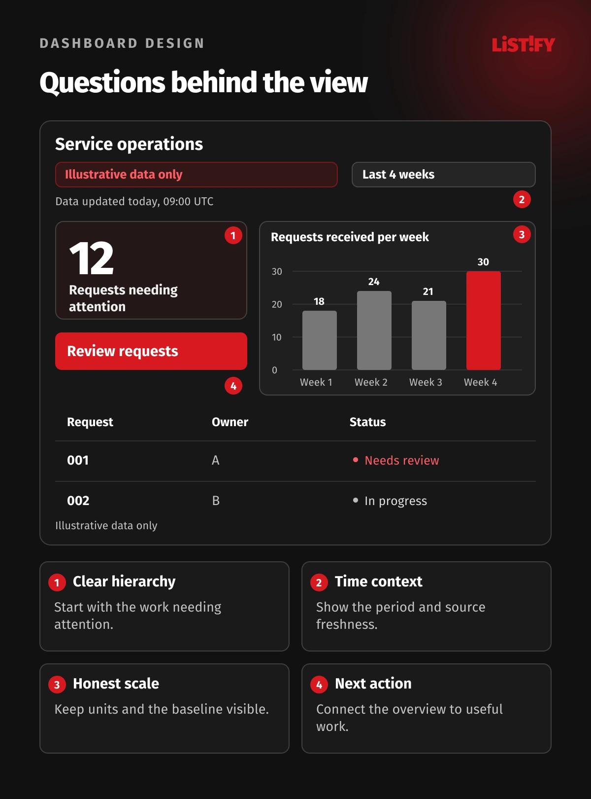
Put the most important question where users can find it immediately. An attention indicator should have a clear label, meaning, and route to the affected records. A large number without a definition or timeframe invites interpretation instead of supporting a decision.
Use a small set of priorities. Primary information supports the immediate task. Supporting trends explain change. Detailed records let the user investigate or act. Repeating the same information in several visual forms can consume space while making the screen seem more comprehensive than it is.
| Information need | Useful presentation | Context to preserve |
|---|---|---|
| Know what needs attention | A clearly labeled count or status with a detail link | Definition, period and severity or priority |
| Understand change over time | A trend with appropriate labels and scale | Time range, unit, comparison and data gaps |
| Compare categories | An ordered bar chart or concise table | Consistent categories, units and applicable filters |
| Find and complete work | A searchable or filtered work queue | Ownership, status, due date and permitted action |
| Inspect an unusual result | A detail view with supporting records | Definitions, source, access and return path |
Make important exceptions visible without using alarm styling for ordinary work. An overdue request, failed import, and temporarily unavailable source need distinct meanings. Agree the terminology with users and the responsible team. Color alone cannot carry those distinctions reliably.
03Show time, freshness and definitions beside the data
A count of open requests at this moment is not the same as requests created during the month. A weekly total is not a daily average. Label the measure so users know which interpretation applies, and make its definition accessible when it matters.
Show the active reporting period and relevant timezone. Explain whether a comparison uses the previous period, the same period last year, or another baseline. If the current period is incomplete, avoid presenting it as directly comparable to a completed period without that qualification.
Data freshness should describe the information available, not merely the time the webpage rendered. A screen refreshed at noon can still show a source last synchronized the previous evening. Make delayed or failed updates visible and tell users whether acting on the displayed information is appropriate.
Define the source of important metrics and assign an owner. A request can be counted differently by sales, support, and finance. Reconcile those definitions before turning the differences into charts. When a definition changes, explain the effect on historical comparison instead of silently making the trend appear continuous.
04Use chart scales that support an honest comparison
Choose a chart for the relationship you need to show. Bars help compare quantities across categories. Lines can show a sequence over time. A table supports exact values and multiple record attributes. Decorative variation adds little when it makes users relearn how to read every panel.
For bar charts, a zero baseline normally preserves the meaning of bar length. A line chart may use a more focused range when that helps reveal a meaningful variation, but label the scale clearly and consider the decision the visual supports. Do not use a changing scale to dramatize a small movement.
Keep units visible and avoid combining unrelated quantities simply because both fit on the screen. Dual axes require particular care: apparent correlation can depend heavily on scale choices. Separate charts can be easier to understand and less likely to imply a relationship the data do not support.
Display gaps honestly. Missing data, zero, and not applicable are different states. A line drawn across an absent period can imply evidence you do not have. Provide an appropriate gap or explanation and preserve the distinction in exports and accessible data views.
Keep comparisons stable enough to recognize. If colors, category order, or units change across panels, users must spend effort reconstructing the relationship. Make necessary changes explicit, and test whether people can explain the chart without guidance from its designer.
05Make filters and detailed tables predictable
Show active filters in a place users can inspect and change. Explain whether a selection affects the whole page, one chart, or a detail panel. Hidden filtering is a common source of apparent disagreements between numbers that are actually using different populations.
Use sensible defaults for the task, then let people reset to a known state. Preserve context when opening a record and returning to the queue. For a shared link or export, define whether filters travel with it and how the recipient learns which state produced the result.
For dense tables, select columns around the task rather than every available field. Group related information, use understandable headings, align values consistently, and provide useful sorting. The GOV.UK table component guidance includes semantic headings and captions that help explain tabular information.
Large data volumes need deliberate behavior. Search, pagination, or carefully implemented virtualization can reduce the immediate load. Test keyboard access and assistive technology rather than assuming an optimized visual table remains accessible. Clearly distinguish no matching records from a loading failure.
Keep actions specific. A queue may need assignment, investigation, or approval, with the relevant permissions and confirmation. The dashboard should not expose a destructive bulk action simply because a filter is active. Show the scope of the action and preserve a clear outcome or failure message.
06Build accessibility and permissions into the view
People may use a keyboard, a screen reader, a small display, zoom, or different color perception. Design focus order, controls, headings, labels, and feedback so the task remains understandable under those conditions. A chart that looks clear in a screenshot can still be unusable in the actual application.
WCAG's guidance on use of color explains why color should not be the only way to communicate information. Add meaningful text, shapes, or other cues. The relevant non-text contrast guidance also addresses necessary graphical and interface information, with defined scope and exceptions.
For complex charts, provide an appropriate text explanation and access to underlying information. The W3C complex-images tutorial describes approaches for communicating a chart's information beyond a short alternative-text label. Decide what the user needs to understand, not just what the image looks like.
Product-specific features still need configuration. Microsoft's Power BI accessibility documentation describes built-in capabilities and author responsibilities. Their presence does not demonstrate that every report is accessible or that a custom data application meets all applicable requirements.
Keep access consistent across cards, detailed records, downloads, and shared views. Hiding a table column in the interface does not protect the underlying data. Confirm that the actual data access follows the user's permissions and that sensitive exports receive the appropriate controls.
07Test decisions before adding more visual detail
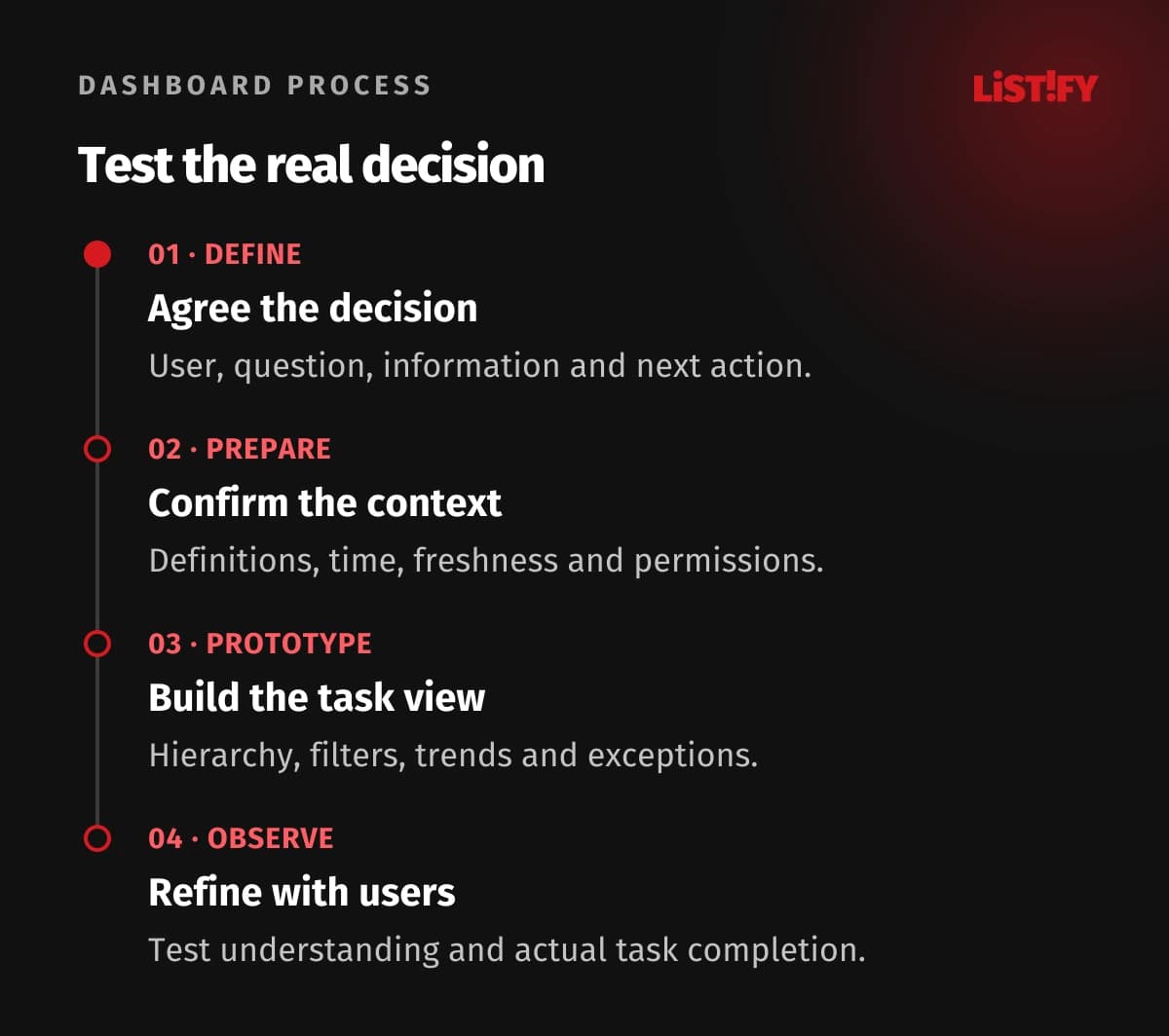
- Define the decision. Agree the user, question, information and next action.
- Prepare the data. Confirm definitions, time context, freshness and access.
- Prototype the task. Build hierarchy, filters, trends, details and exceptions.
- Observe and refine. Test understanding and action before adding more panels.
Give users realistic tasks: find overdue requests, explain a recent change, identify which source is stale, or return from a record without losing the filter. Observe where they pause and what they believe the numbers mean. Avoid leading them through the layout while calling the exercise a usability test.
Review the interface with realistic volume and awkward states. Long labels, empty results, missing values, permission restrictions, loading delays, and a narrow screen can change the experience substantially. Include these conditions before polishing the final visual style.
Keep a record of metric definitions and component behavior for future changes. A growing data application benefits from consistent patterns; our UI and UX comparison explains why attractive presentation and successful task completion need to be considered together.
08Questions about dashboard and data application design
How many metrics should a dashboard contain?
Choose the information needed for its defined decisions. There is no useful universal count. Put priority information in the overview and provide supporting detail where people investigate or act.
Should every dashboard fit on one screen?
A concise monitoring overview can benefit from that constraint, but operational tasks may need detailed queues, scrolling and separate views. Test the actual task and display conditions instead of applying one layout rule everywhere.
How should we show data freshness?
Show when the relevant source information was updated and whether synchronization succeeded. The time the webpage refreshed is not necessarily the time represented by its data.
Can we use color for status?
Use color as a supporting cue and provide another understandable indication, such as a clear label. Check contrast and accessibility for the relevant information and interactions.
Does a missing value mean zero?
No. Distinguish zero, missing, unavailable and not applicable. Preserve the distinction in charts, tables and exports so users do not make decisions from an invented value.
What makes a dashboard actionable?
Connect relevant attention indicators to records, owners and permitted next steps. Users should understand the period and meaning of the measure before investigating or acting.
What should we test before launch?
Test realistic decisions with representative users and data volume. Include filters, returning from detail, stale sources, errors, permissions, narrow displays, keyboard use and assistive technology.