Analytics and heatmaps: Turn user behaviour into a testable improvement
People click the button but never submit the form. Bright areas on a heatmap look persuasive, yet they do not explain the cause. Combine counts, individual journeys and a focused test before deciding what to change and how to measure its value.
01Start with a question, not a coloured map
Analytics establishes the scale of a pattern, a heatmap locates interaction and a user test helps assess an explanation. None provides the complete answer alone. Start with a concrete question: why do people on phones begin an enquiry but fail to finish it? That is more useful than a general instruction to inspect heatmaps.
Define the decision the investigation could support. Will you change a field, form placement, validation or the offer itself? Choose an outcome such as a qualified enquiry, alongside a guardrail such as errors, response time or support demand. More clicks are not success if they create more mistakes.
02Understand what each source can tell you
| Evidence | Useful question | Limit |
|---|---|---|
| Events and funnel | At which step do measured users drop out? | Does not explain why alone |
| Click map | What do people interact with? | A click is not satisfaction |
| Scroll map | Which sections does the sample reach? | Reaching content is not reading it |
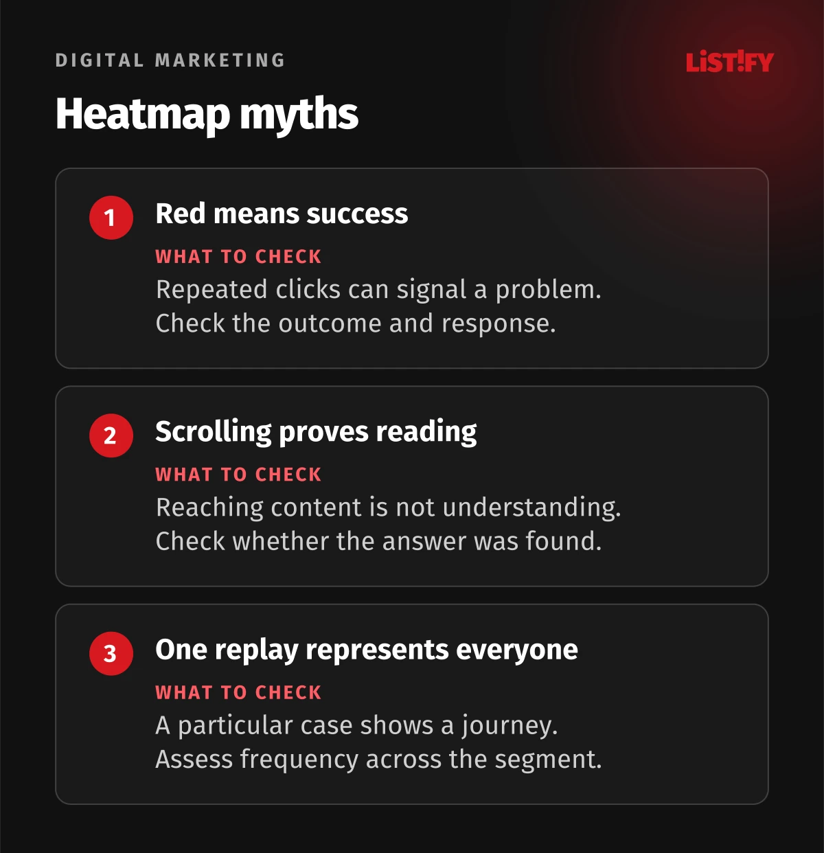
| Session replay | What happened in this journey? | One case does not establish frequency |
| User test or interview | What did the person expect and understand? | A small recruited sample is not all traffic |
| Business system | Was the order or enquiry useful? | Requires a consistent outcome definition |
Microsoft Clarity describes heatmaps as an aggregated view. Read colours together with counts, filters and dates. A map without a description of its audience is weak evidence for changing the entire website.
03Verify events before looking for causes
Define each event. Form exposure should reflect the form becoming available, a start should reflect a meaningful interaction and submission should mean confirmed server acceptance. Clicking Submit is not the same as submitting successfully. Distinguish validation errors, network failures and duplicate requests.
Consider GA4 recommended events for standard situations and keep custom names consistent. Run one journey and confirm one correct outcome. Try refreshing, going back and refusing consent. Do not put names, email addresses or enquiry text into event parameters.
Our 50 GA4 setup tips cover configuration in greater detail. This investigation starts once the outcome is dependable and you need to understand a particular interface obstacle.
04Select a comparable segment
Separate phones and computers, meaningful traffic sources, new and returning visitors and language versions. Start with one segment linked to the question. Dividing a small sample into dozens of groups can create more random differences than actionable findings.
Record the page version, date range, consent coverage and excluded internal visits. Do not interpret clicks from an old layout as though they occurred on the new one. For authenticated products, separate roles and account states too. A newcomer with no records faces a different task from an administrator with a long list.
05A click can signal interest, expectation or failure
Clicking an inactive heading may suggest it looks like a link. Repeated clicks can reflect slow feedback or ordinary operation of a control. Clarity defines rage clicks as repeated rapid clicks in a small area and dead clicks as clicks with no detected response. These labels do not establish the user's emotions.
Inspect related journeys and reproduce a suspicious interaction. Is the button covered? Is a loading state missing? Does the response appear outside the visible area? Check technical errors too. Changing a button colour cannot fix a server that rejects valid form input.
06Scrolling does not measure reading
Clarity scroll maps show the sections reached and support device-based views. Reaching a section does not establish that someone read or understood it. Rapid scrolling might indicate a search for pricing rather than attention to every intervening block.
If few measured visitors reach an important explanation, form a hypothesis about its availability. Do not automatically remove lower-page content: it may serve a small but commercially important group. Connect behaviour to outcomes and investigate whether people actually miss that information.
07Treat replay as a reconstructed journey
Clarity collects interaction events and DOM information for playback. It is not a complete video of the user's device. Masking, unavailable external content and technical limitations may affect the replay.
Select sessions using a rule established beforehand, such as the first available journeys in the relevant segment containing a particular error. Add successful journeys for comparison. A presentation containing only dramatic failures distorts the evidence. Separate the event you observed from the explanation you infer.
08Check dynamic content and application states
For menus, dialogues, changing page heights and nested scrolling, verify that the map matches the state being investigated. Clarity documents limitations involving dynamic elements and nested scrolling containers. An empty region does not necessarily mean people ignored it.
Run a test journey containing an expanded panel, sign-in, an error and completion. Compare the replay with what you actually did. In a single-page application, check virtual page changes and names so that the entire journey does not disappear under one misleading address.
09An illustrative funnel: Where to investigate next
The following figures are entirely illustrative. Assume 1,000 lawfully measured unique users of one page version, one segment and a predefined seven-day window. Count each person at most once per step. Business qualification belongs to the same cohort. These are not client results.
| Step | Users | Share of the original 1,000 |
|---|---|---|
| Initial cohort | 1,000 | 100% |
| Form exposed | 600 | 60% |
| Form started | 240 | 24% |
| Successfully submitted | 120 | 12% |
| Qualified enquiry | 90 | 9% |
Of those exposed to the form, 240 / 600 = 40% started it. Half of those starting submitted. Qualification covered 90 / 120 = 75% of submitters. Each percentage has a different denominator. The model identifies where to investigate; it does not prove that the form is too long or predict the uplift from a change.
- Initial cohort1,000
- Form exposed600
- Form started240
- Successfully submitted120
- Qualified enquiry90
Our illustrative model, not client measurements. One cohort of 1,000 unique users, one page version and a seven-day window. Each user is counted at most once per step. All bars share the same baseline.
10Write a hypothesis that can be disproved
An observation might be: mobile users begin the form but stop after a telephone-number error. Hypothesis: the expected format is unclear and correction is difficult. Proposed change: show an example, accept ordinary formats and explain errors beside the field. Check: fewer relevant errors and more useful submissions.
Record alternative explanations, such as a slow API or an unsuitable offer. Run a short test with people from the intended audience and let them use the form without prompting. Fix a reproducible defect directly. If choosing between two plausible designs, plan a comparison.
11Evaluate the outcome rather than the heatmap colour
Where traffic and conditions support random allocation, use an A/B test with a primary metric, guardrails and a stopping rule agreed beforehand. Required sample size depends on the baseline rate and the difference you want to detect. No universal visit count applies to every site.
For lower traffic, combine targeted usability work with subsequent observation. When comparing before and after, account for campaigns, seasonality and other website changes. An improvement after release does not establish causation by itself. Decide using the combined evidence, record uncertainty and schedule another check.
Keep the business outcome visible. A shorter form might increase submissions but reduce useful enquiries. A clearer price might reduce clicks while helping suitable customers proceed. Evaluate what the business and customer need, rather than rewarding activity for its own sake.
12Choose tools around the evidence you need
GA4 can organise defined events and reports; Clarity adds interaction maps and replay. Matomo offers click, movement and scroll maps; its Heatmap & Session Recording capability is a plugin. Check current availability, licensing and operation for the proposed setup.
Compare recording targeting, masking, team permissions, retention, export and behaviour on your actual site. Validate the choice with a small pilot. This is not a first-hand performance comparison or a ranking of these products. Adding two similar replay tools without a defined purpose adds administration and collection without necessarily improving the answer.
13Configure privacy before collection
Define purpose, scope and retention. The GDPR includes a requirement to minimise personal data. Assess cookie and consent requirements for the jurisdictions and methods involved separately. Technical configuration should implement that assessment rather than simply inherit a vendor default.
Exclude sensitive screens and mask content before sending it to the service. Clarity documents masking controls; verify the defaults. Inspect test recordings for fields, personalised headings, URL content and error messages.
Clarity ConsentV2 distinguishes granted and denied consent and changes measurement coverage. A cookieless mode does not itself establish legal compliance. Test refusal, acceptance and withdrawal, plus staff access and deletion. Account for changing measurement coverage when interpreting trends.
14Make investigation a repeatable working process
For each finding, save the question, segment, dates, outcome definition, observation, hypothesis, proposed action, owner and review date. At a short regular meeting, select a change the team can actually deliver. A collection of screenshots without a decision is not a work plan.
After release, verify instrumentation first, then the result and possible side effects. Our product analytics guide explains how events connect to useful product work. A heatmap earns its place when it makes that process quicker and more precise.
15Common questions about analytics and heatmaps
Does a heatmap show where people look?
An ordinary click or mouse-movement map is not eye tracking. It records interaction. Attention and understanding require additional evidence.
How many sessions should we watch?
There is no single correct count. Define selection around the question, include successes and failures, and use analytics to assess frequency. An interesting case does not represent the whole audience.
Can we record every form field?
Collect only what the stated purpose needs. A field state and error category are usually enough to investigate friction. Personal details and message contents are generally unnecessary for that task.
Does less scrolling mean a worse website?
Not necessarily. Someone may find an answer or complete the task near the top. Evaluate the outcome rather than the distance travelled.
Have data but no clear next improvement? Our digital marketing service connects measurement with website outcomes. Bring one question, a specific page and a definition of a useful enquiry.